Orthodontie
Gentbrugge
services
Brand identity
Web design
Signage
credits
Project management Laura De Backer
Logo Sam Rombaut
Photography Thibault Florin
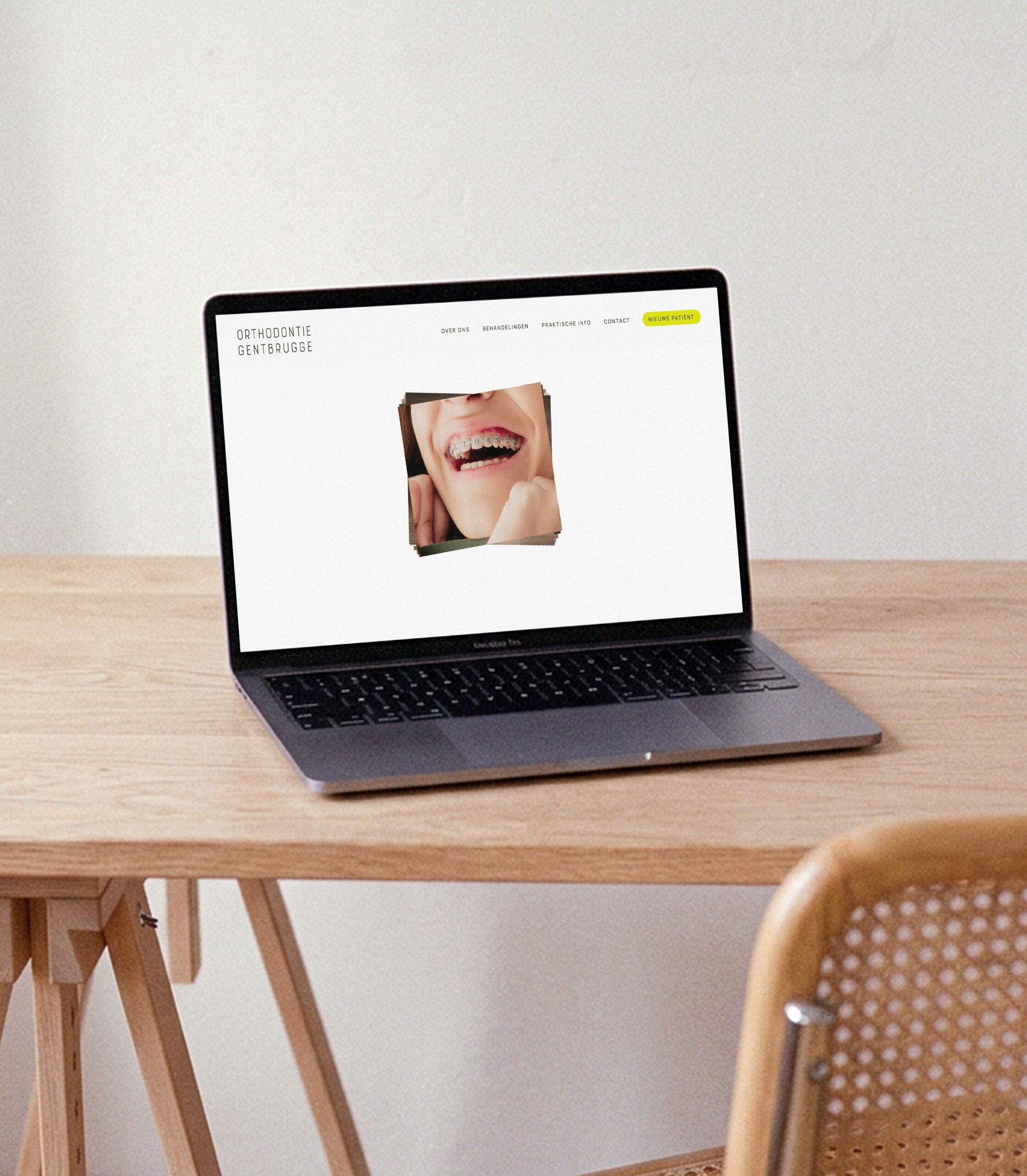
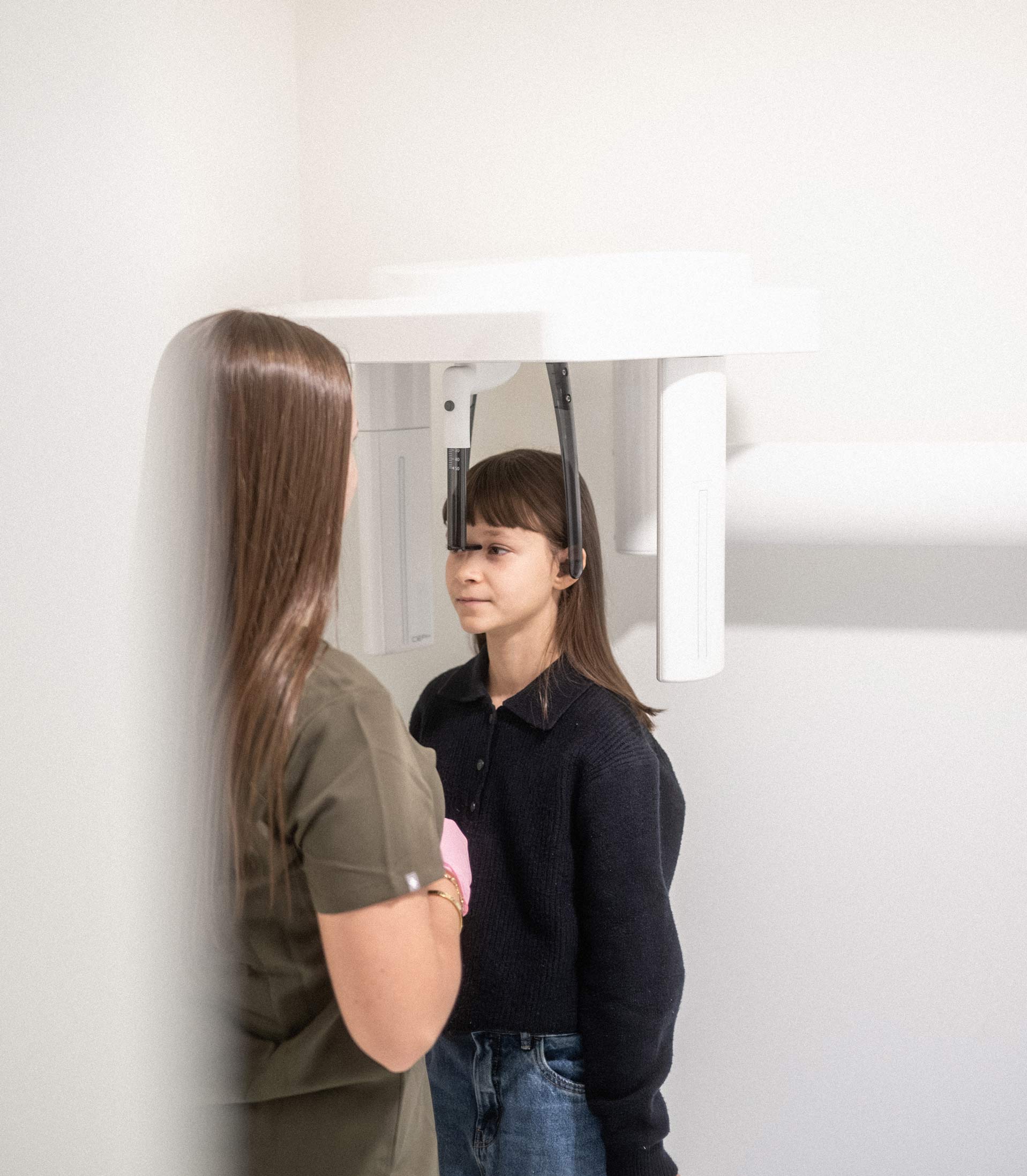
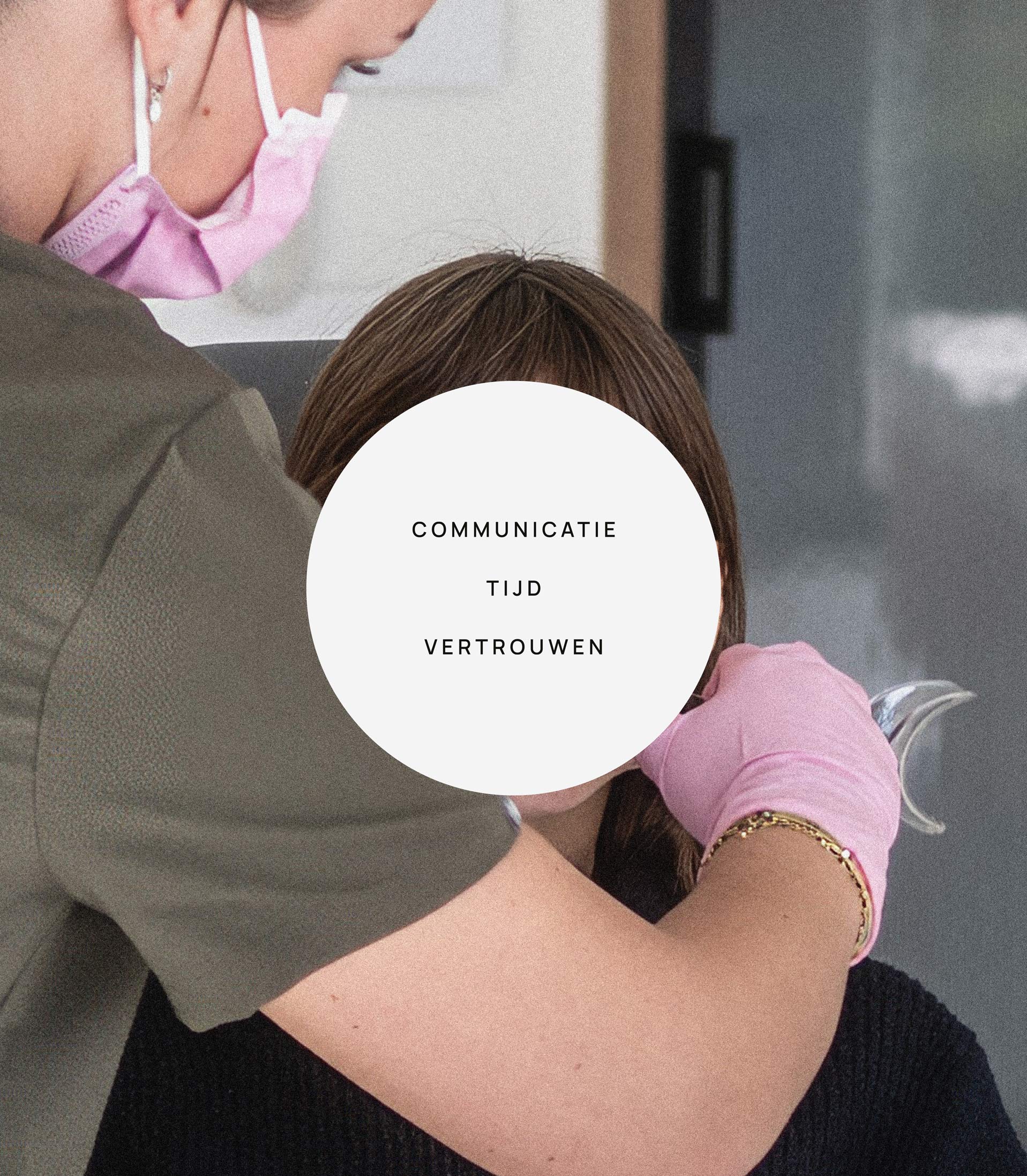
For her new practice in Gentbrugge, Justine was looking for an identity that felt calm, trustworthy and approachable. Specialized in orthodontics she treats children, teens and adults. By open communication and taking their time for every patient, the team puts them at ease. This feeling, given by a warm and attentive approach, should be there from the first visit on the website until walking out with a healthy and confident smile.
the mission
Our goal with Orthodontie Gentbrugge was to create a brand that reflects calm, trust and care. We aimed for a visual identity that feels light and reassuring, appealing to families who value a practice that takes its time, explains clearly and puts the person before the treatment. We also wanted to make it fun because in the end their smile is what the whole process is leading to.
the results
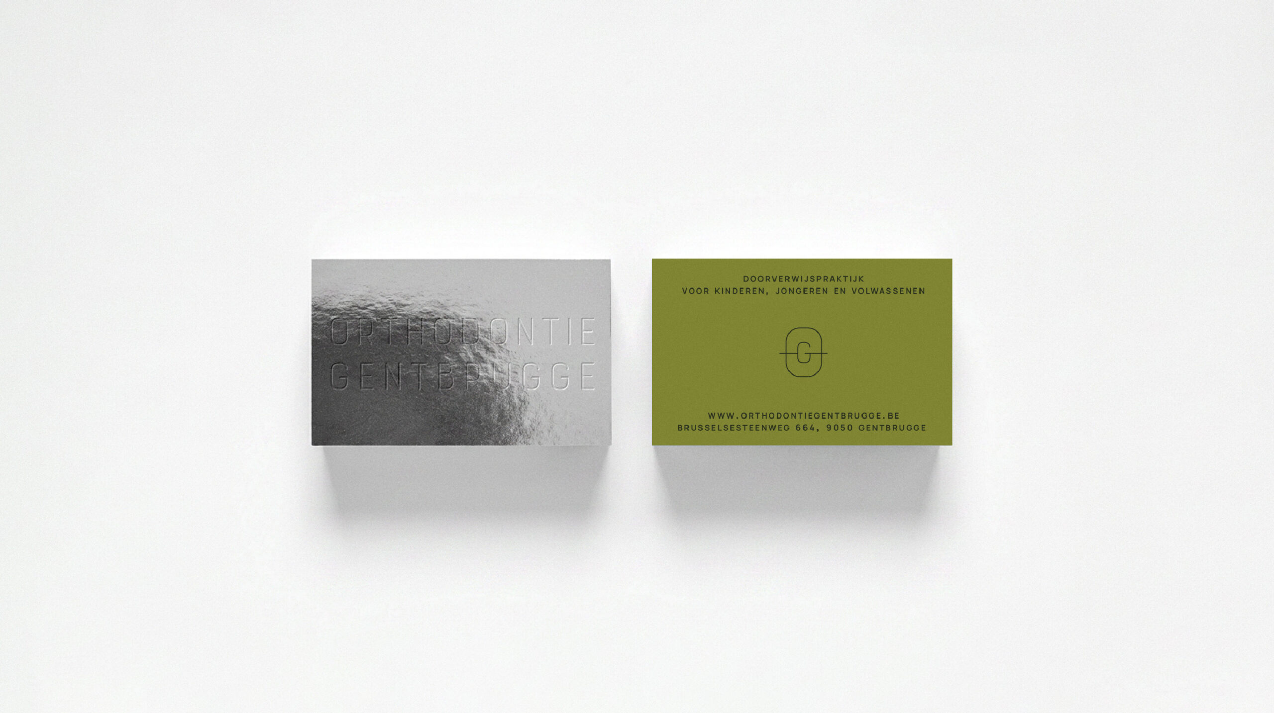
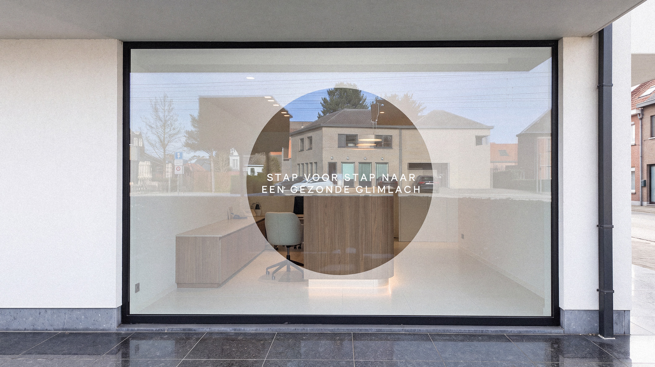
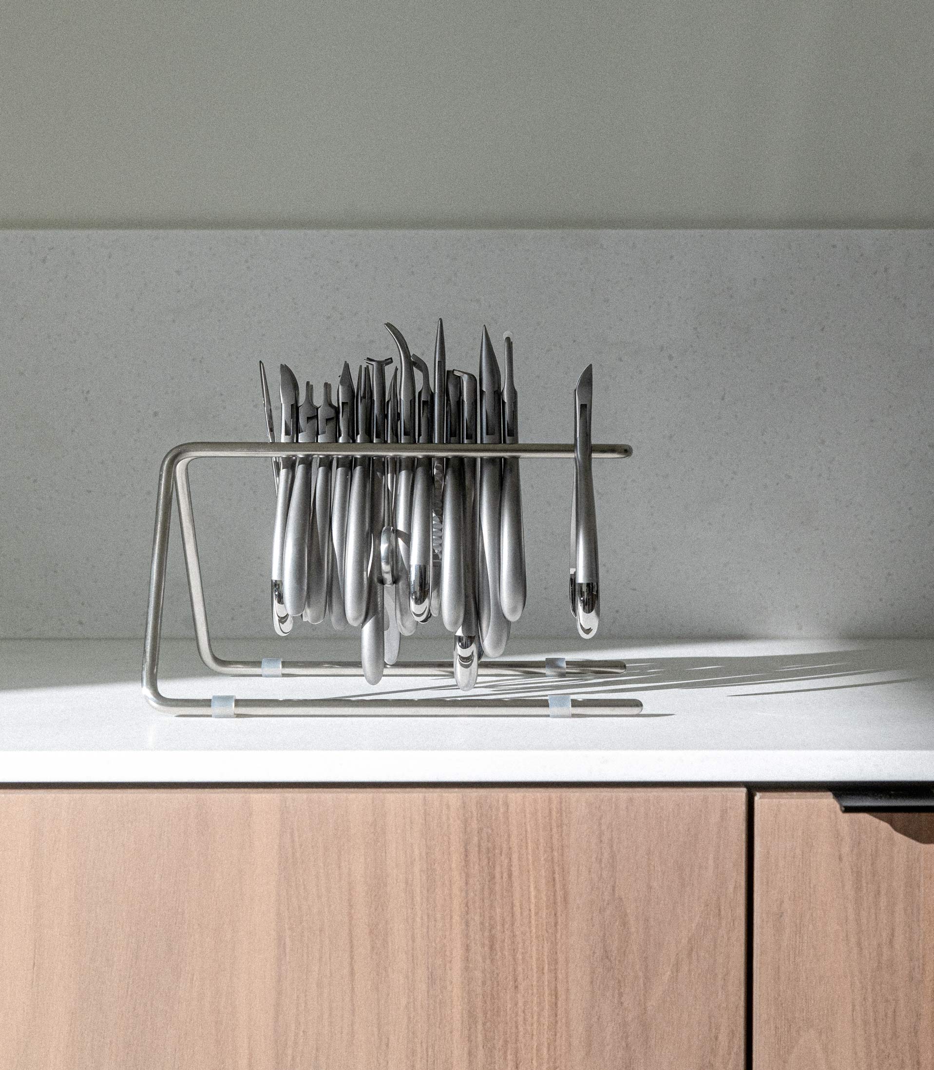
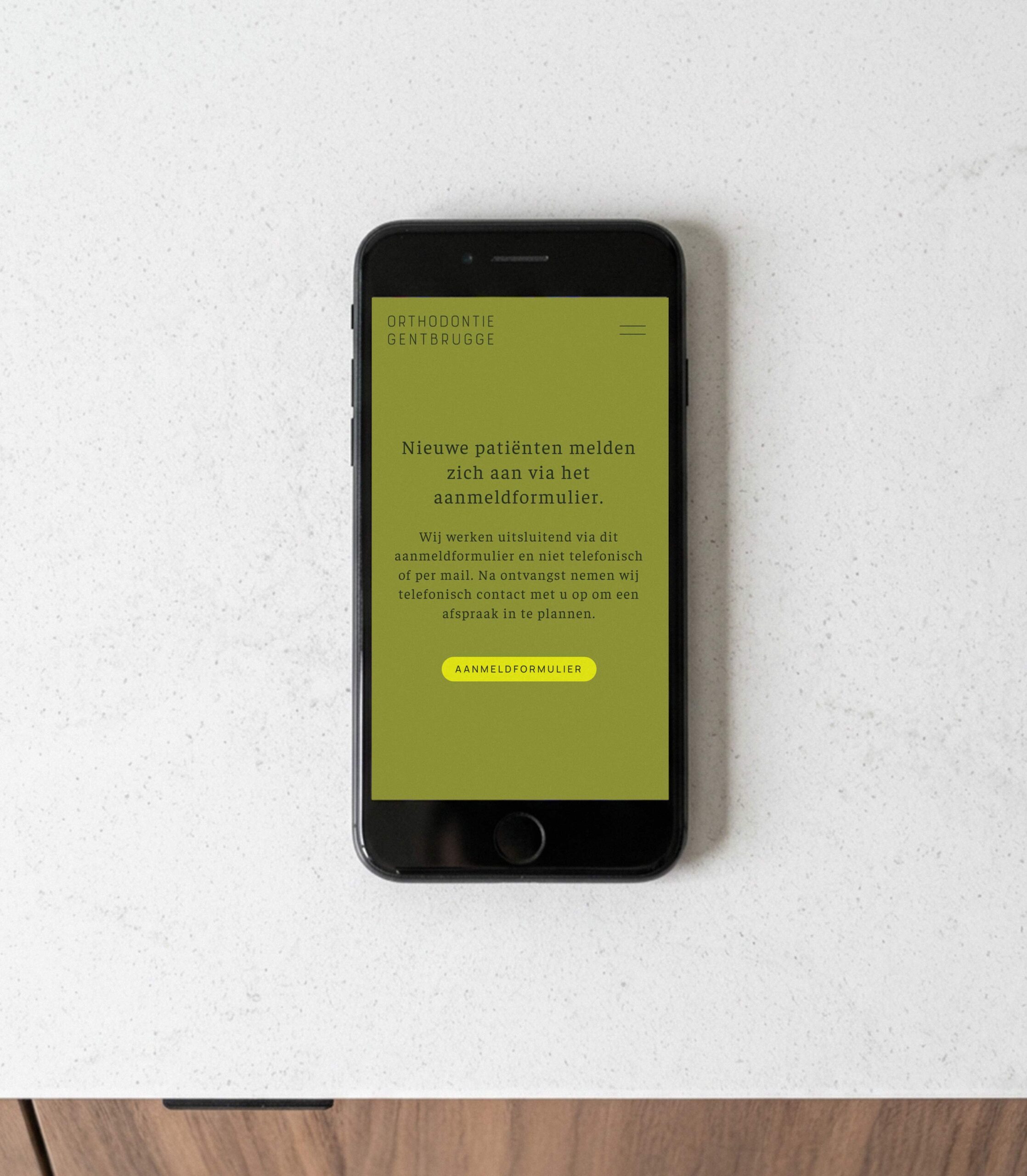
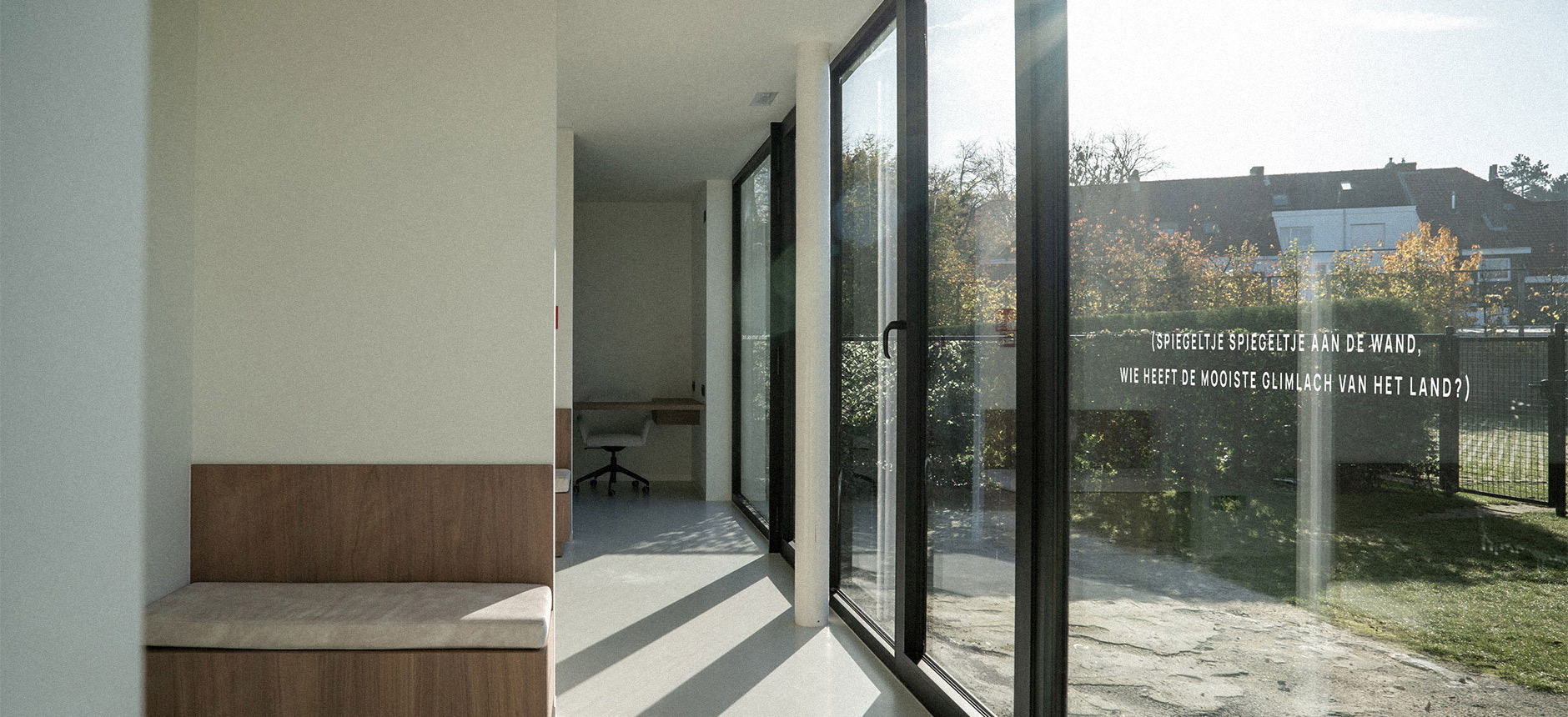
We refined the existing logo and built a complete visual identity around it: clean typography combined with a soothing colour palette, making the practice feel more like a peaceful place than a clinical setting. The interior itself reflects that same philosophy: bright spaces with natural materials and warm, thoughtful details, so that patients of all ages feel at ease rather than in a clinical setting.
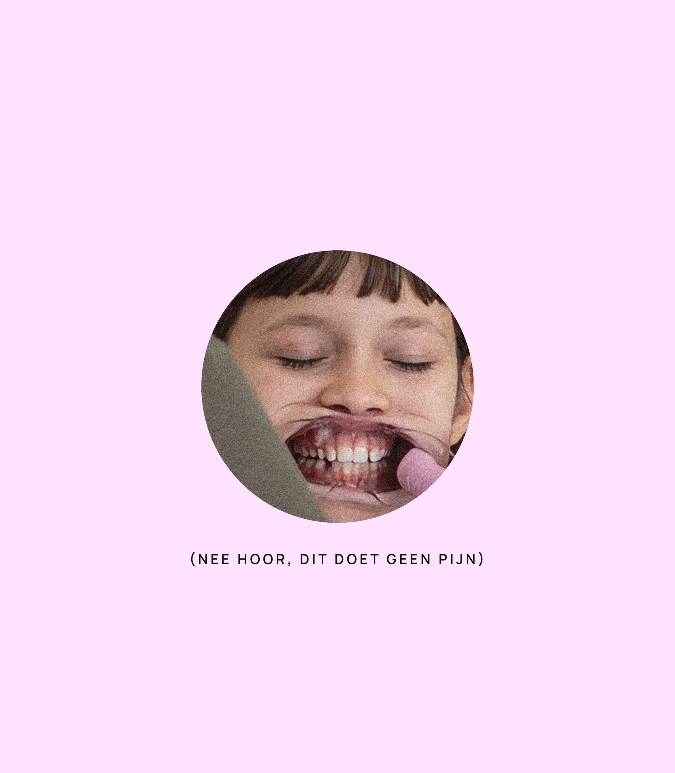
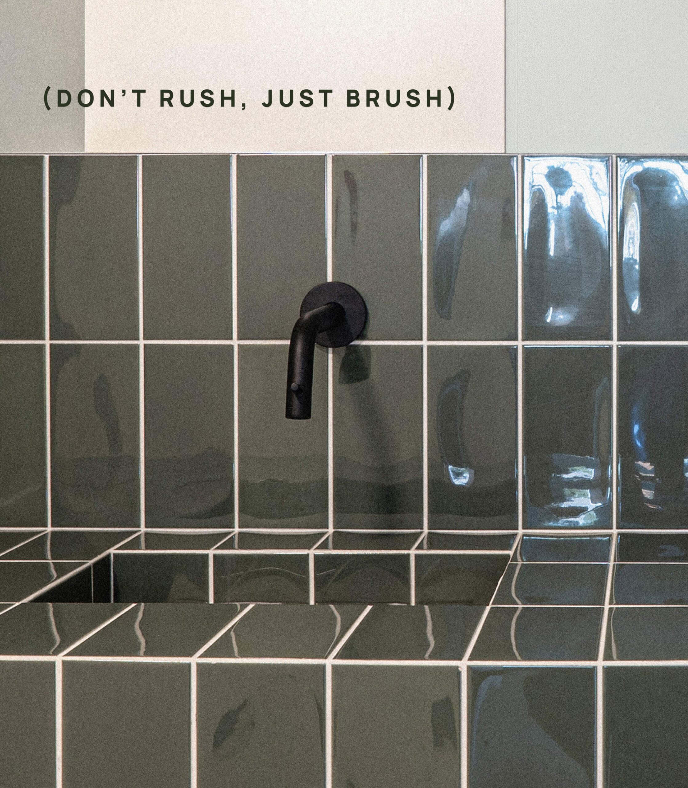
That same approach is carried through in the messaging, with the occasional playful touch to put both children and parents at ease. Short, playful phrases like “braces, no worries” or “we take our time” make a first visit a little less nerve-wracking, without ever losing sight of the practice’s calm, professional core.