PATATAK
services
Brand identity
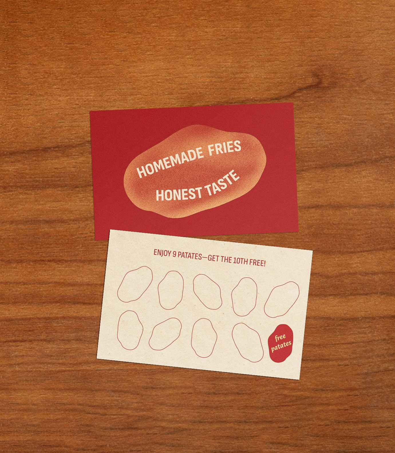
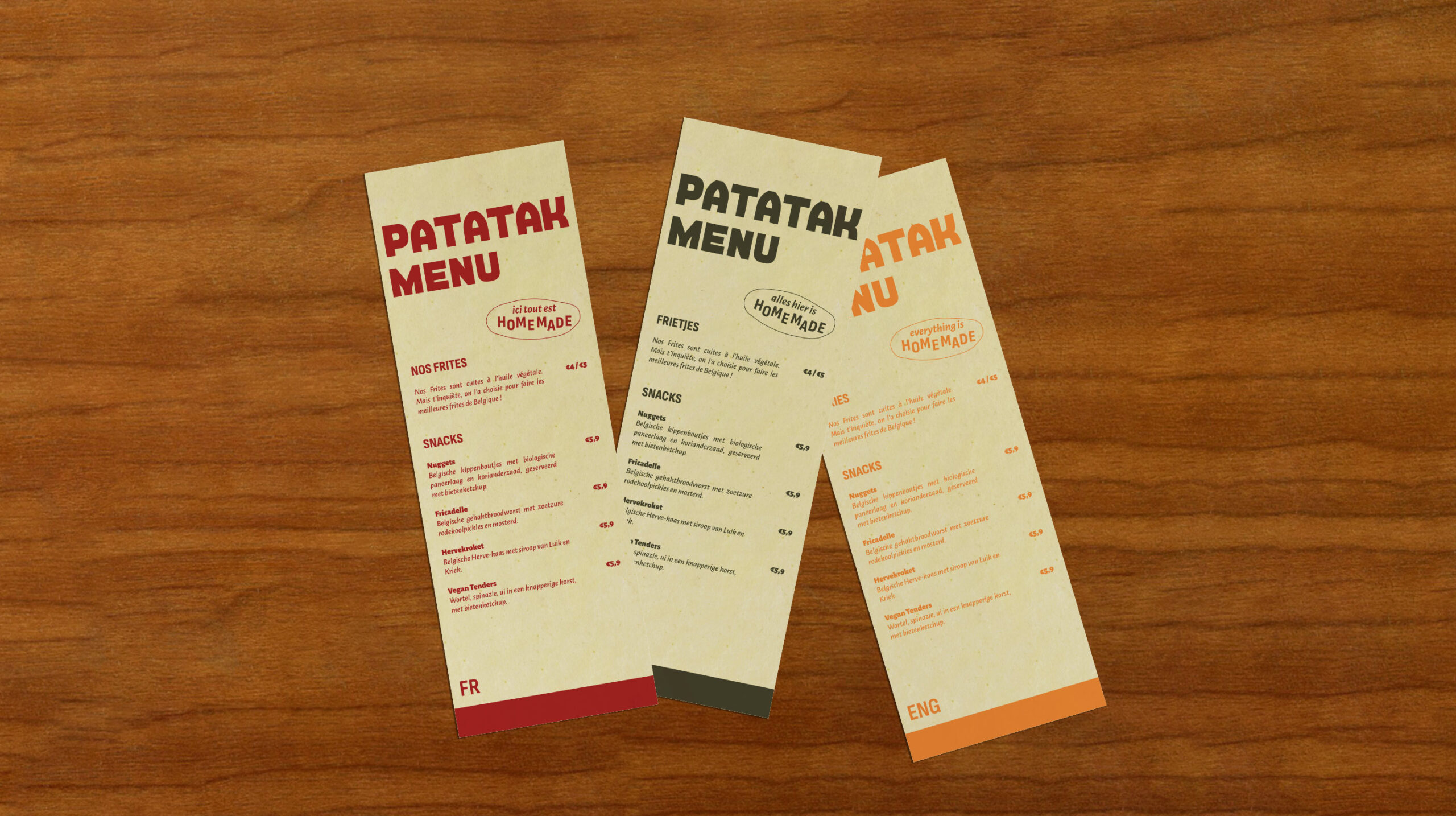
Print collaterals
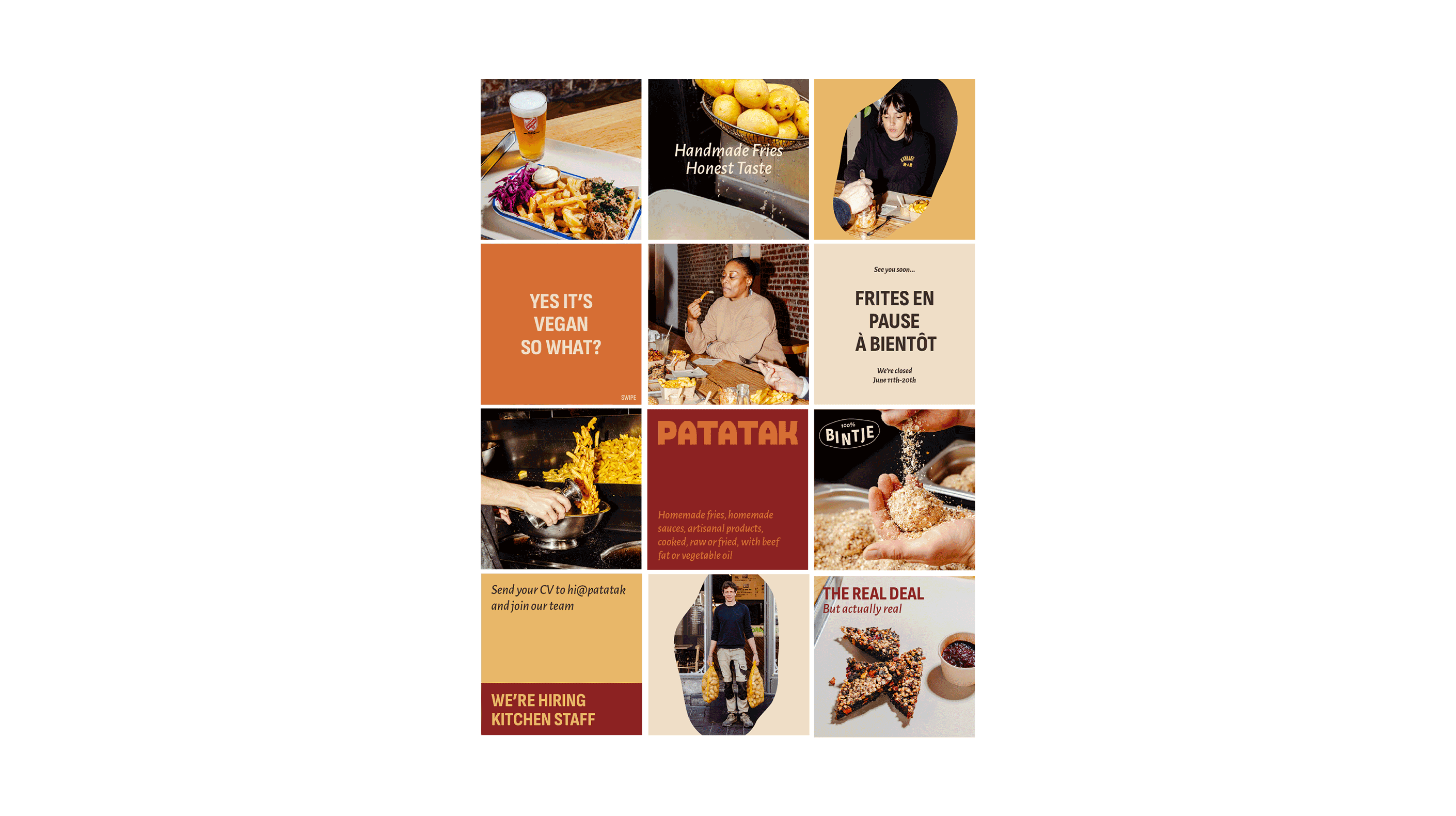
Socials
Web design
credits
Photography by Buro Bonito
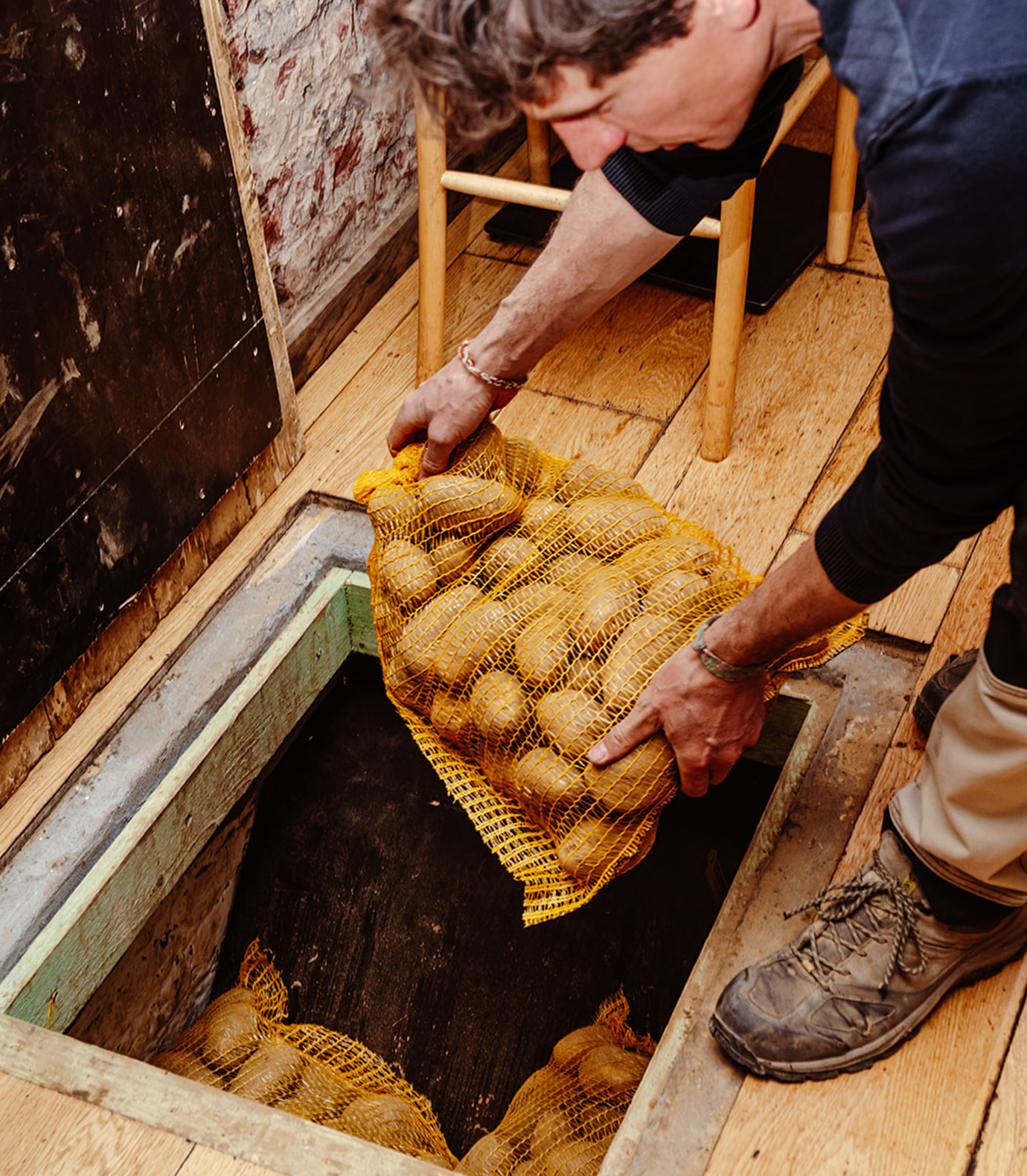
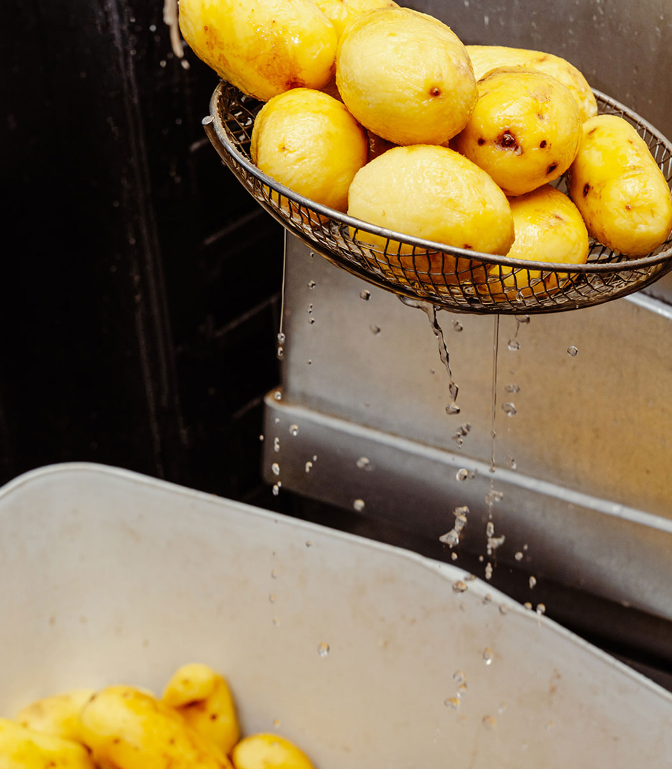
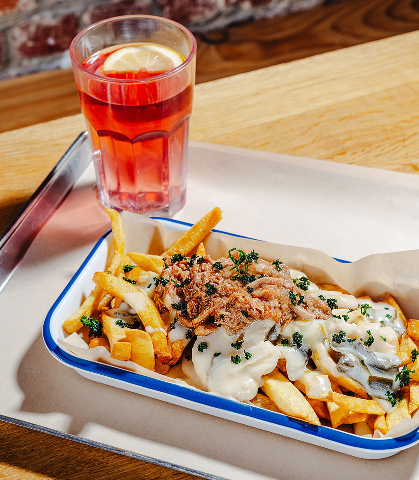
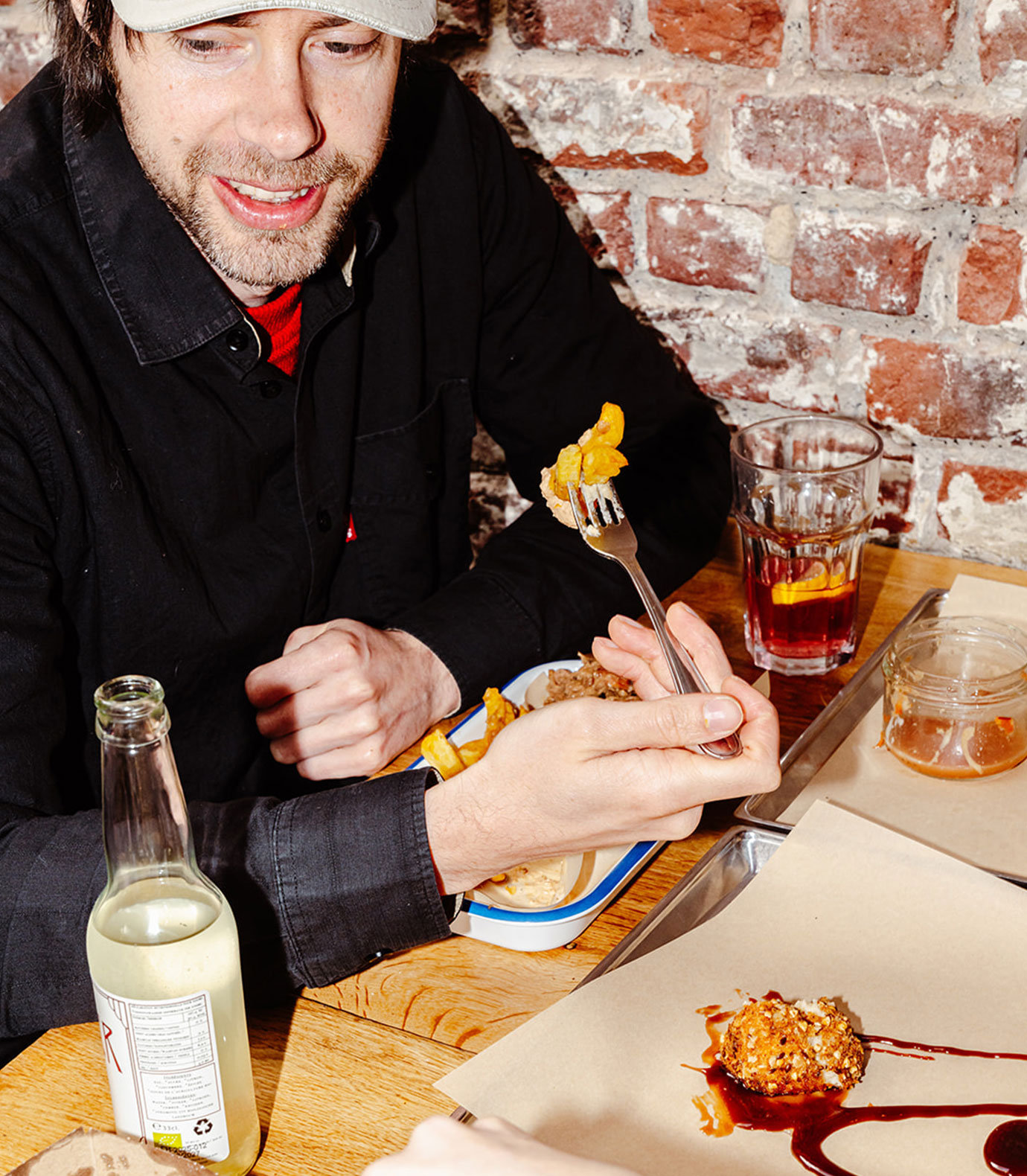
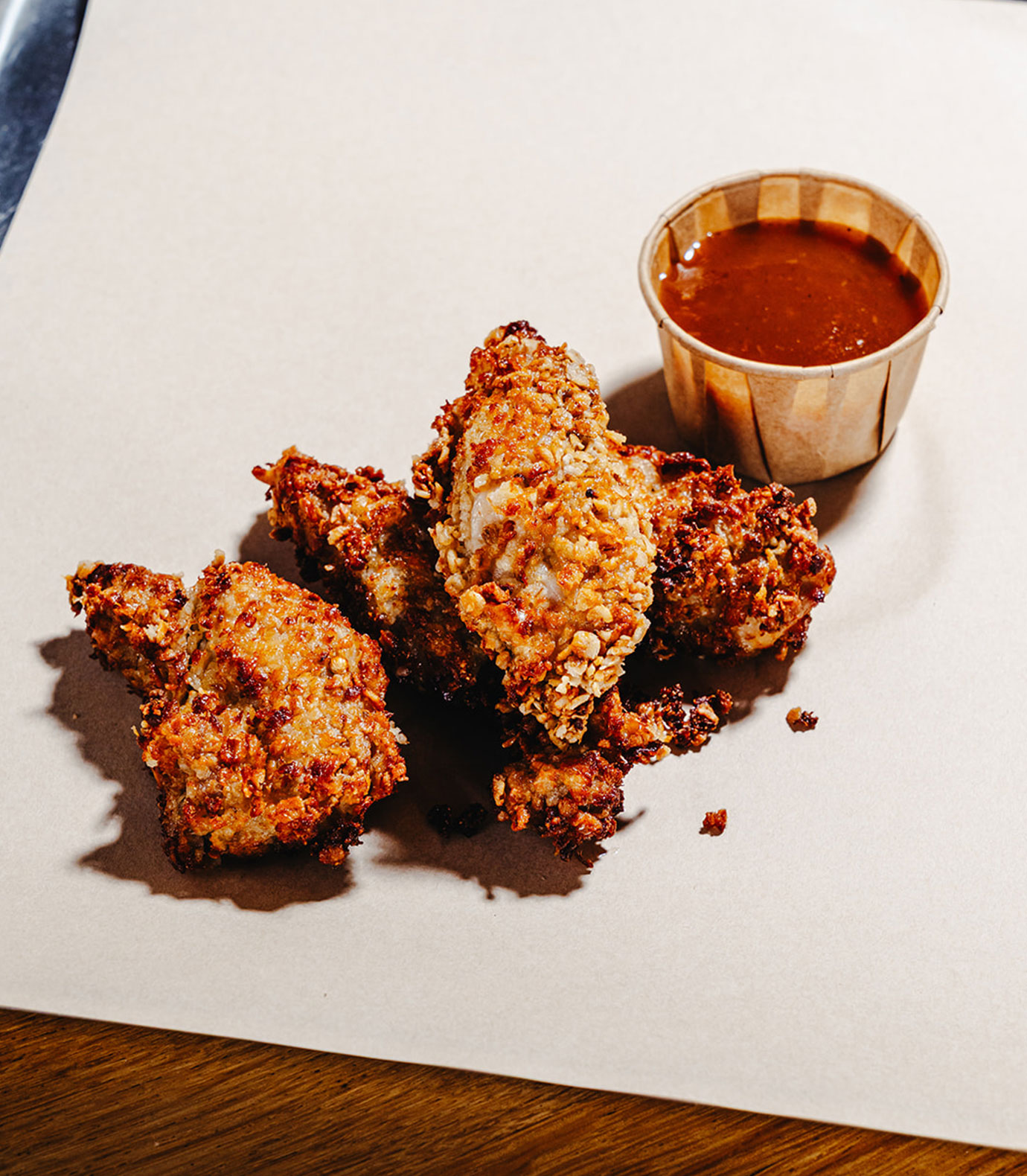
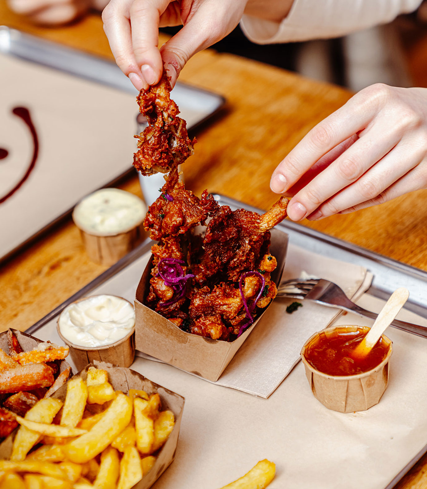
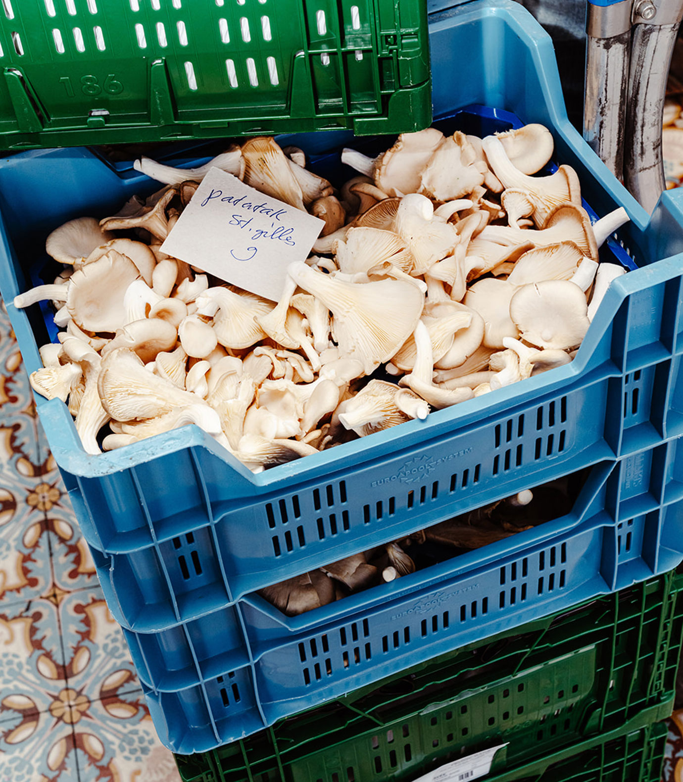
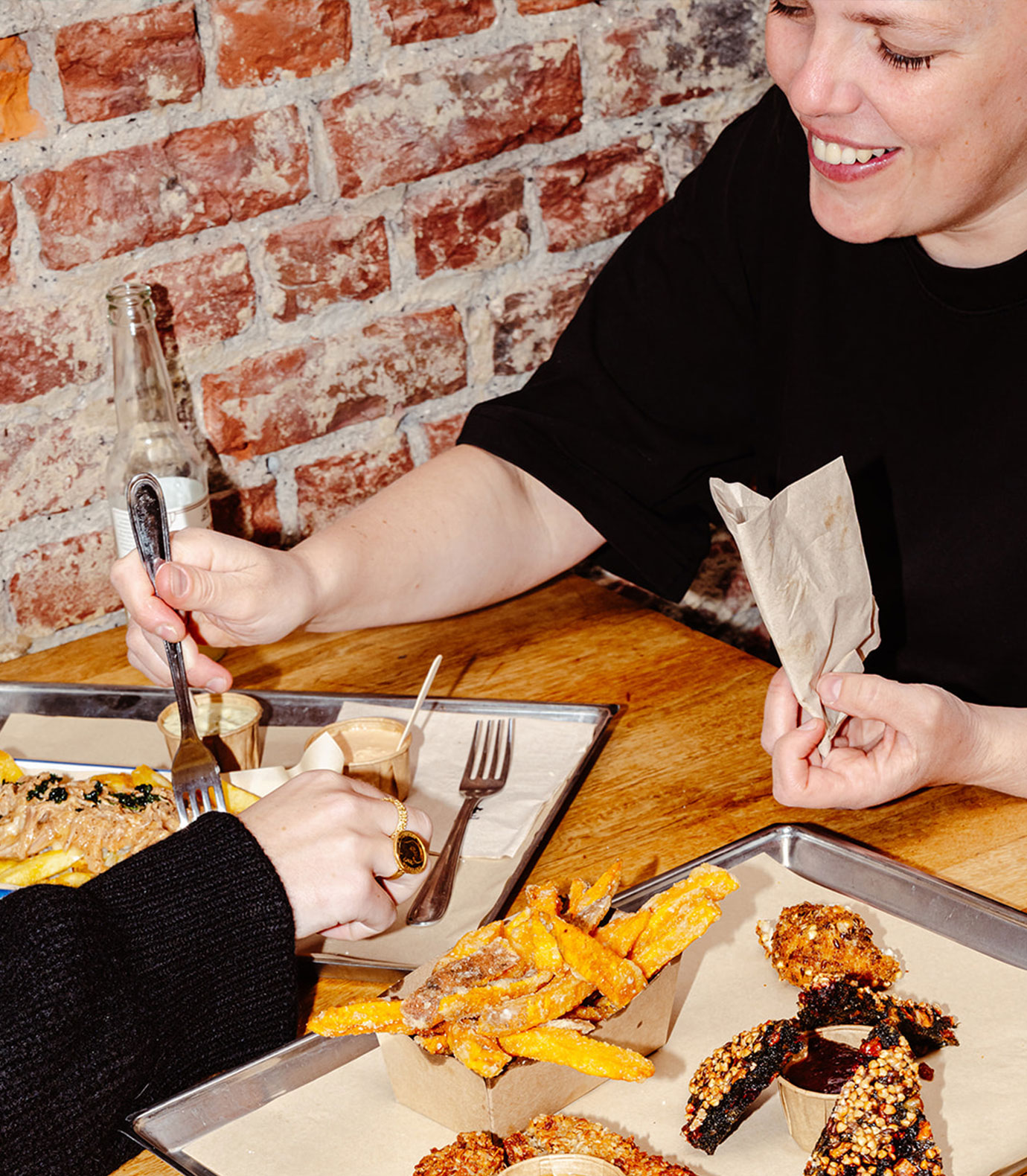
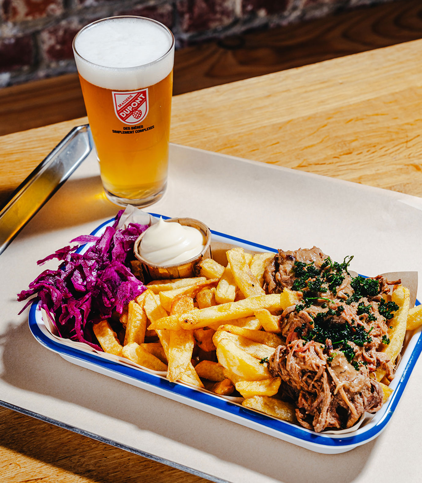
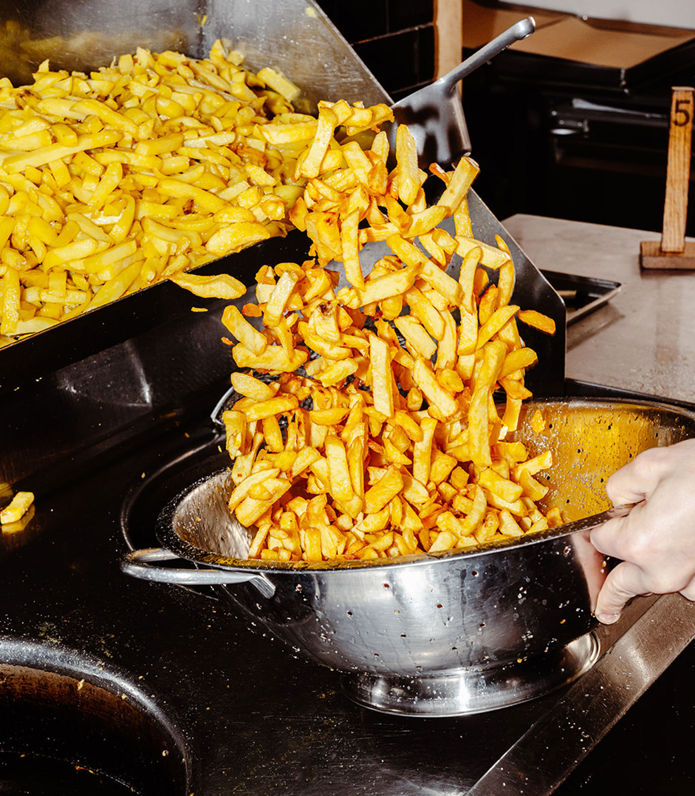
Patatak brings the true flavor of Belgian fries to life, using locally sourced potatoes that are freshly peeled, cut, and cooked to perfection. Their modern Fritkot welcomes every kind of eater with 15 distinctive sauces, crispy chicken, fresh salads, fermented veggies, and fries cooked in either traditional beef fat or vegetable oil. Whether you’re vegan, vegetarian, or a meat lover, Patatak always has something delicious ready for you.
the mission
Patatak wanted to reconnect people with the joy of authentic Belgian fries in a way that feels fresh and inclusive. The goal was to create a brand that speaks to everyone from traditional frietjes-lovers to adventurous foodies while celebrating local ingredients and craftsmanship. The identity needed to be approachable warm and ready to grow with the brand as it evolves.
the results
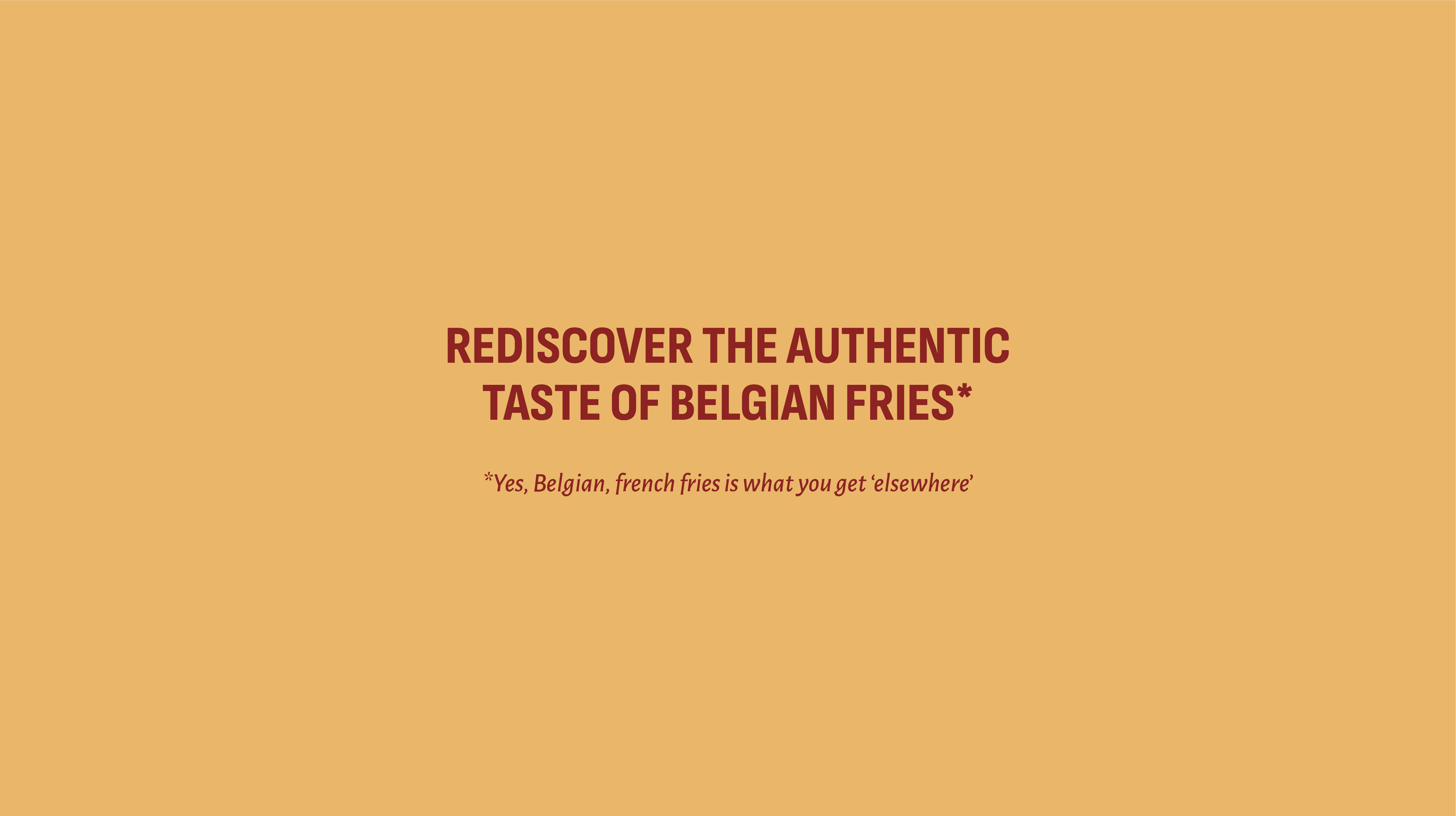
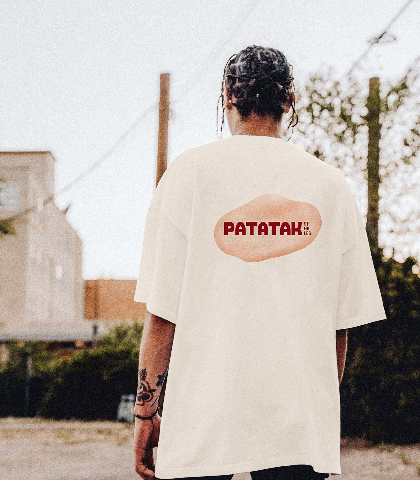
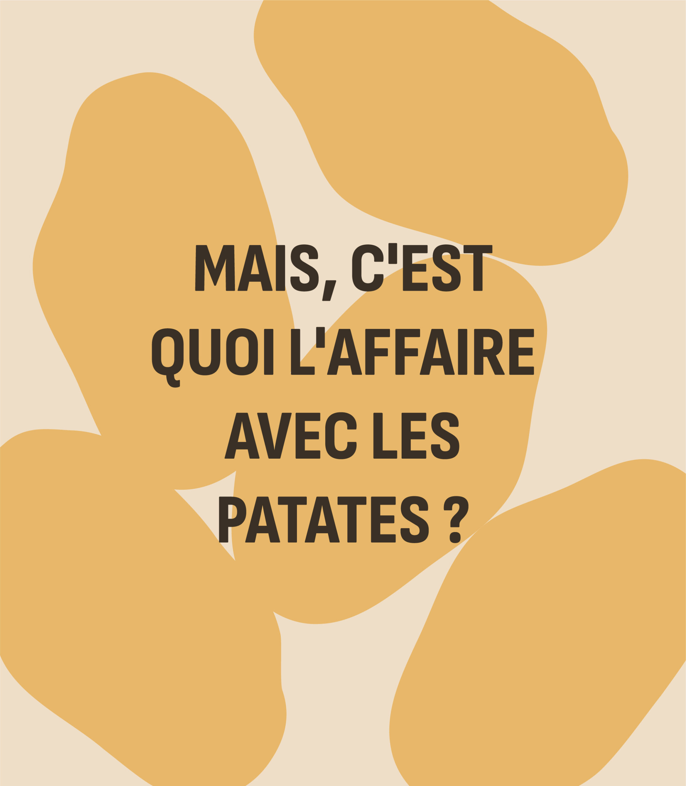
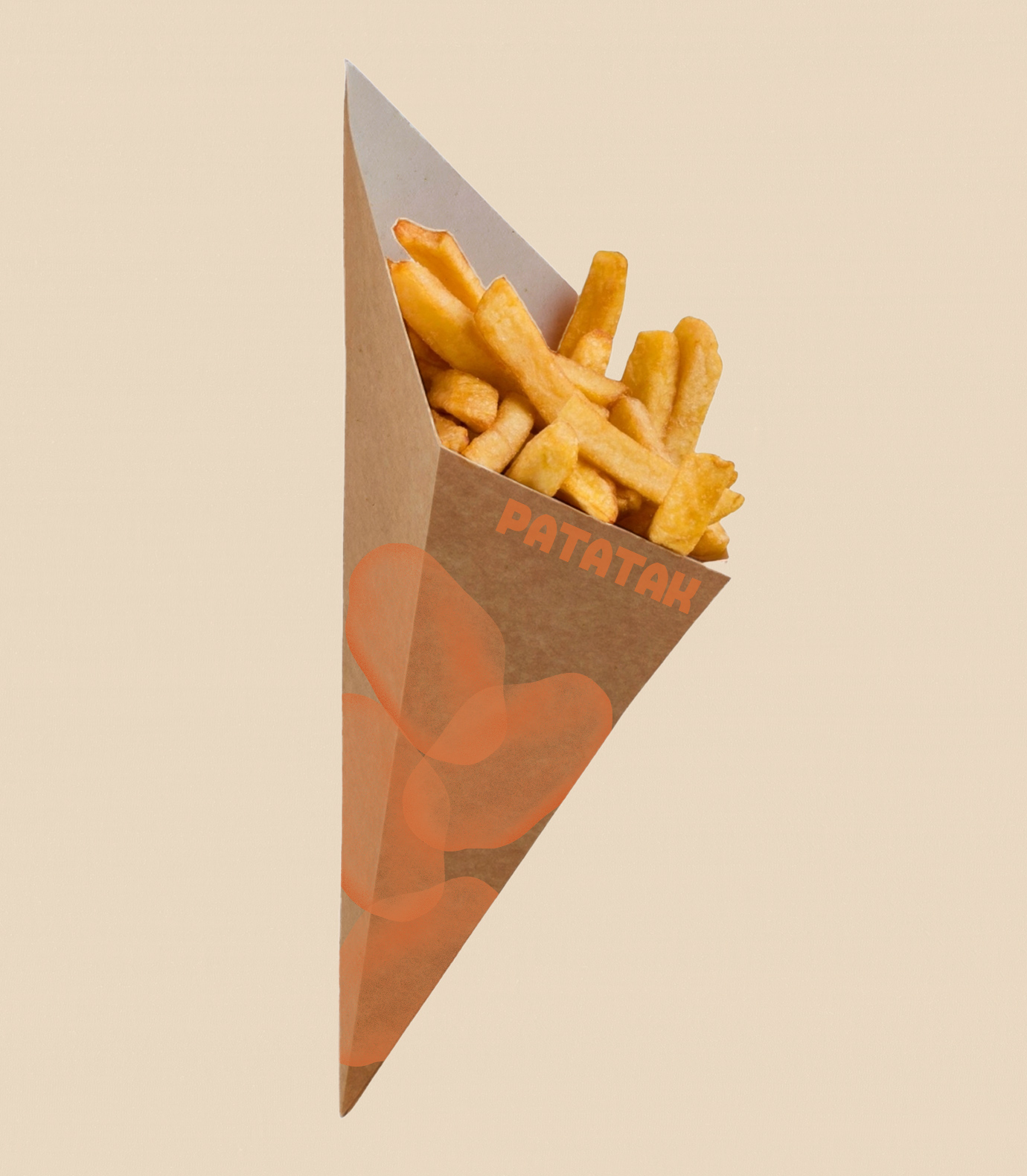
We developed a brand identity that is bold inviting and instantly recognisable. Deep earthy tones playful yet refined typography and the patat as a central graphic element give the brand a strong visual character. The patat is used in multiple styles from a crispy textured version to a clean outline or a vibrant full colour shape offering flexibility while keeping a consistent anchor. This design language adapts effortlessly from menus to packaging signage and digital platforms while short punchy phrases keep the storytelling alive. It is a flexible and cohesive identity that captures the heart of Patatak a place for everyone to enjoy great food rooted in Belgian tradition but ready for the future.
