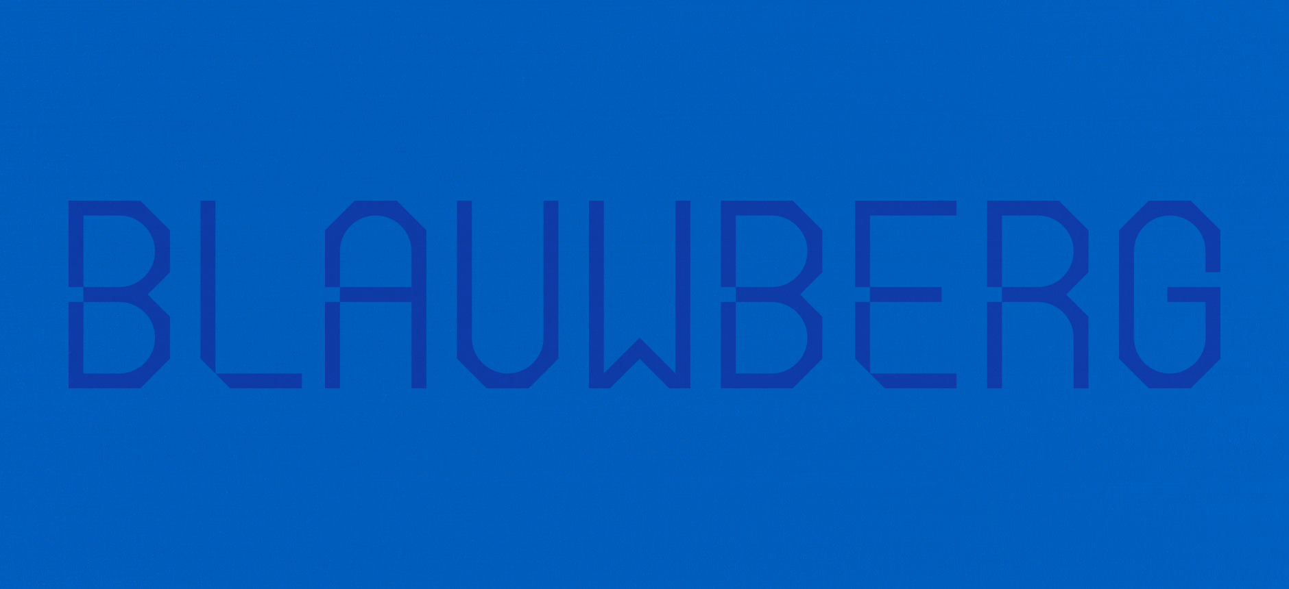
Blauwberg
services
Brand identity
Custom font
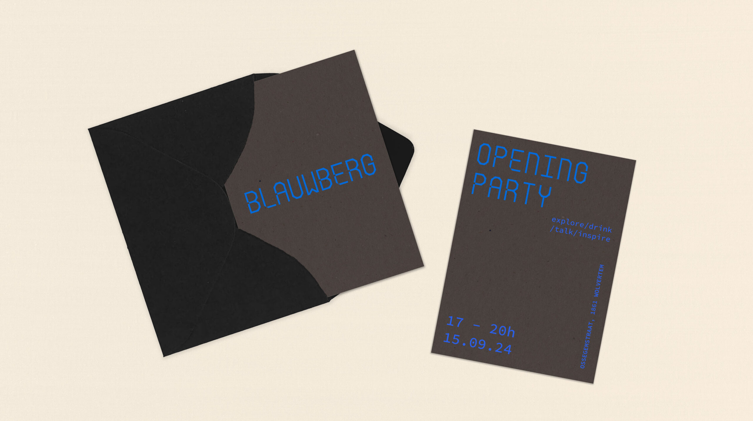
Print collaterals
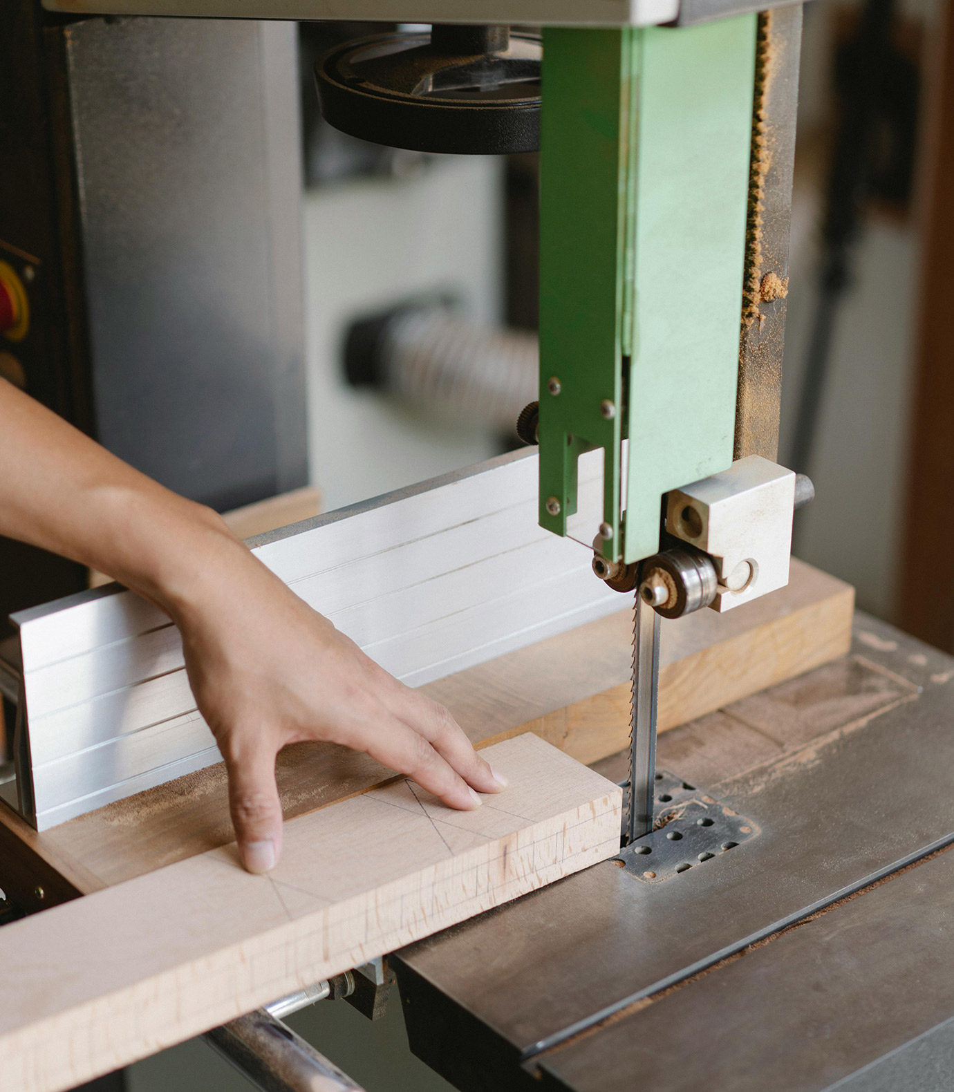
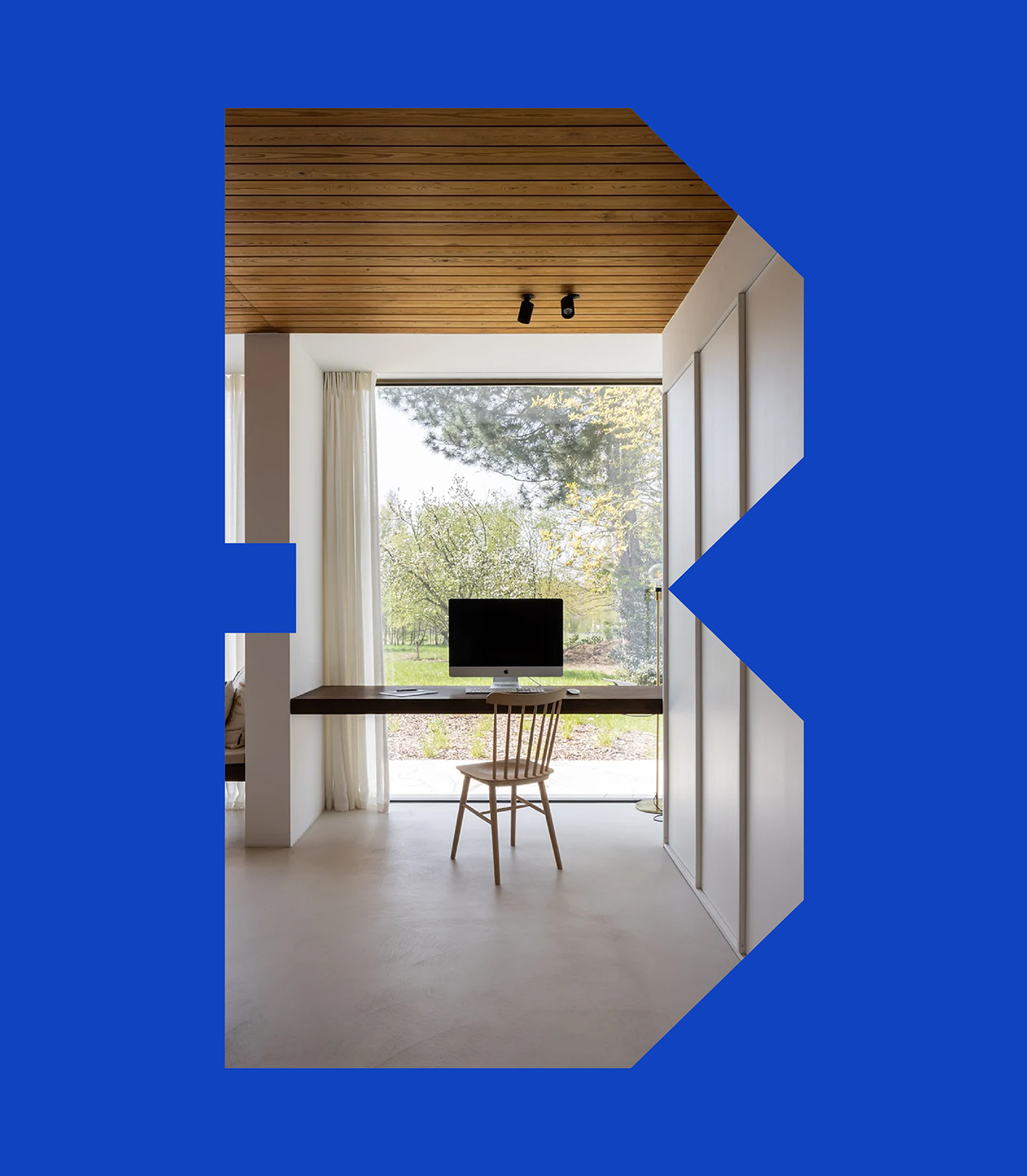
Blauwberg approached us with a clear vision. They wanted a bold identity that reflects the high-end custom carpentry they are known for. As a team driven by precision, creativity and craftsmanship, they needed a visual language that matched the care and character they put into every project. With a modern and hands-on approach, they turn raw materials into timeless spaces. Always custom. Always thoughtful.
the mission
Our goal with Blauwberg was to create a brand that reflects refinement, structure and personality. We aimed for a visual identity that feels solid and smart, appealing to people who value detail, aesthetics and a company that sees the whole picture.
the results
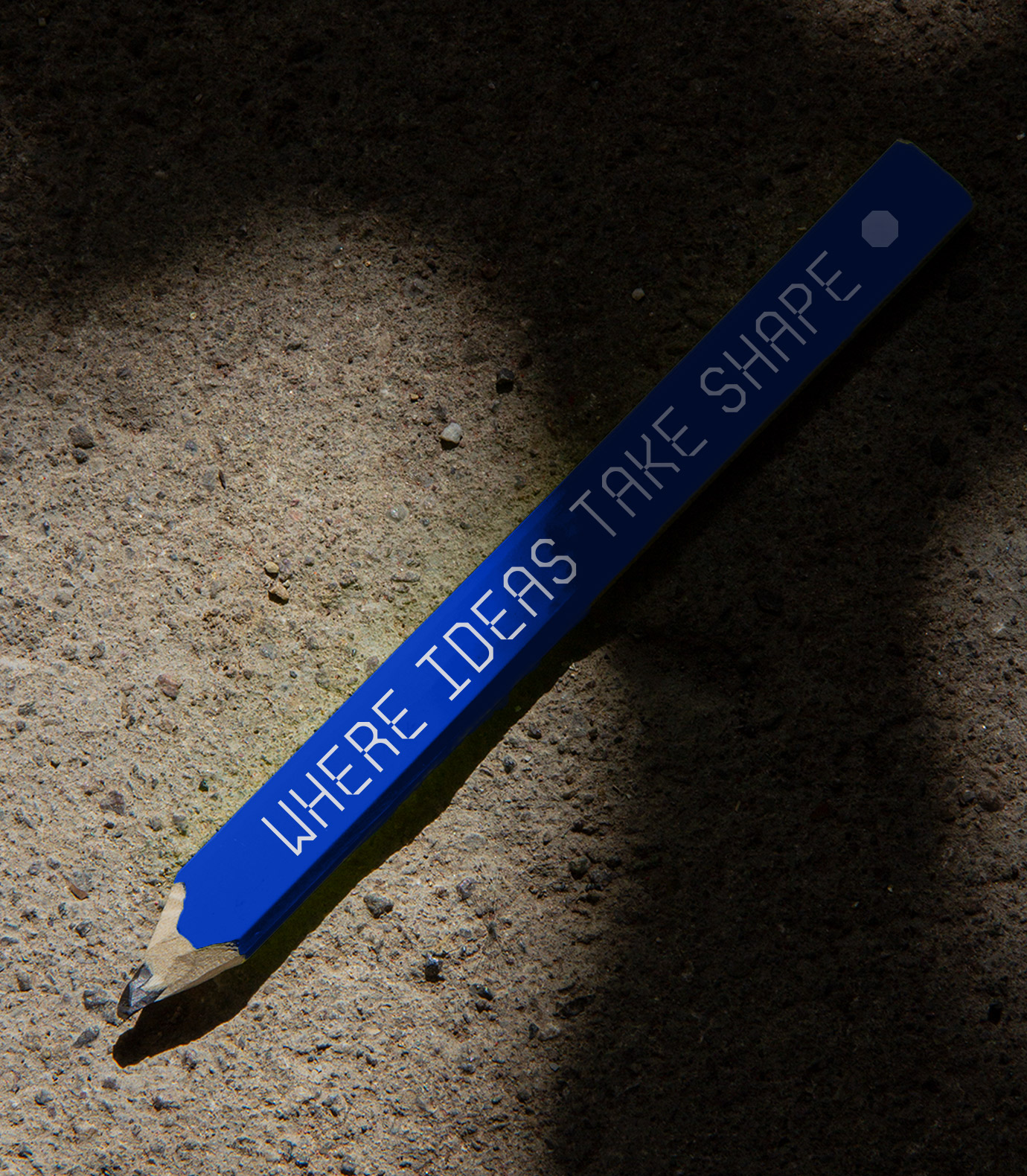
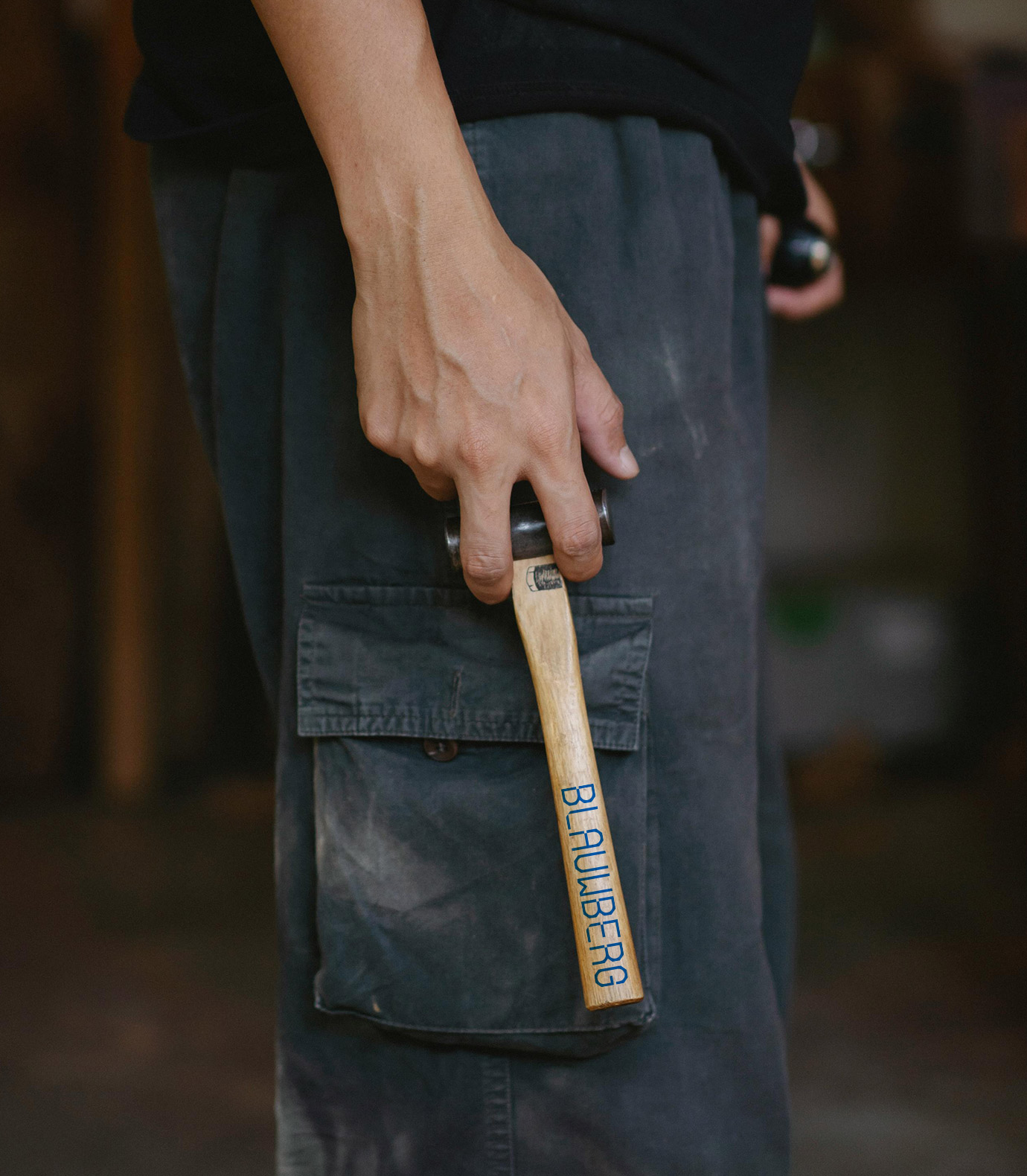
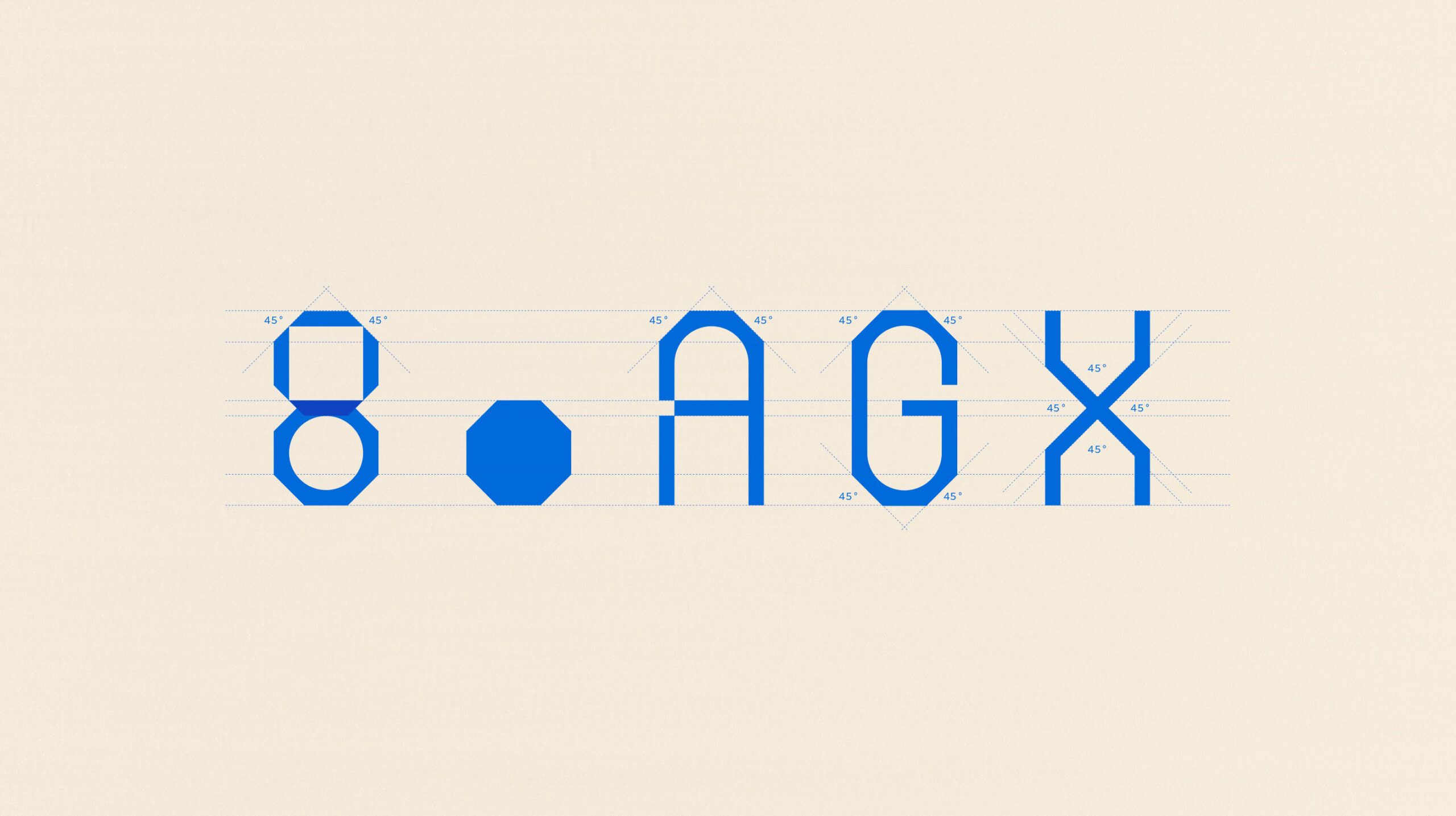
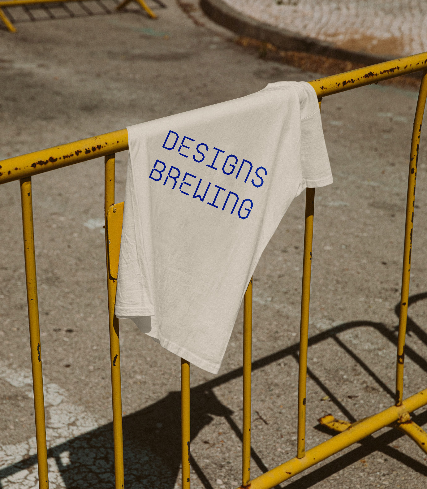
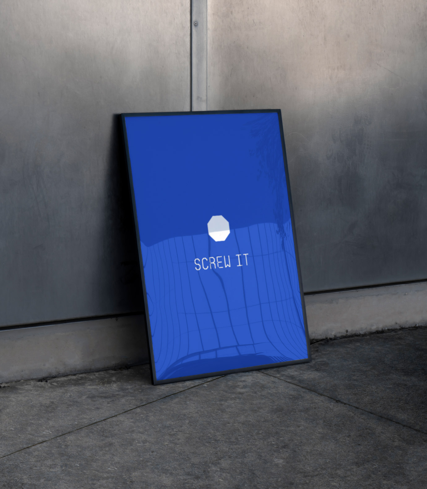
From logo to type. We created a fully custom font exclusively for Blauwberg, used across titles, embossings and design accents. Inspired by the shape of an octagon, a bolt and a full circle, we designed an entire alphabet with a strong architectural rhythm. We named the font Contraire. A little unconventional, slightly quirky and full of character — just like Blauwberg.
The tone of voice follows that same spirit. Clean but playful, with room for bold statements and witty lines. Paired with striking layouts and confident typography, the branding brings clarity and attitude in equal measure.
And of course, the colour had to be blue. Not just because of the name, but because it conveys calm strength and a strong sense of identity. The result is a custom-made identity for a custom-made company.