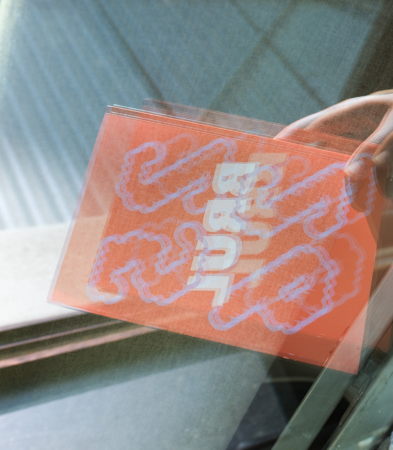
BRUL 2025
services
Visual identity
Print collaterals
Socials
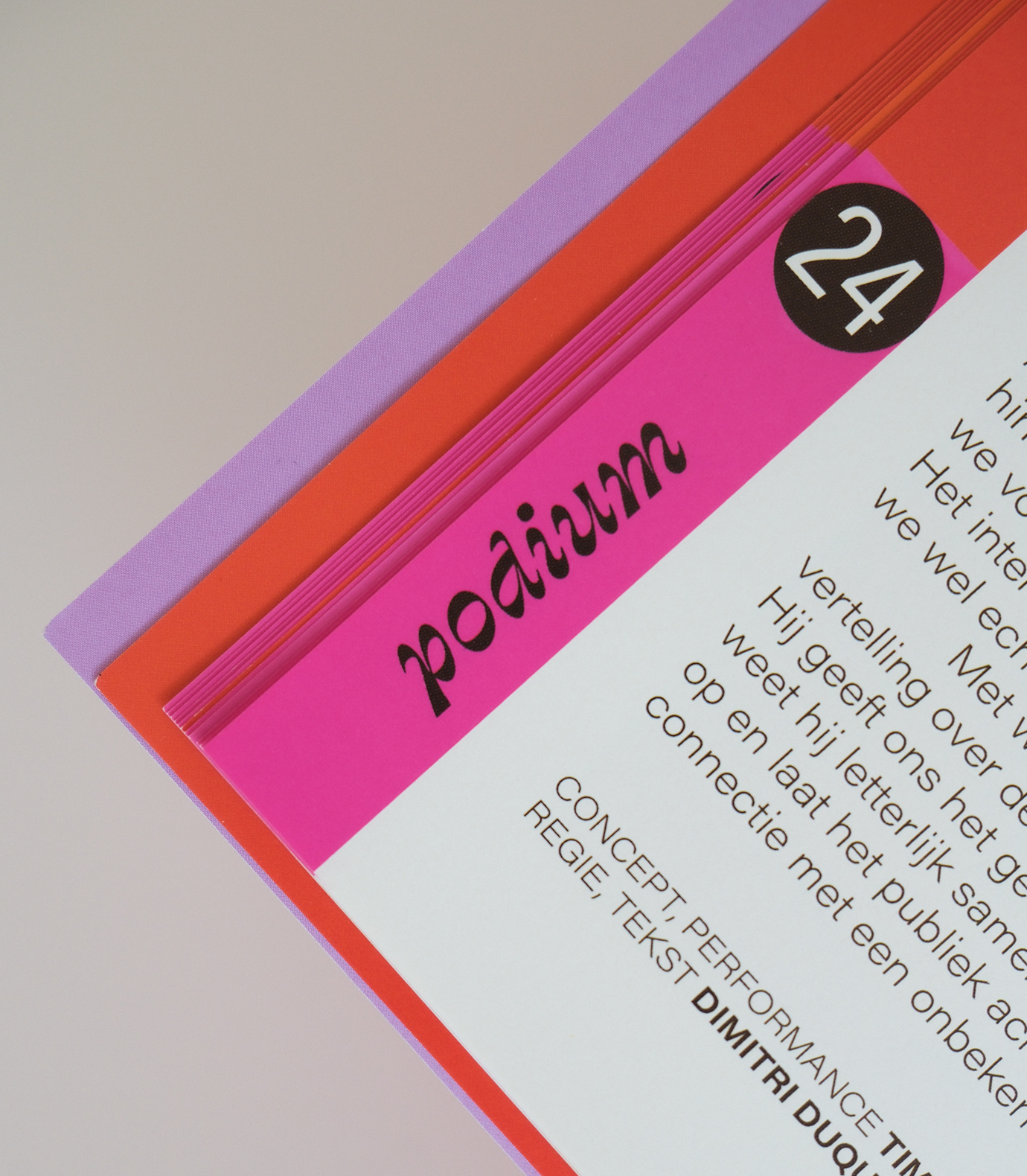
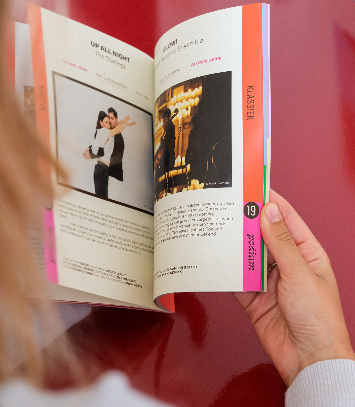
For the 2025 edition of BRUL, we completely reimagined the brochure. Flashy colours, bold type, and a playful design language brought new life to the way BRUL presents its programme. The result is a publication that grabs attention and radiates the same joy and energy as the organisation behind it.
the mission
BRUL (Bruisend Leeuw) organises all things leisure in Sint-Pieters-Leeuw. From theatre and concerts to festivals and kids’ camps. This year, they were looking for a new and exciting way to showcase their offer. Something bright, contemporary and accessible to a wide audience. Something that reflects their enthusiasm and curiosity.
the results
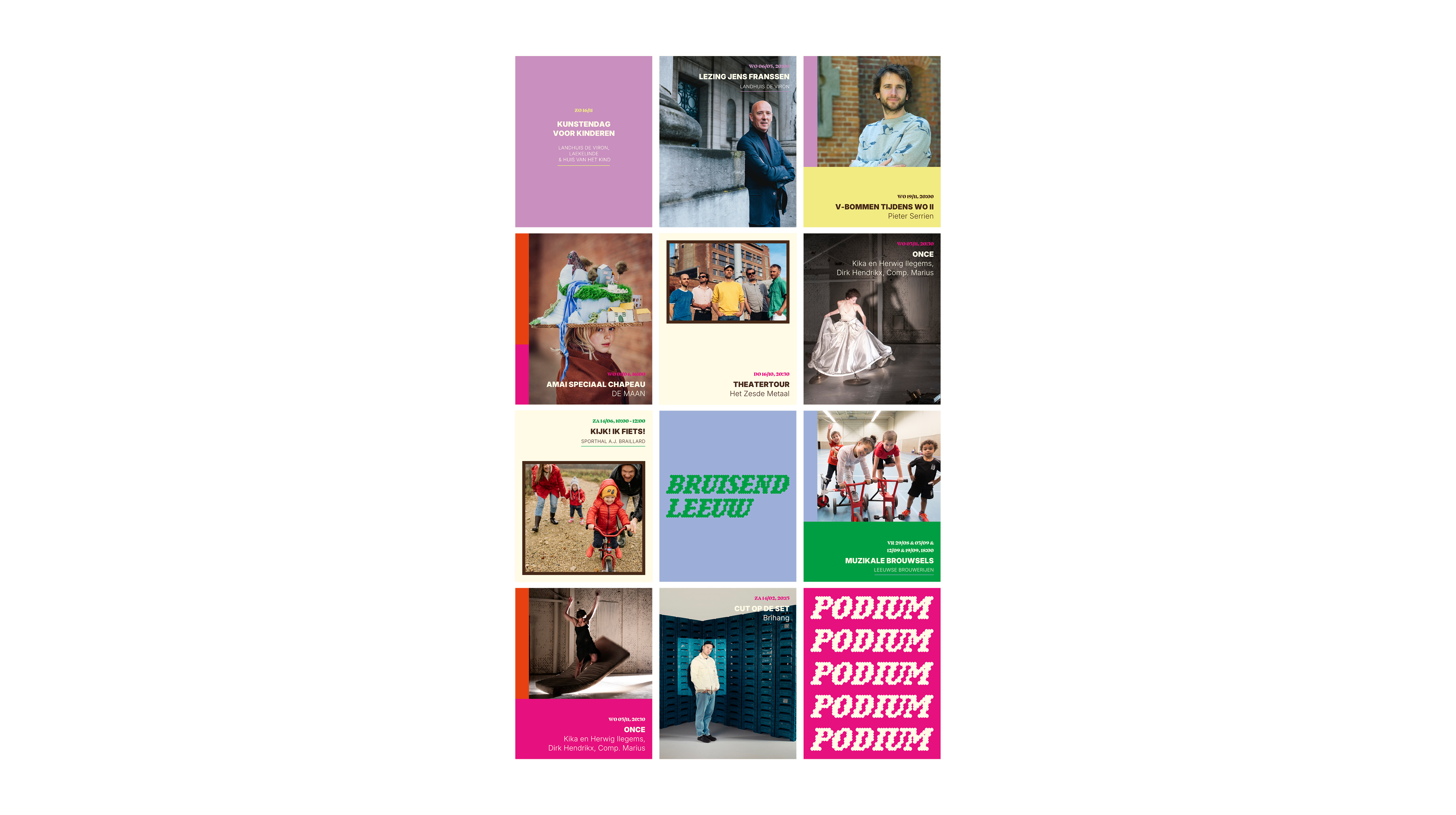
A visual language built on contrast. We used a custom display typeface that’s playful and oversized, paired with simple, legible body fonts to anchor the layout. Strong colour blocks guide the reader and make each event feel like its own moment. The style shifts, but the system holds.