Apotheek
De Stadspoort
services
Brand Identity
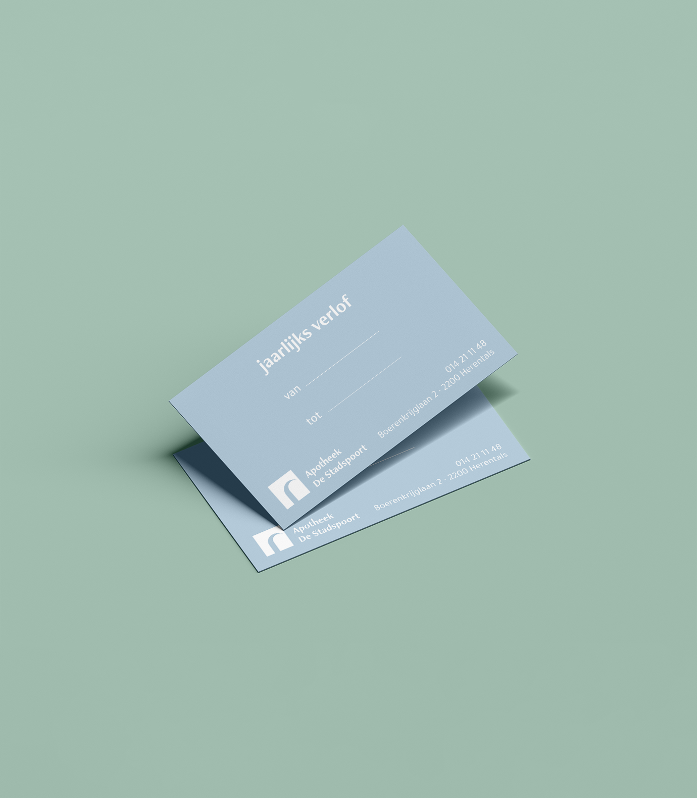
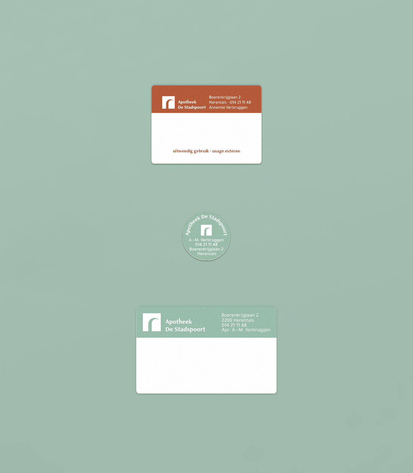
Print collaterals
credits
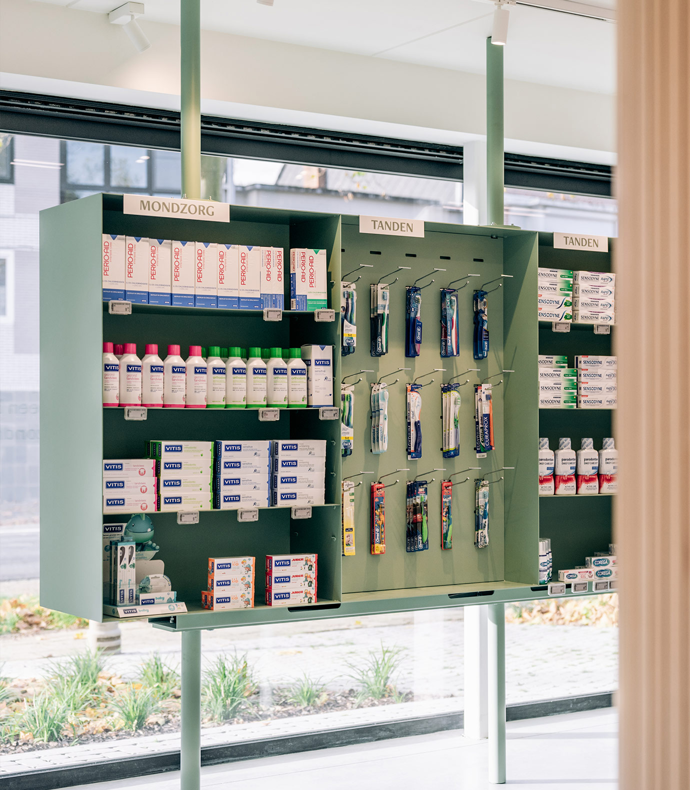
Interior Studio Haver
Photography by Hannelore Veelaert
Apotheek De Stadspoort is known for its personal assistance and their network of healthcare professionals. They strive for the ultimate solution in pharmacy, natural products, and providing the best options of their clientele.
the mission
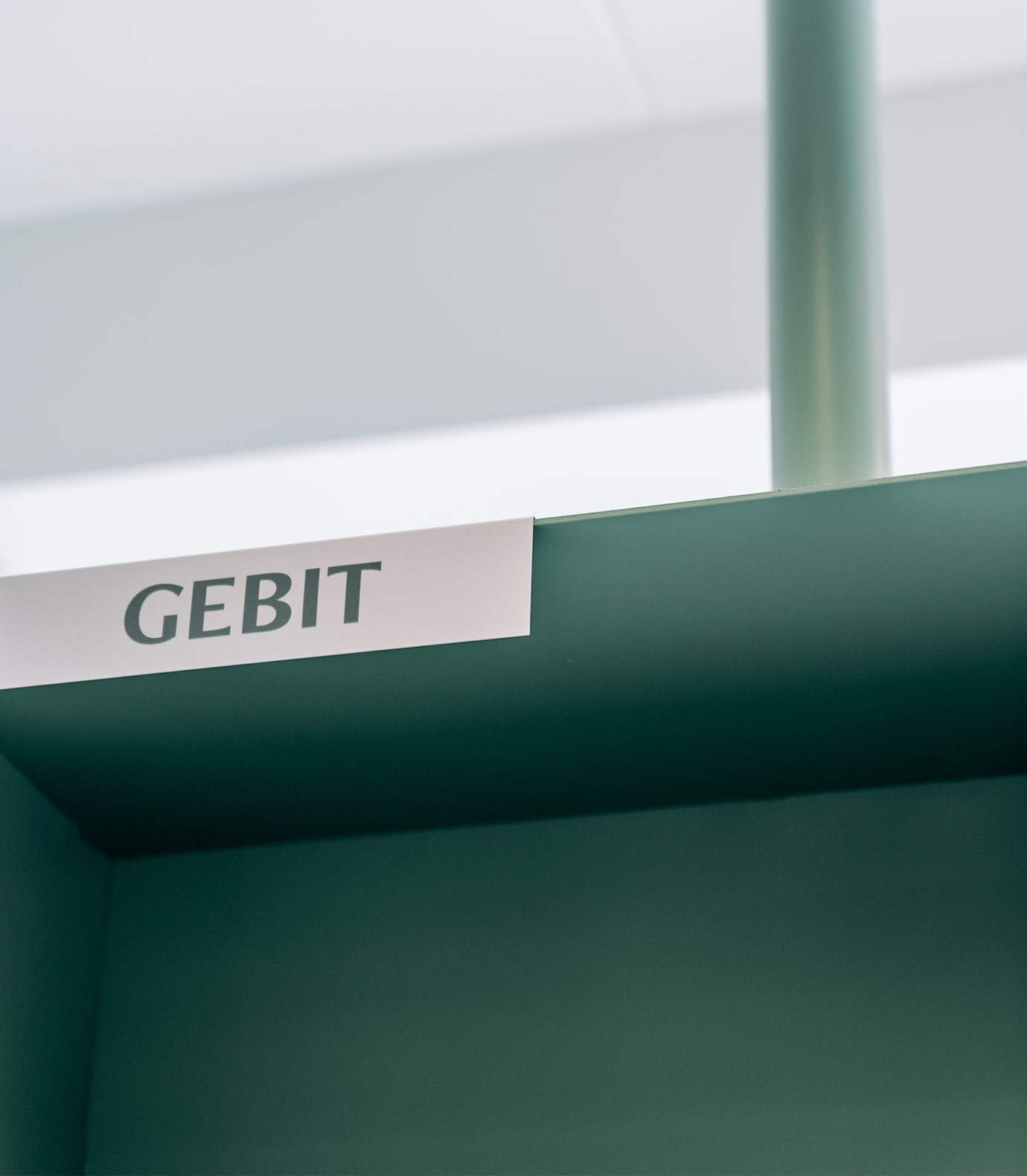
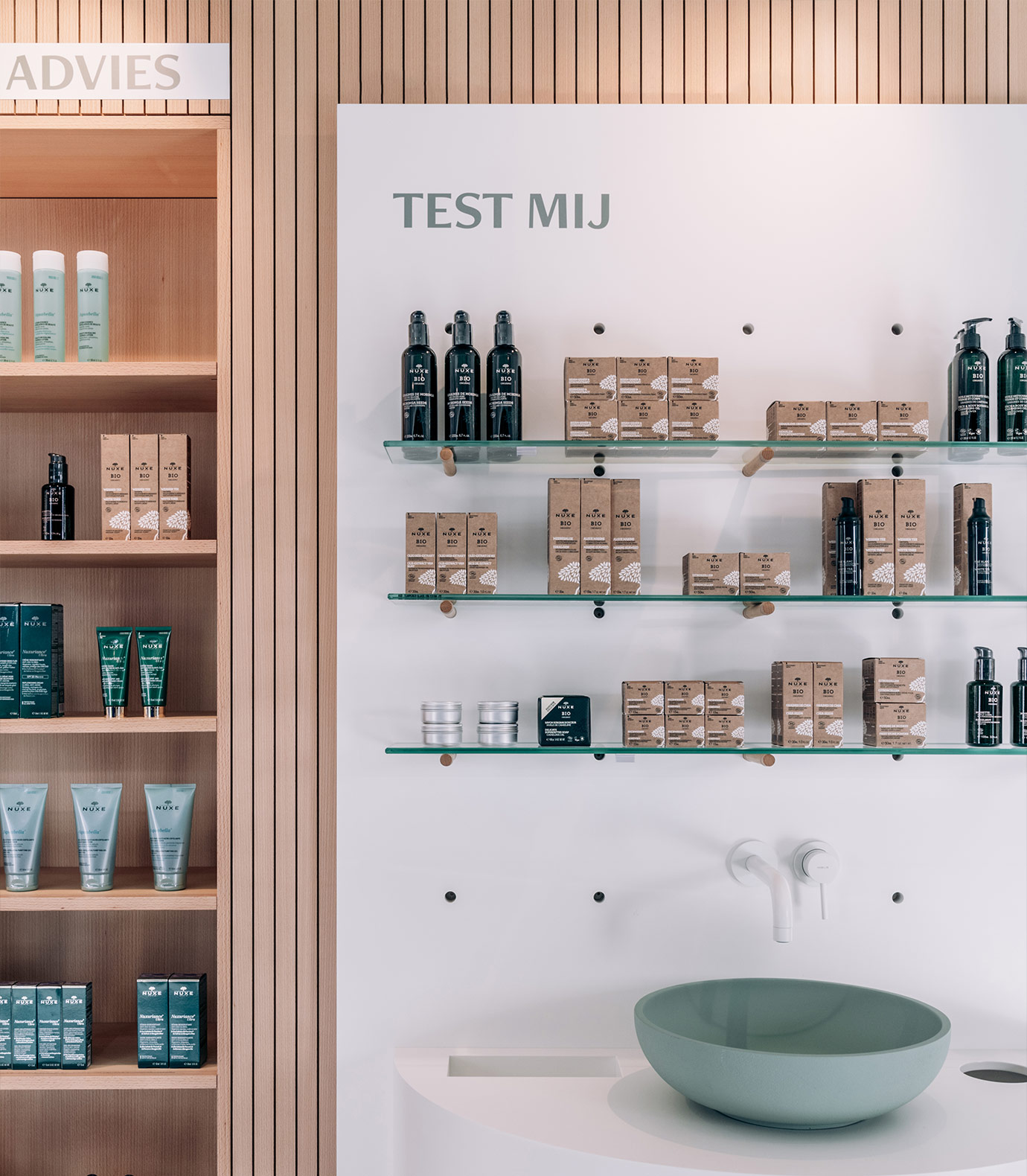
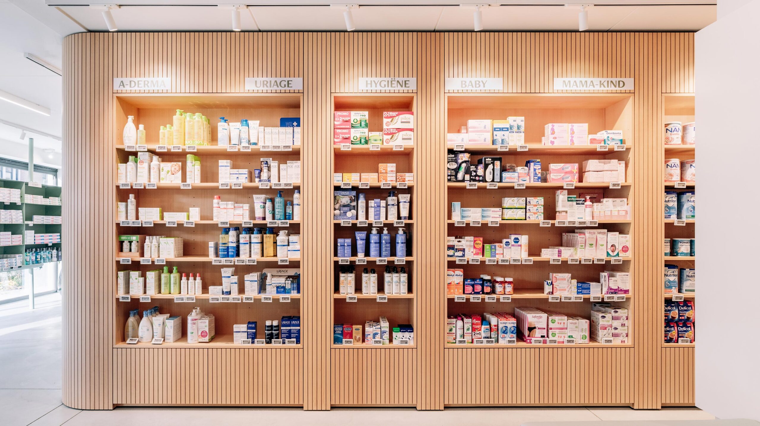
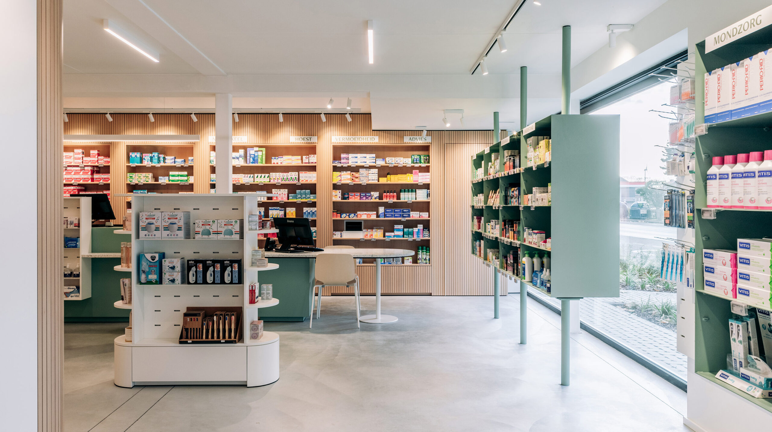
The visual identity of a pharmacy should mainly bring quiet and confidence to its clients. Together with Studio Haver we were asked to create a fresh look & feel that makes people feel at ease.
the results
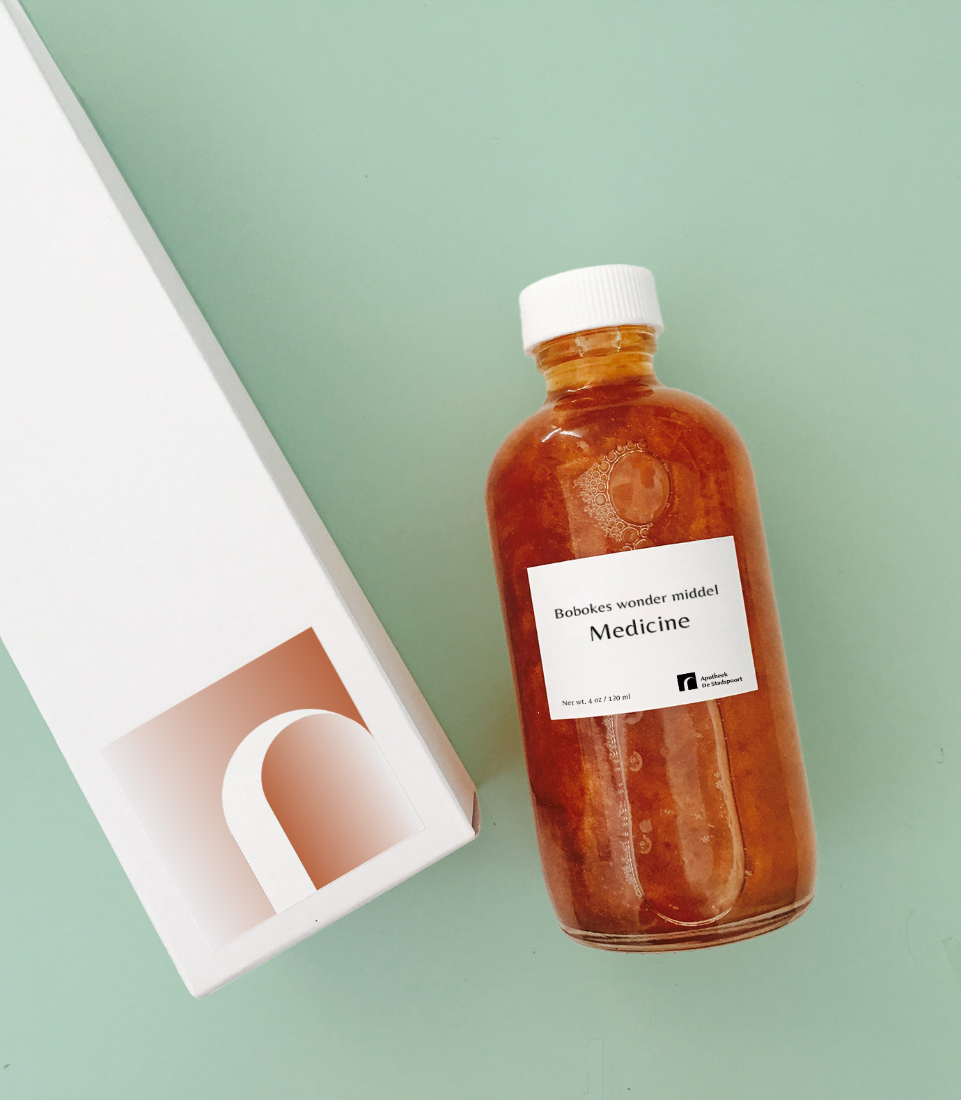
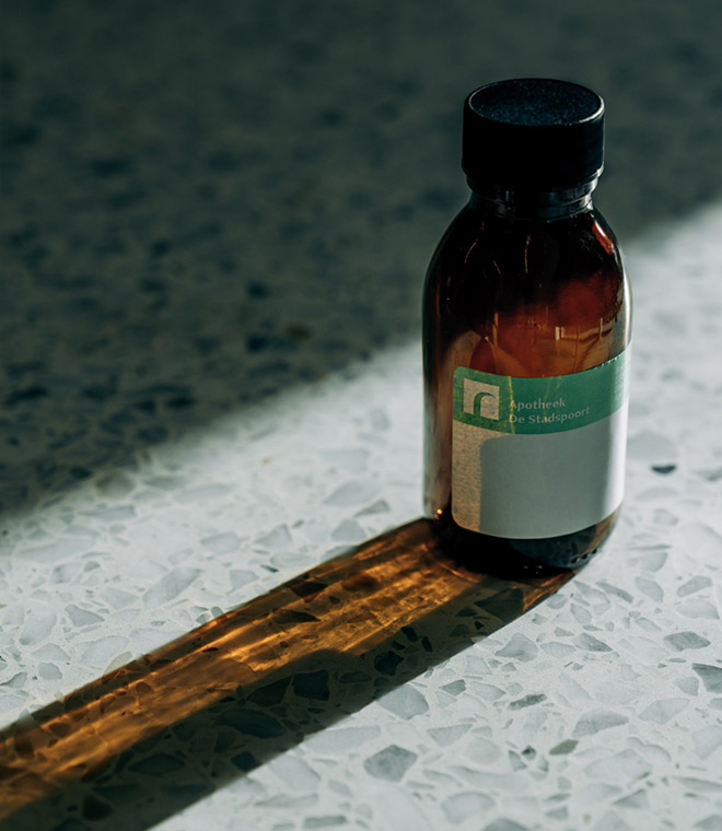
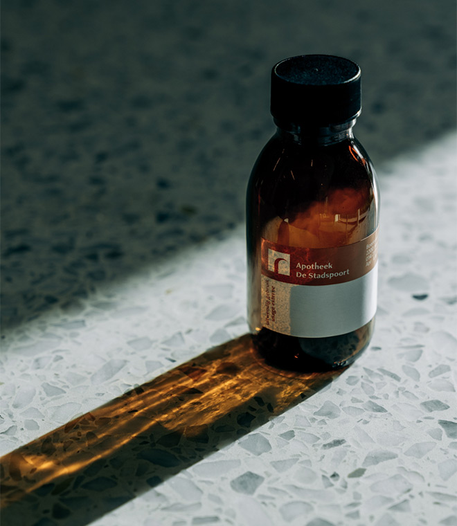
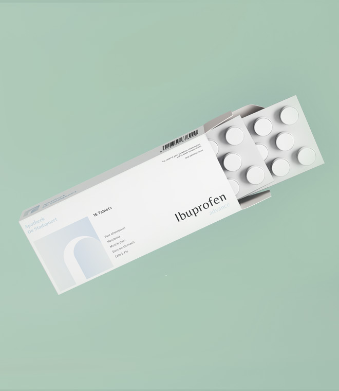
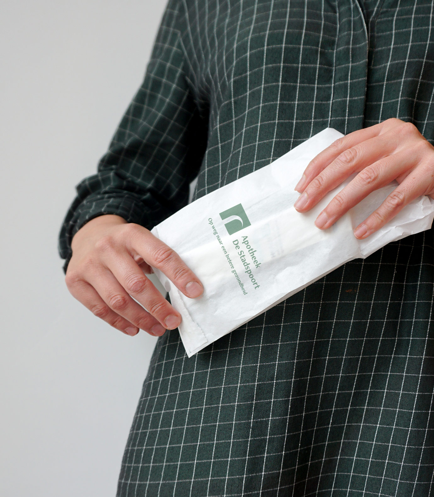
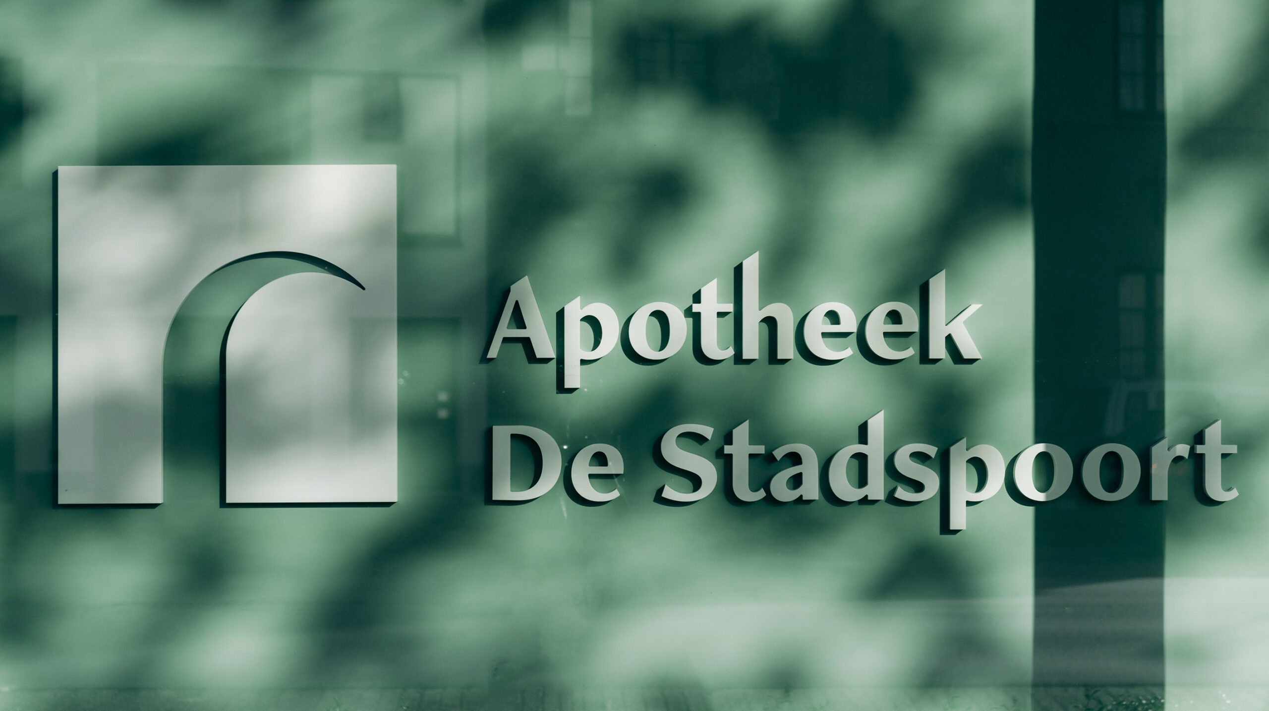
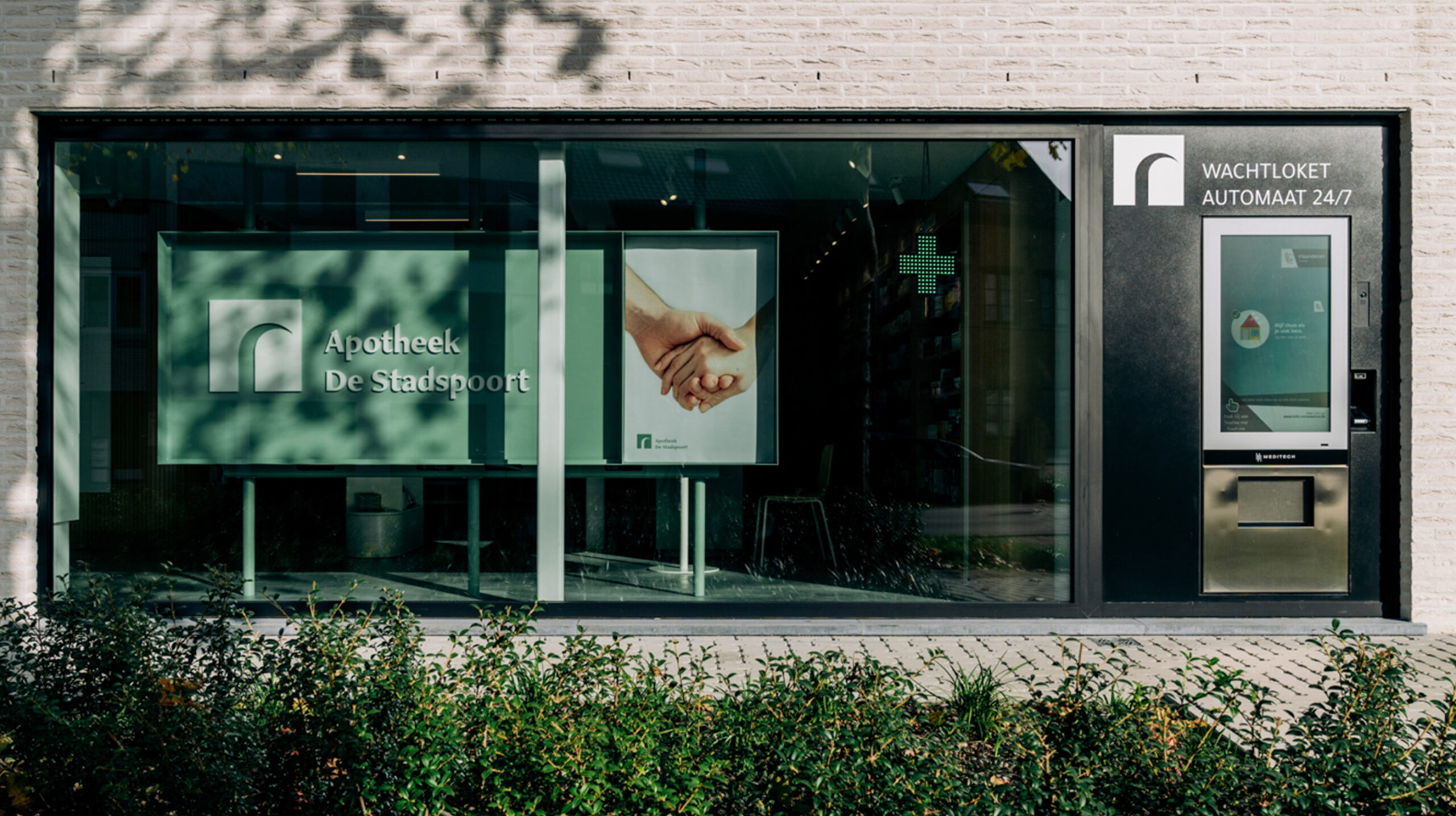
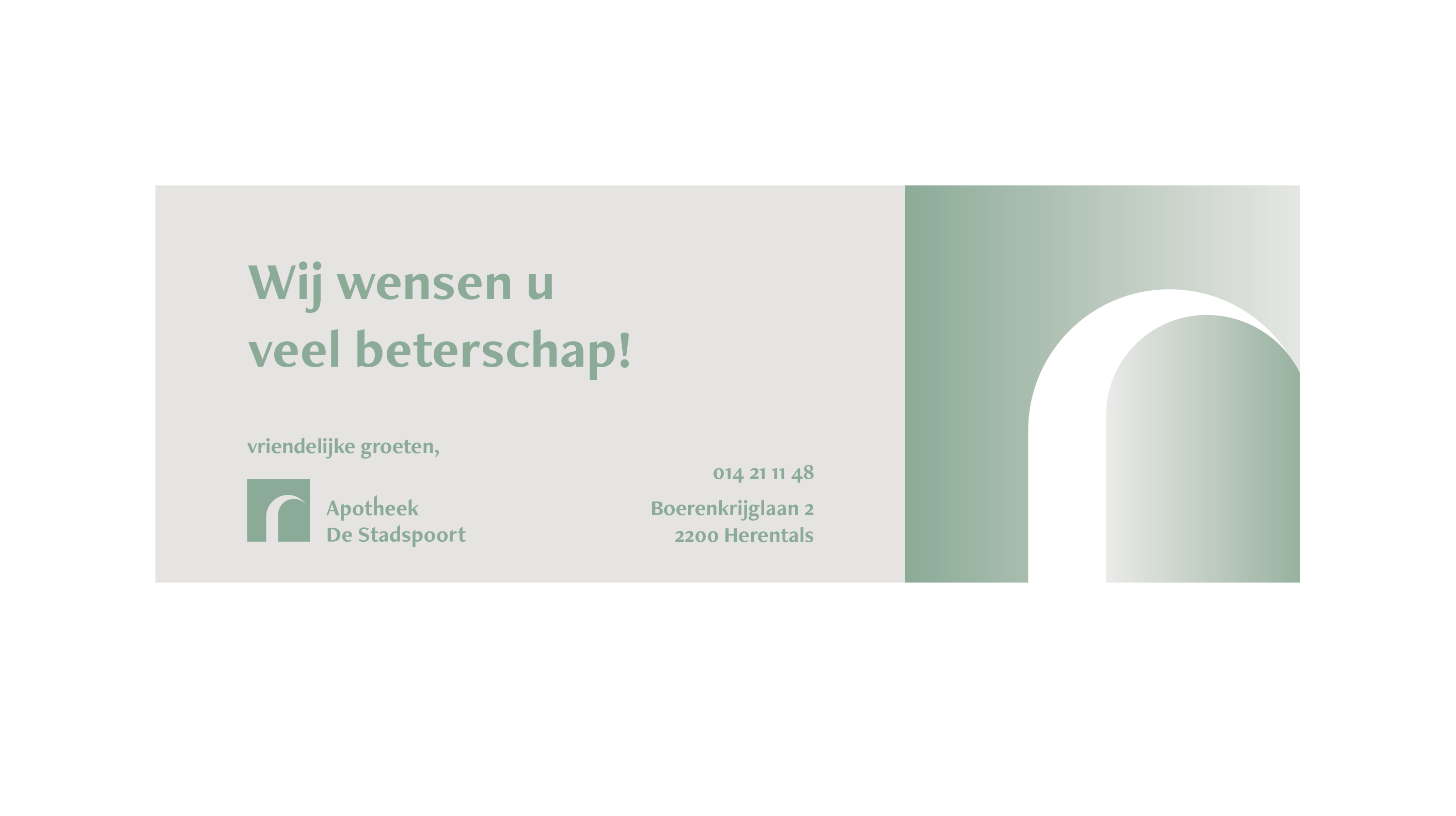
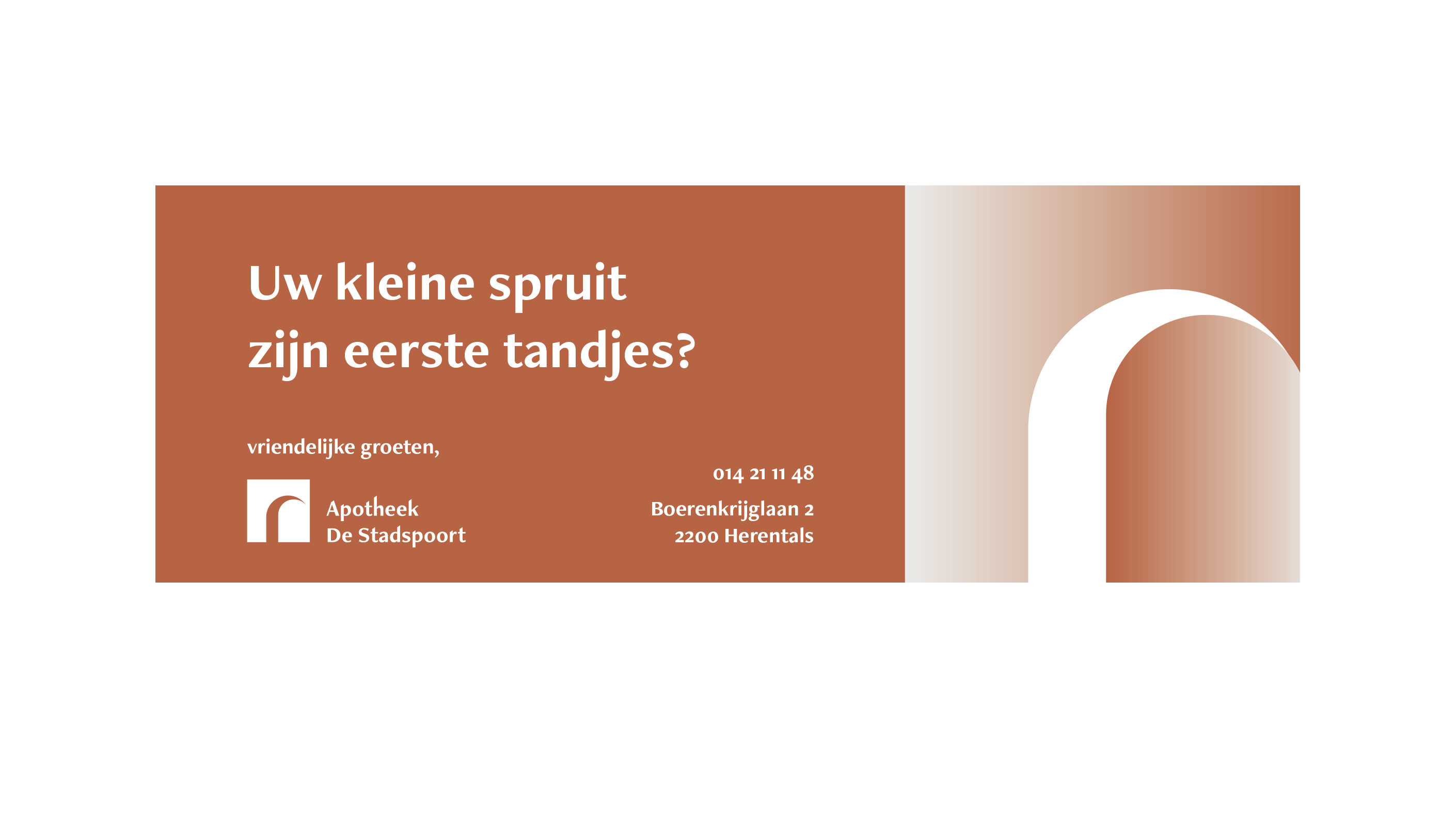
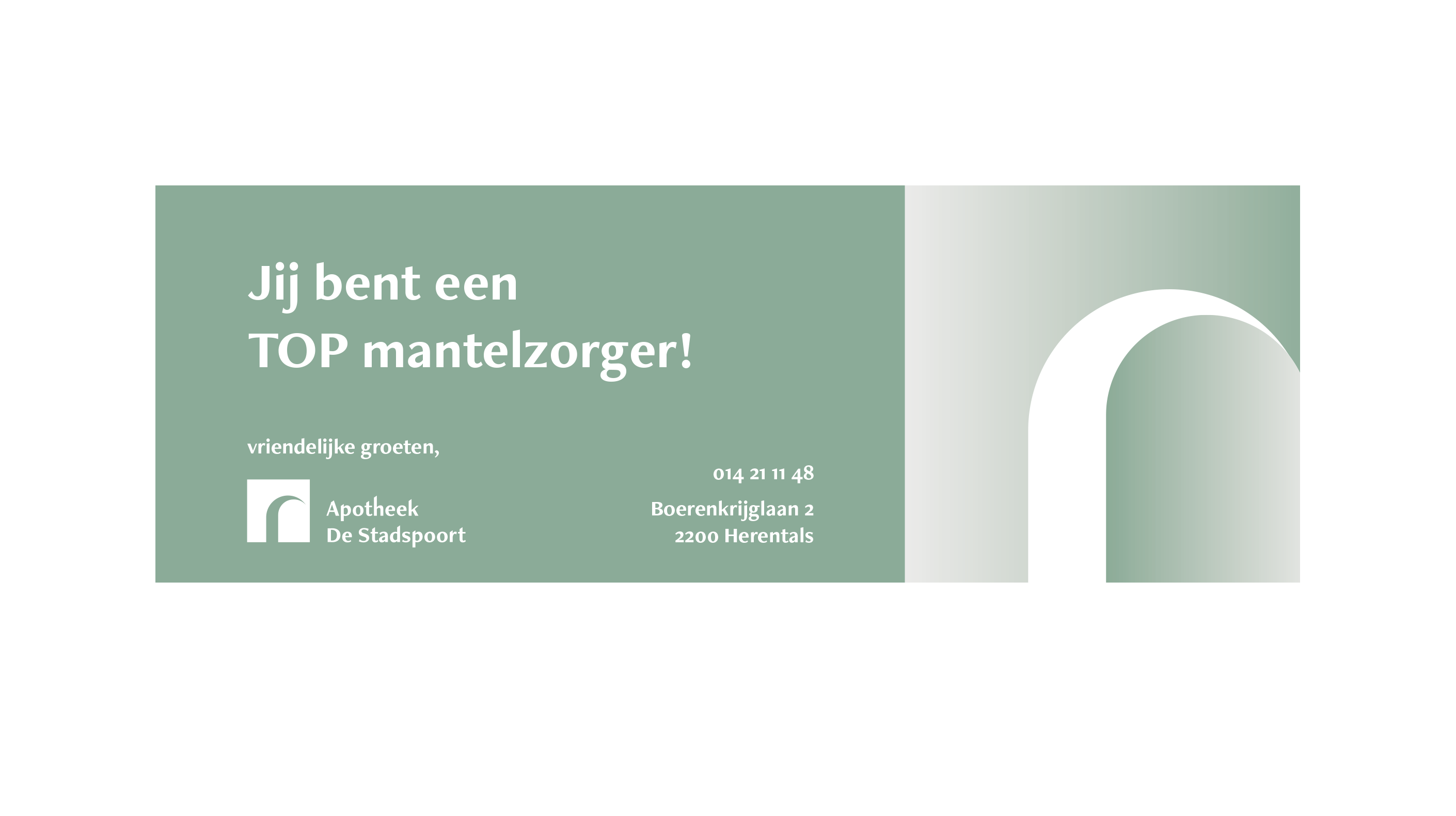
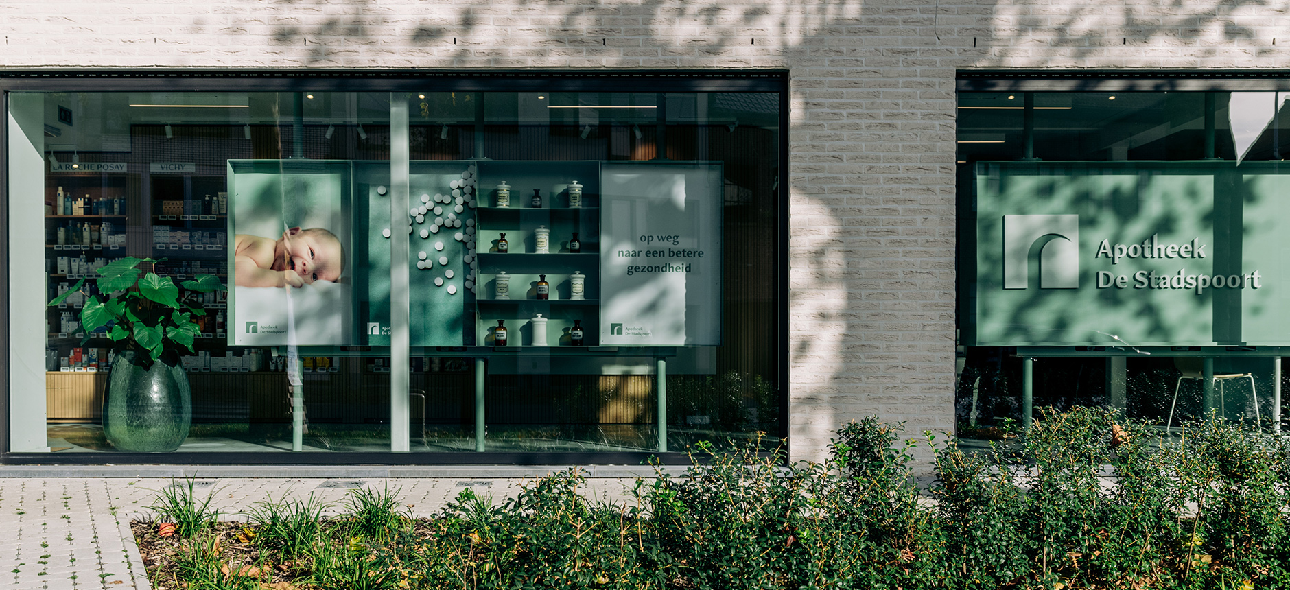
We created a simple identity with a couple of personal elements that make Apotheek De Stadspoort stand out via its communication and signage. The icon is an abstract interpretation of the city gate nearby—after which the pharmacy is named. Inspired by the city gate and the angle of the roof of the building we created a logo that reflects the business’s dedication to serving their community with a door that is always open. Introducing the use of gradients was a clean and striking way to create a little extra dynamic and step away from the often commonplace pharmacy aesthetic.
