Sir Dam
services
Brand identity
Illustrations
Packaging
awards
Gold - San Francisco World Spirits Competition (SFWS)
Gold - The Design & Packaging Masters 2022
Sir DAM is a mystic inhabitant of Amsterdam, he wanders around the little streets and canals of the city savouring his five times distilled vodka, a perfect compliment to the vibrancy of its home city. A proud product of Holland that uses water from Amsterdam in its distillation process, its name is a reflection of the inspirational, aspirational city.
the mission
To encapsulate a distinct feeling of Amsterdam, and the supposed separation of culture and indulgence that live so congenially in Mokum. With a clean but lavish approach that would unequivocally express the attention, care and quality of their products.
the results
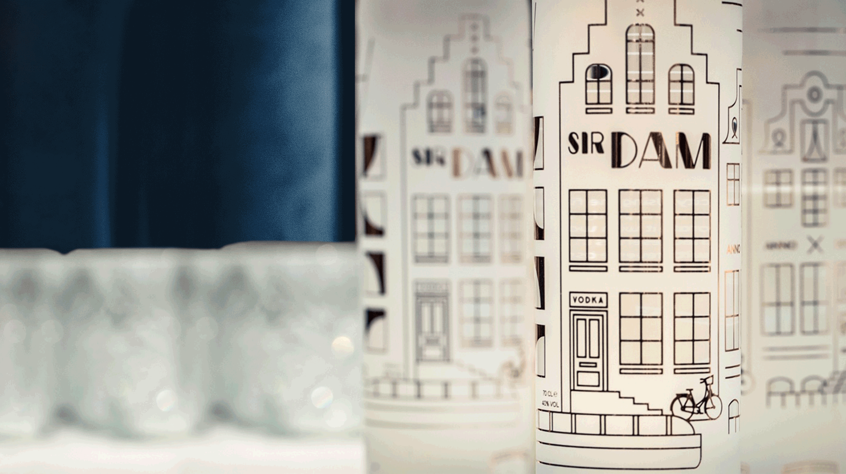
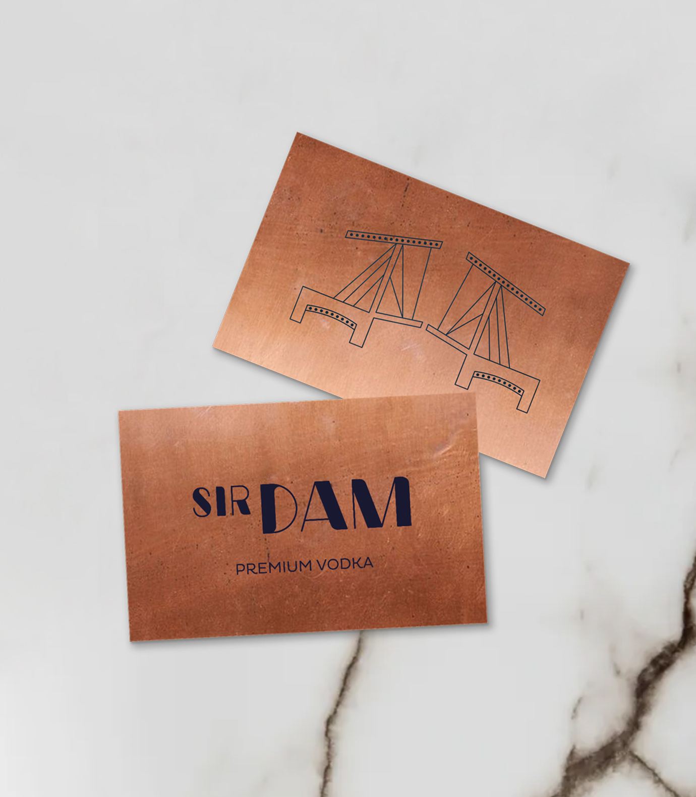
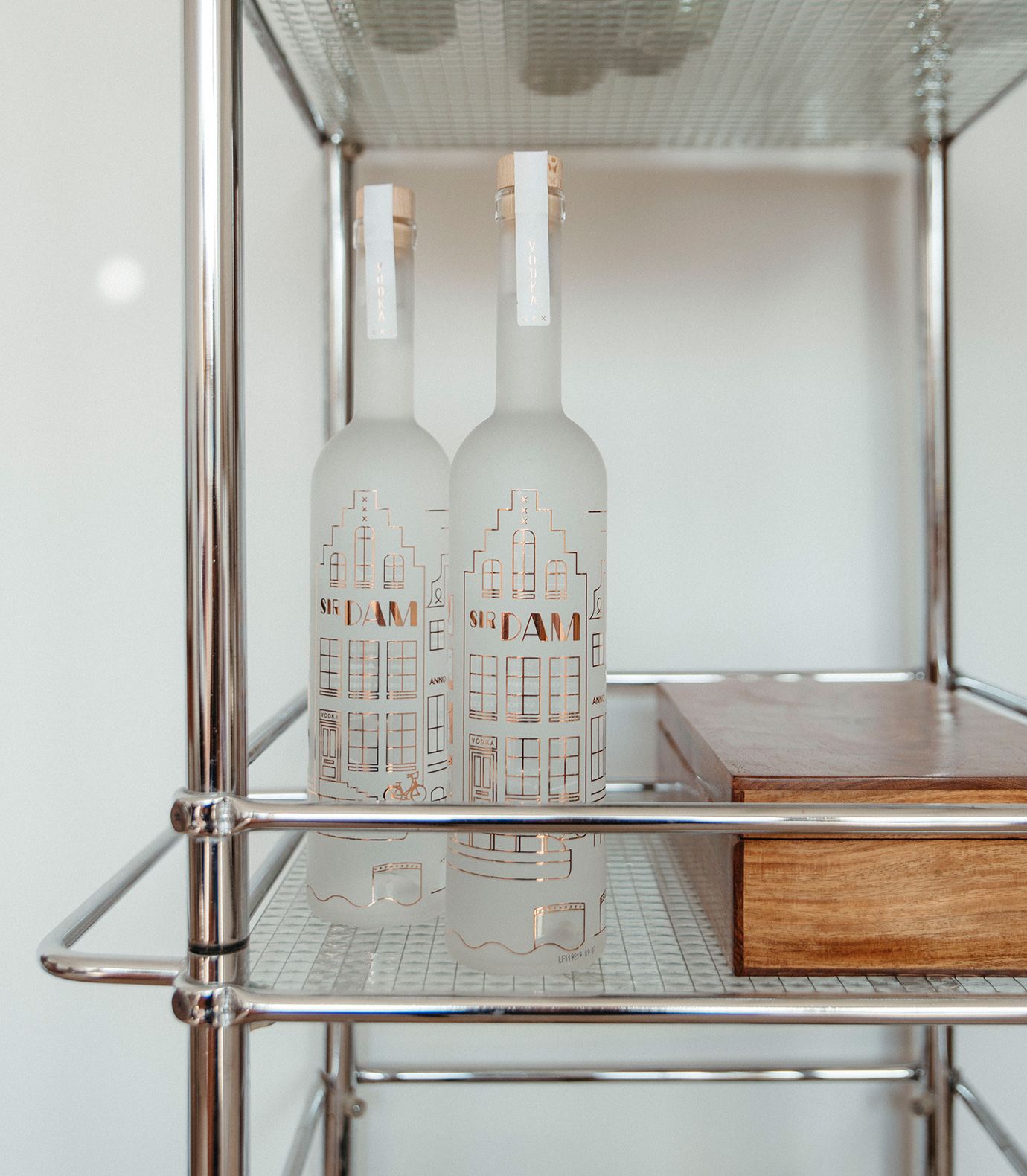
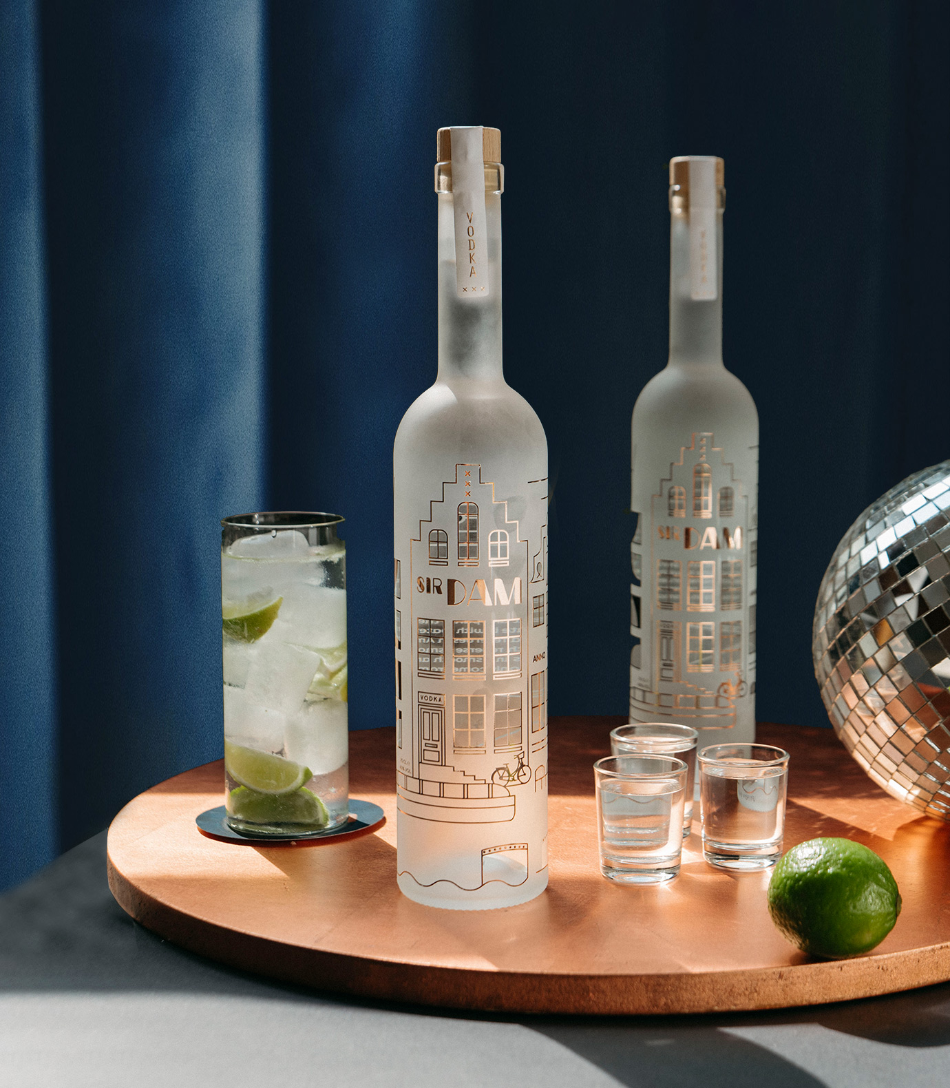
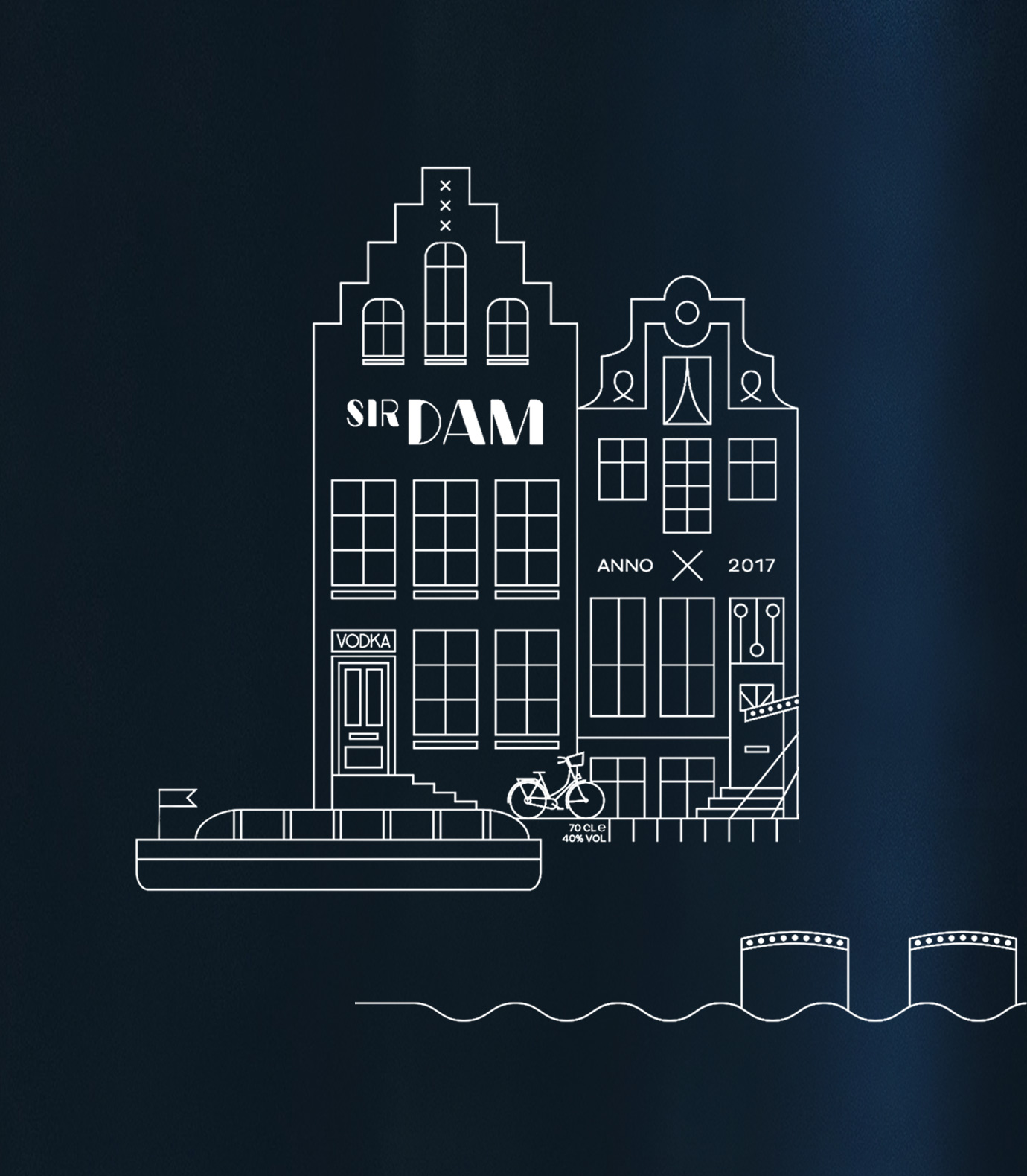
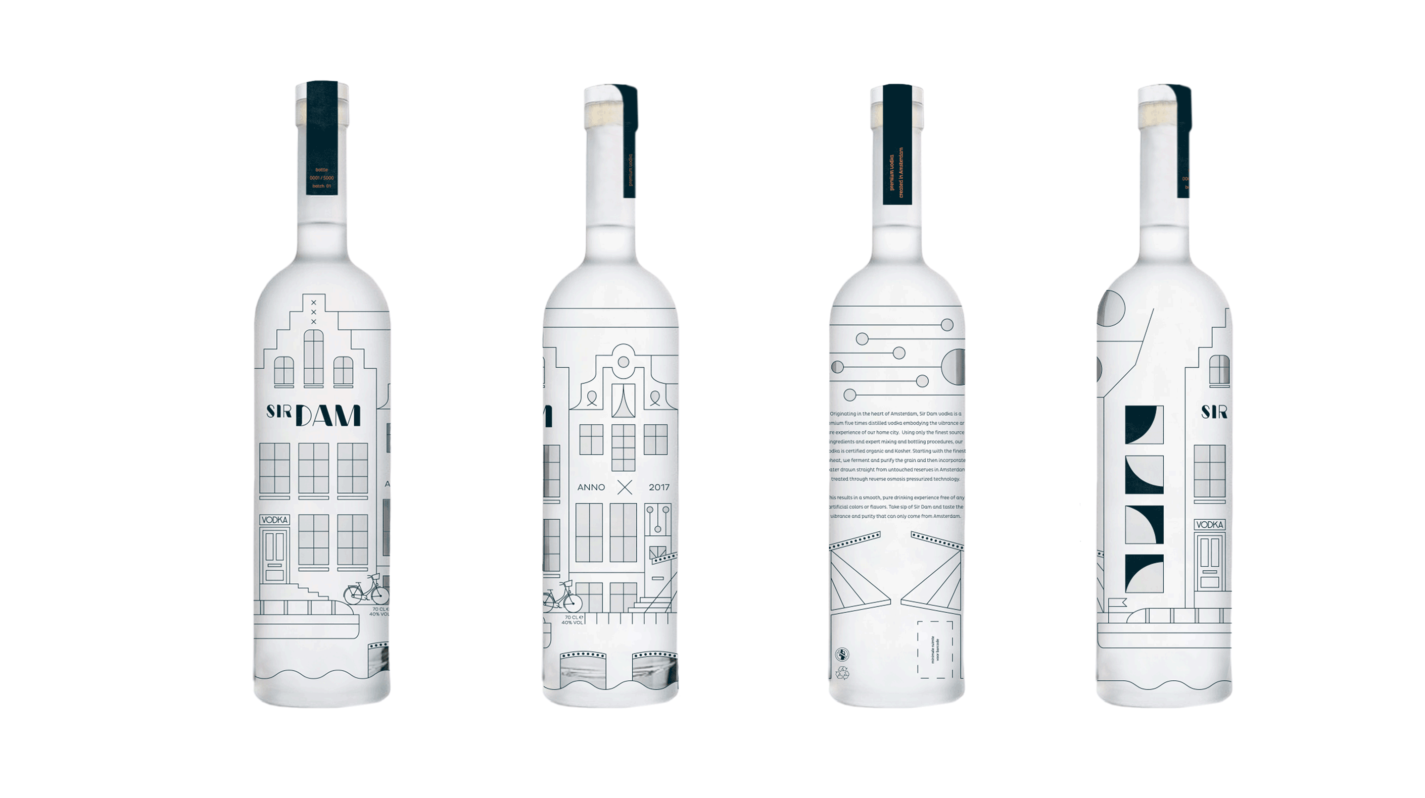
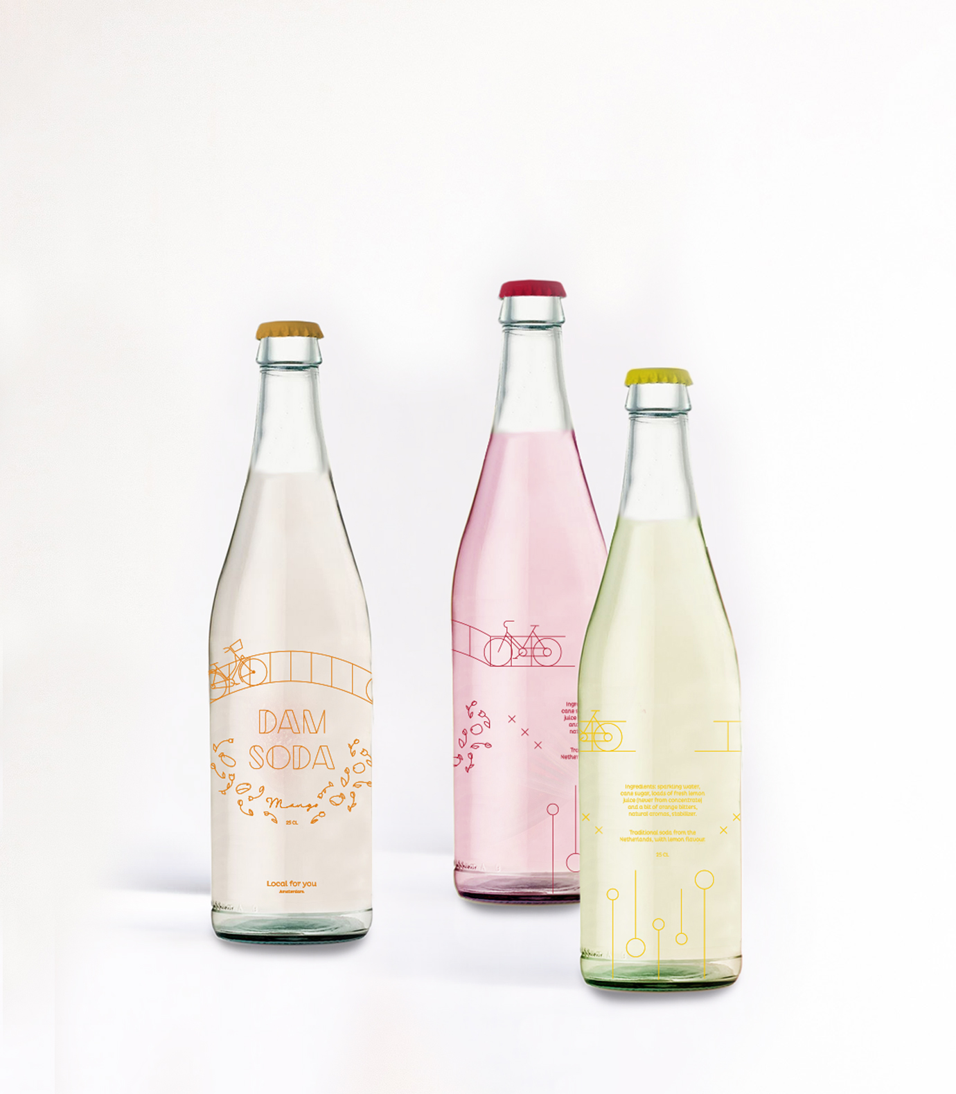
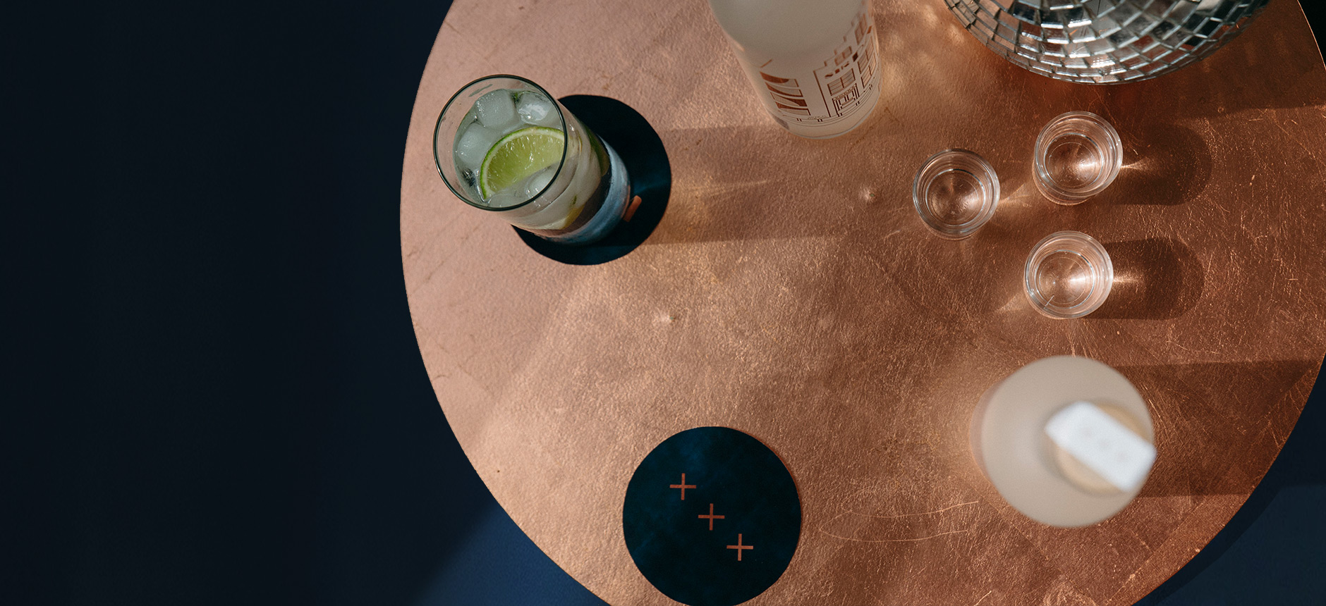
Inspired by the Great Gatsby and the Art Deco movement, the illustration is a geometric interpretation that both tourists and residents alike will recognize. With the illustration wrapping around the bottle, there is always something to discover, much like Amsterdam itself. With two points of sale we wanted to create further curiosity and glamour by distinguishing the bottles for retail in a marine blue and VIP nightlife label with copper. Additionally we designed the packaging for soft drinks that were to pair as mixers are part of the initial concept. With the art deco mood in mind, they are fresh, playful and colourful.
