Apotheek Smith
services
Brand Identity
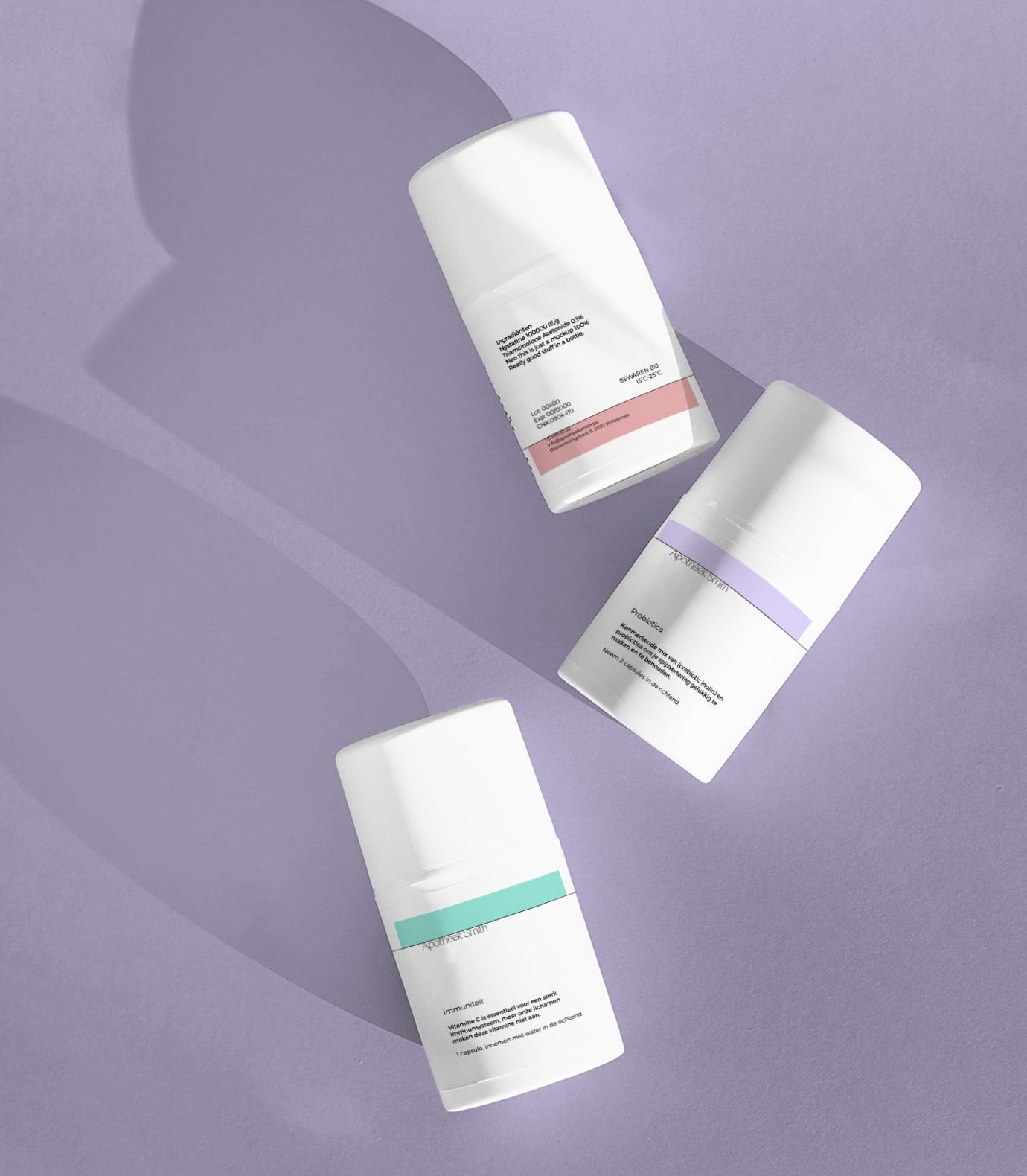
Packaging
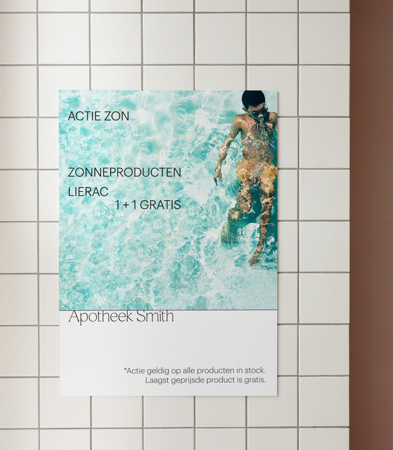
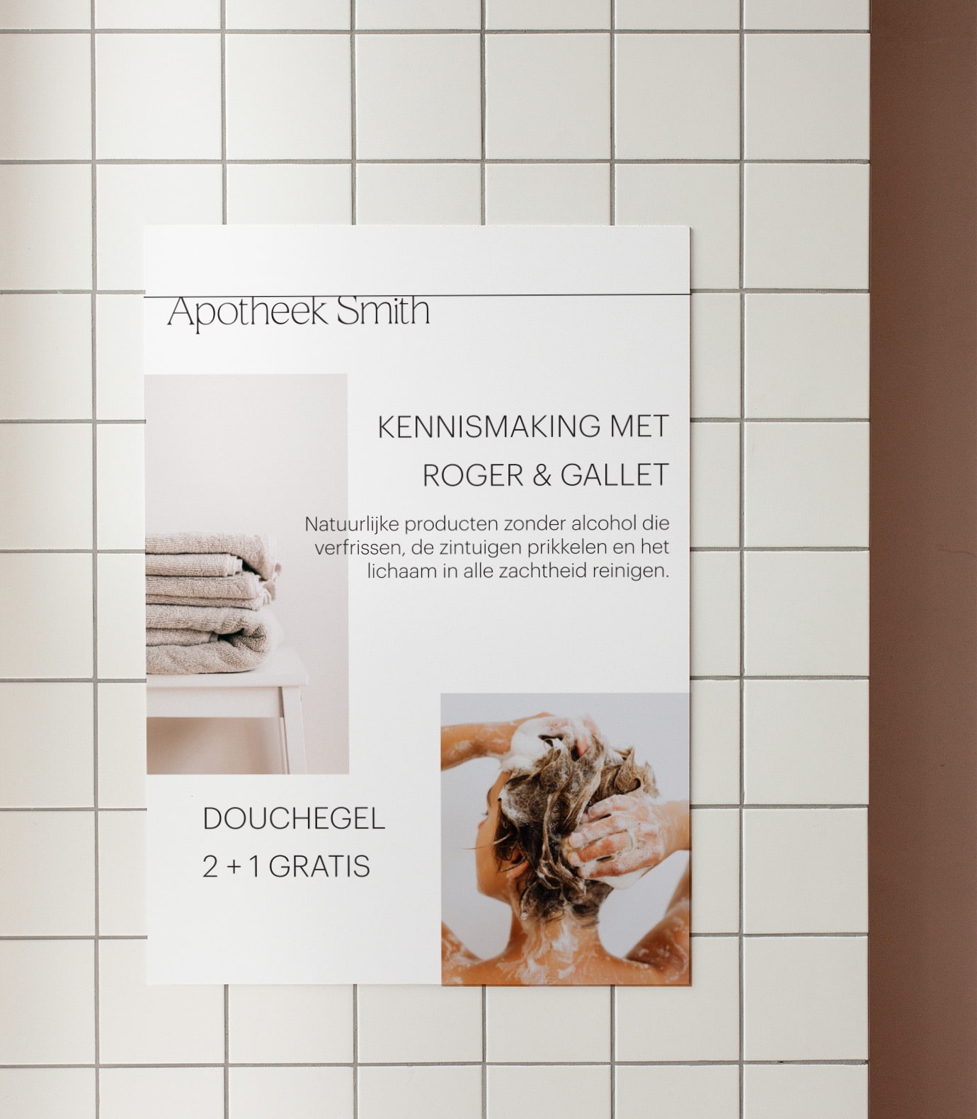
Print collaterals
Socials
Kitty Smith is a jewellery designer by night and pharmacist by day. Apotheek Smith is a local pharmacy where the personal guidance to a better health is crucial. With professional advice and a personal approach, her reliability is why people choose to come here. Online and offline, she tries to connect and find the best solution to every health problem, with existing medication, supplements and even her own remedies.
the mission
With an eye for detail and design, Kitty wanted to translate her passion for healthcare and the trust of her community into a tangible identity that breathed professionalism with an added personal touch. Our goal was to create an easy-to-use identity that felt powerful and reliable but as usual we never want to lose the element of Kitty.
the results
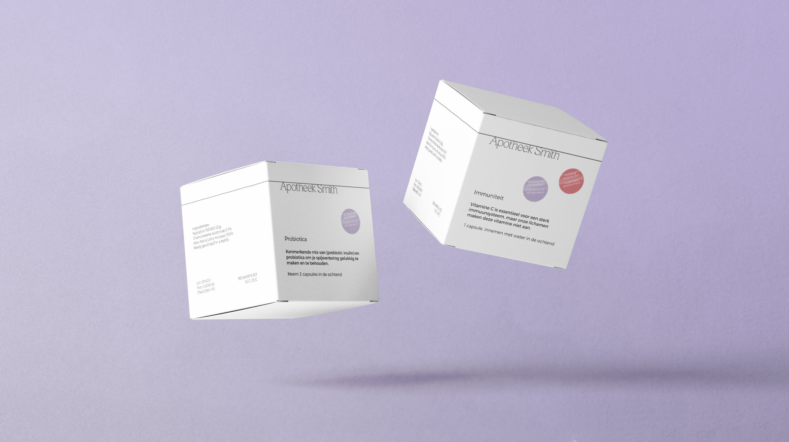
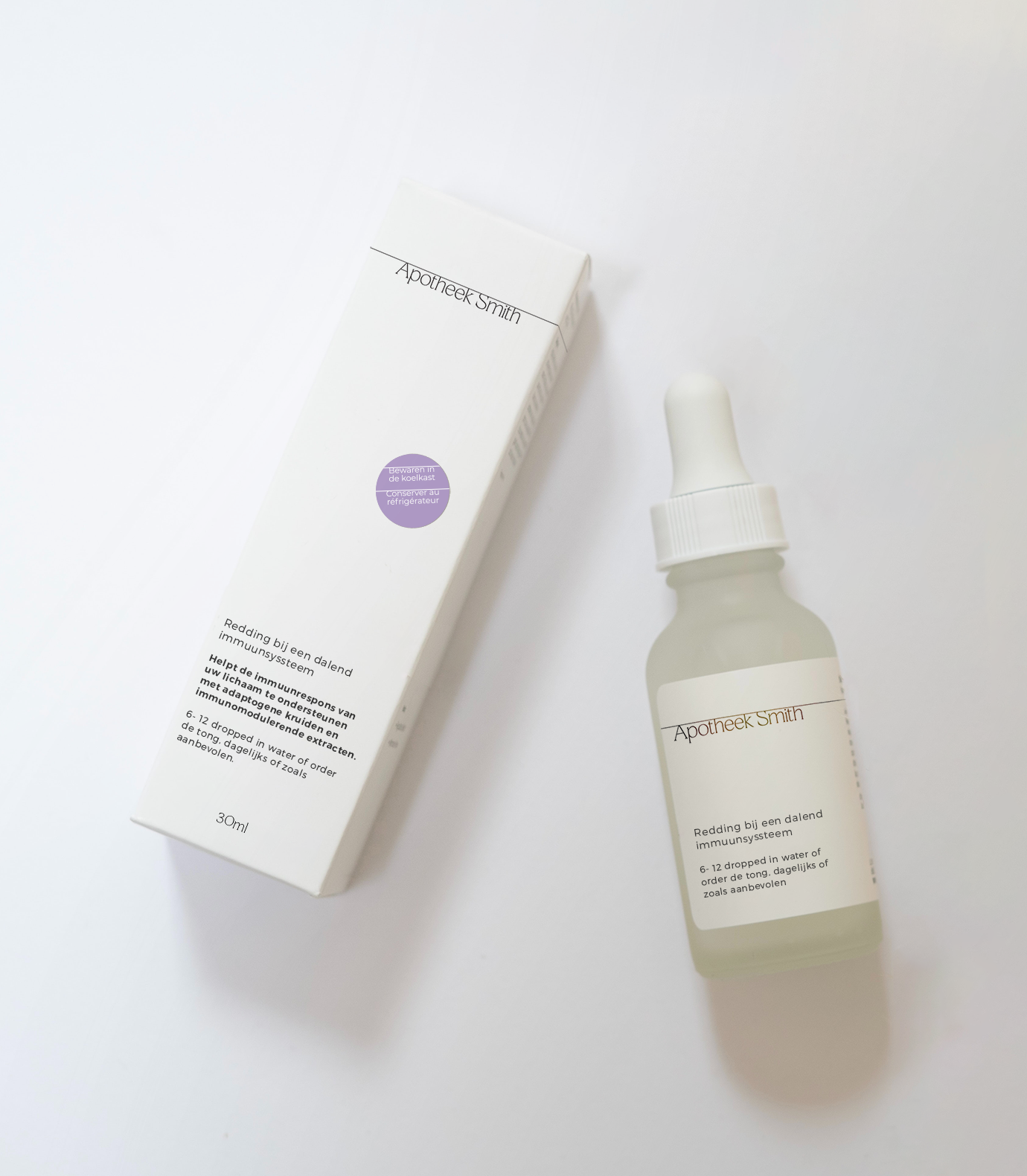
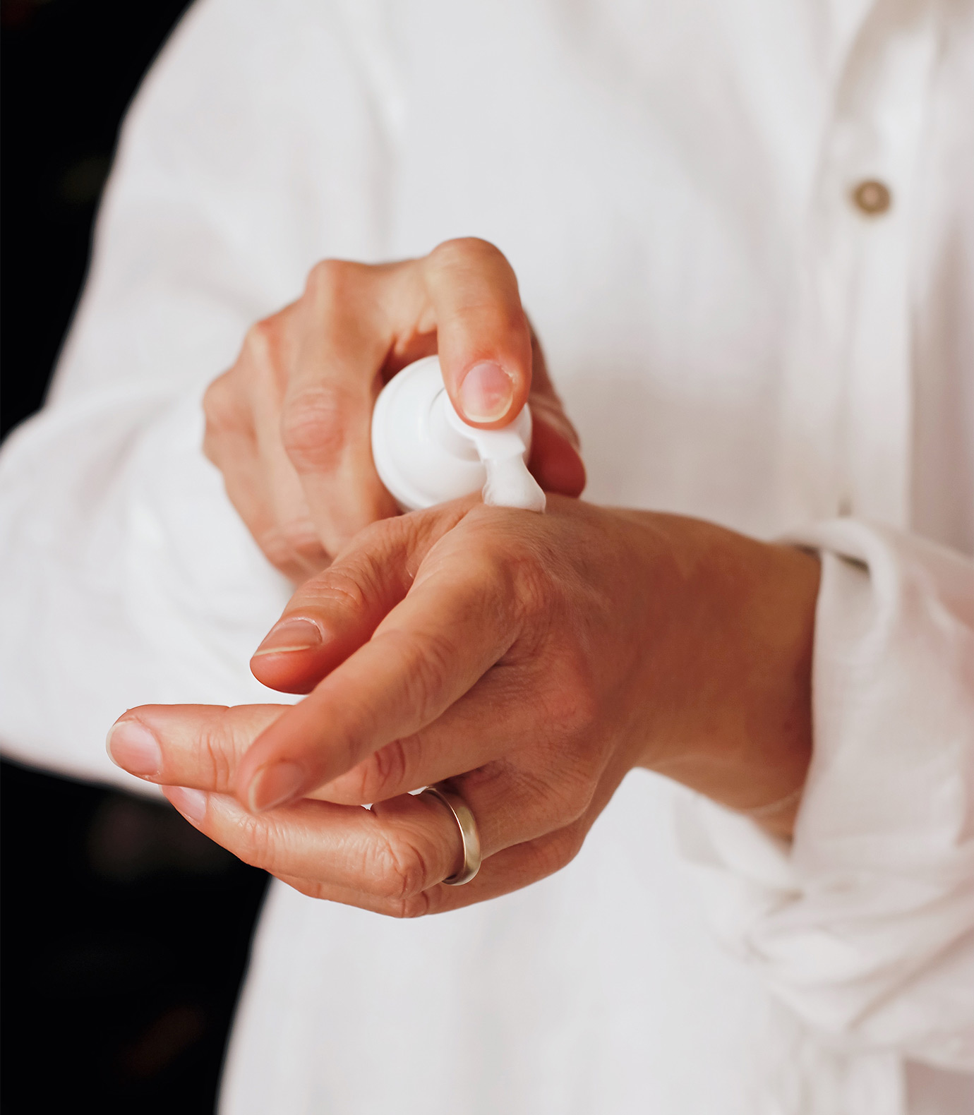
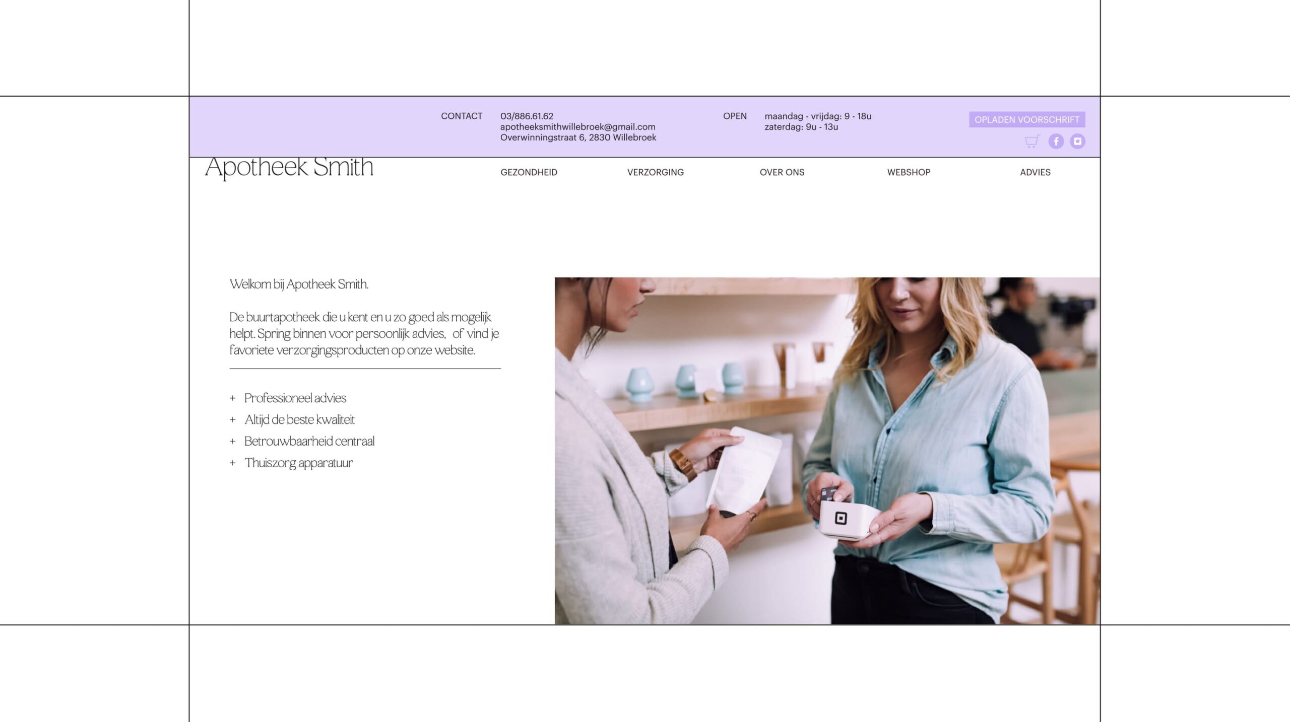
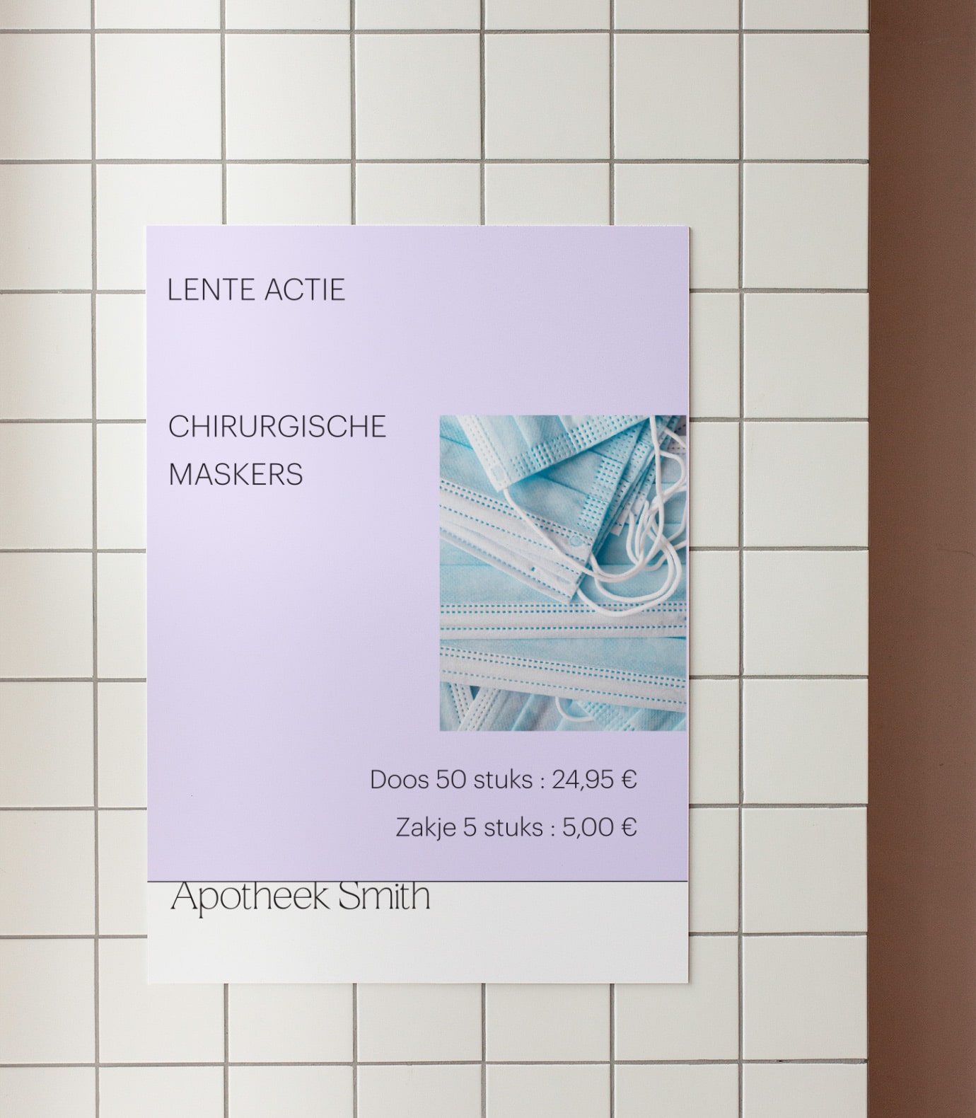
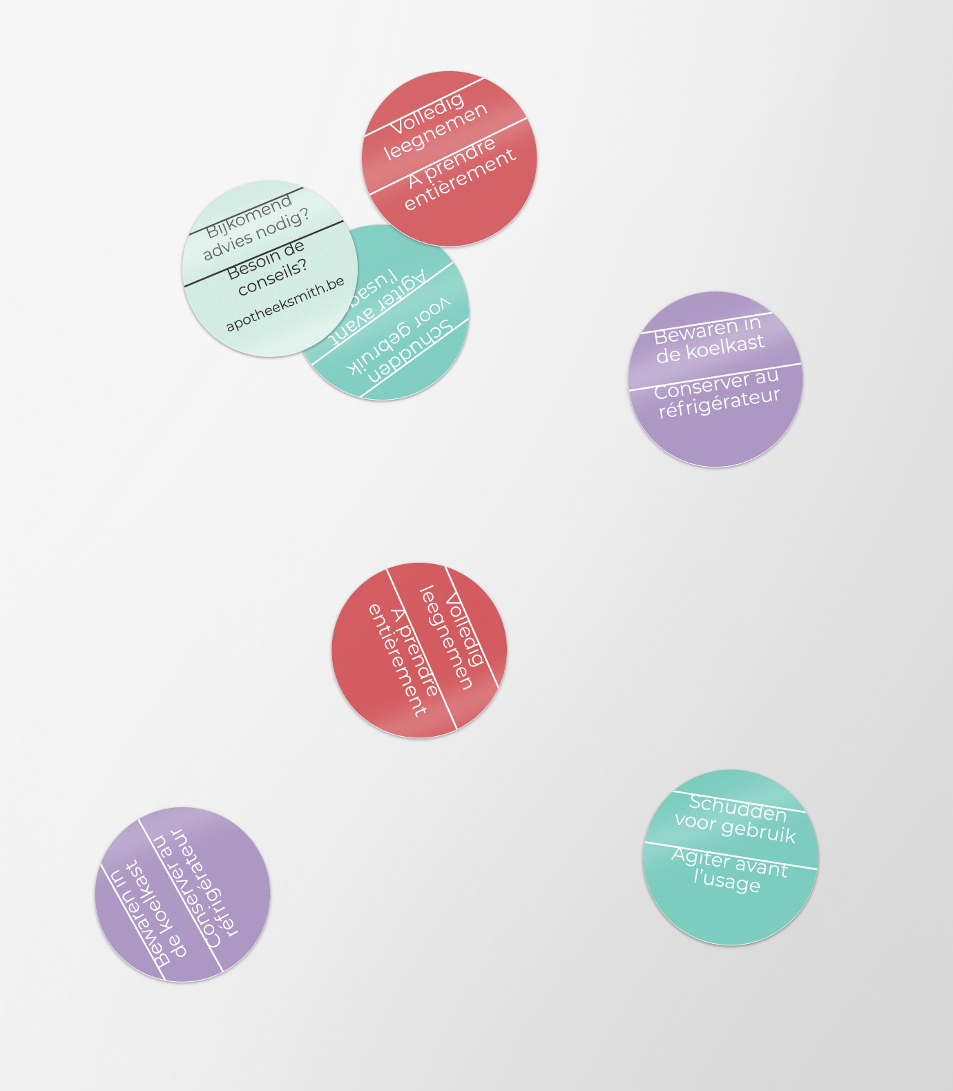
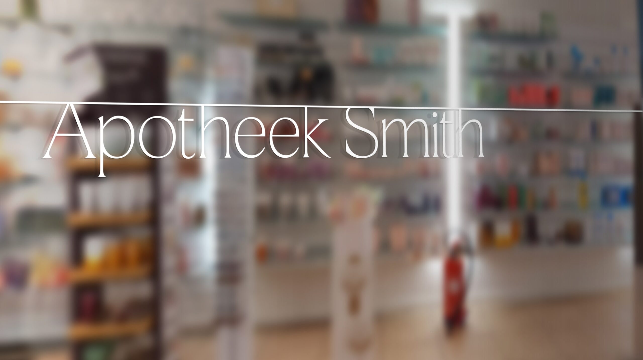
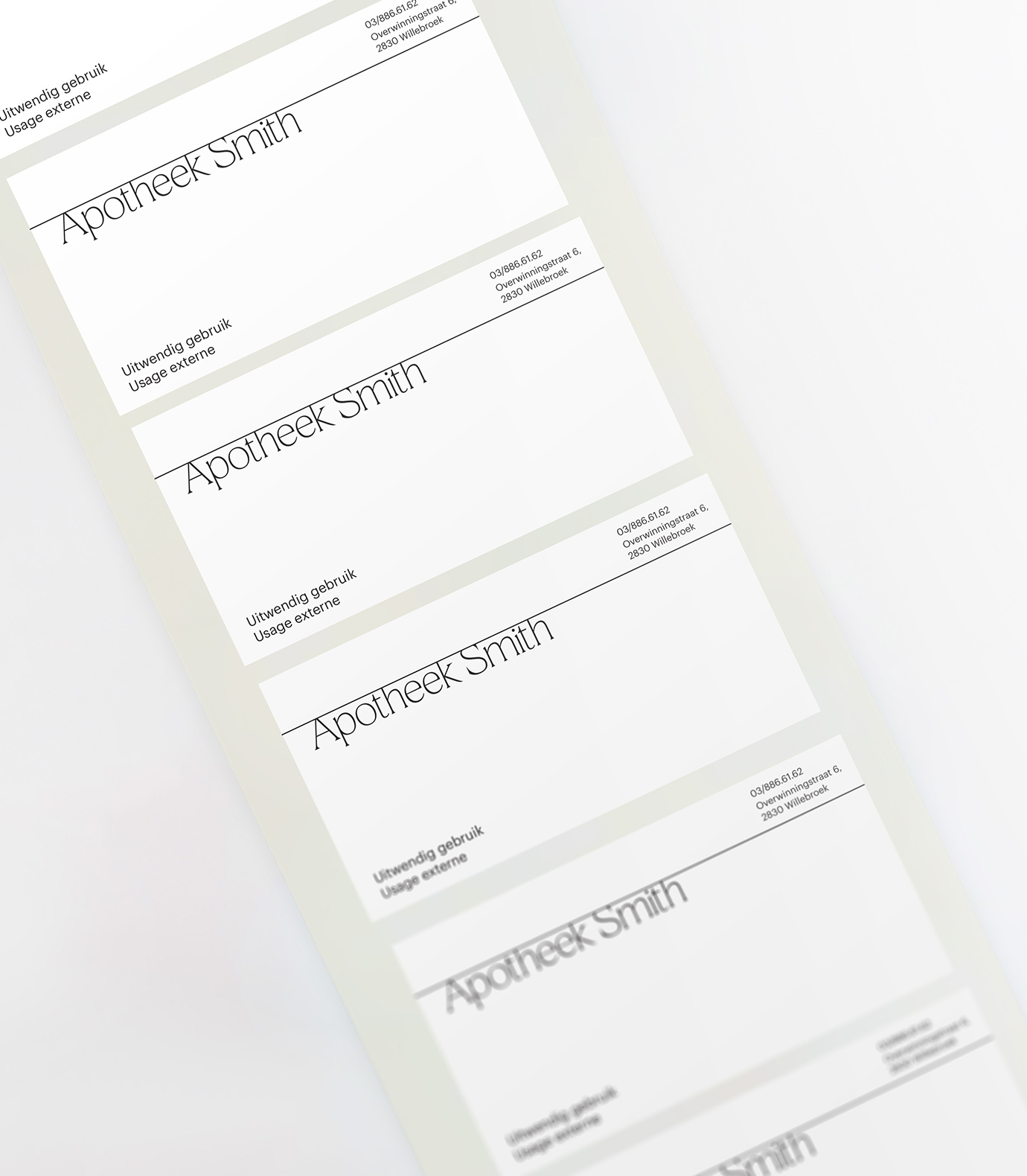
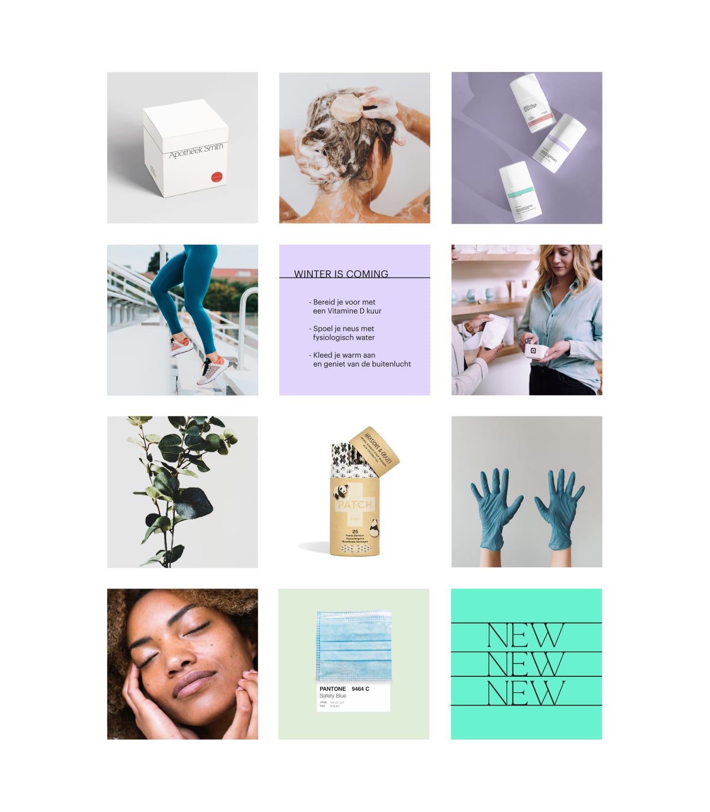
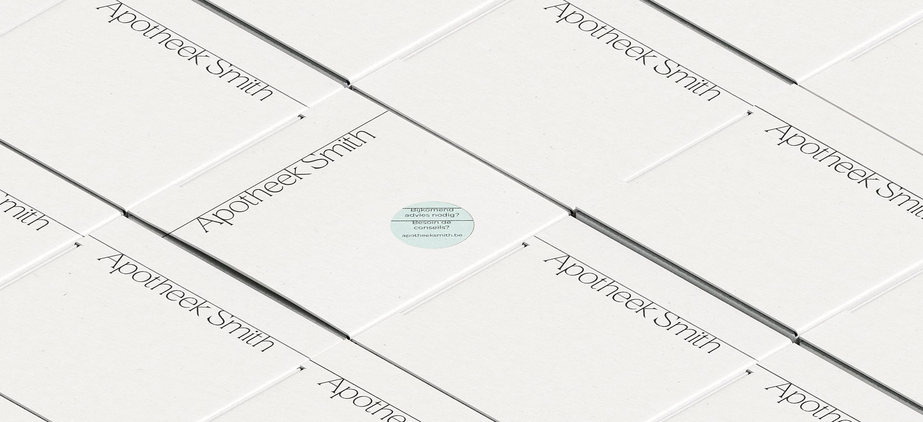
The bones of the brand identity are simple and classic. Black and white offer a timeless and polished feel, appropriate for a pharmacy, while pops of colour provide a playful freshness. The wordmark is elegant with embellished terminals for a little extra personality and the line across the top creates visual intrigue across print and web design alike. On packaging the line further promotes connectivity and possibility through their interaction with one another. Photography is used as a visual tool to stimulate a multi-sensory experience from a visual prompt. Information is further colour coded on packaging or with stickers to highlight information for an accessible and user friendly experience.