Asian District
services
Brand identity
Naming
Animation
Copywriting
Art direction
Illustrations
Packaging
Print collaterals
Website
Socials
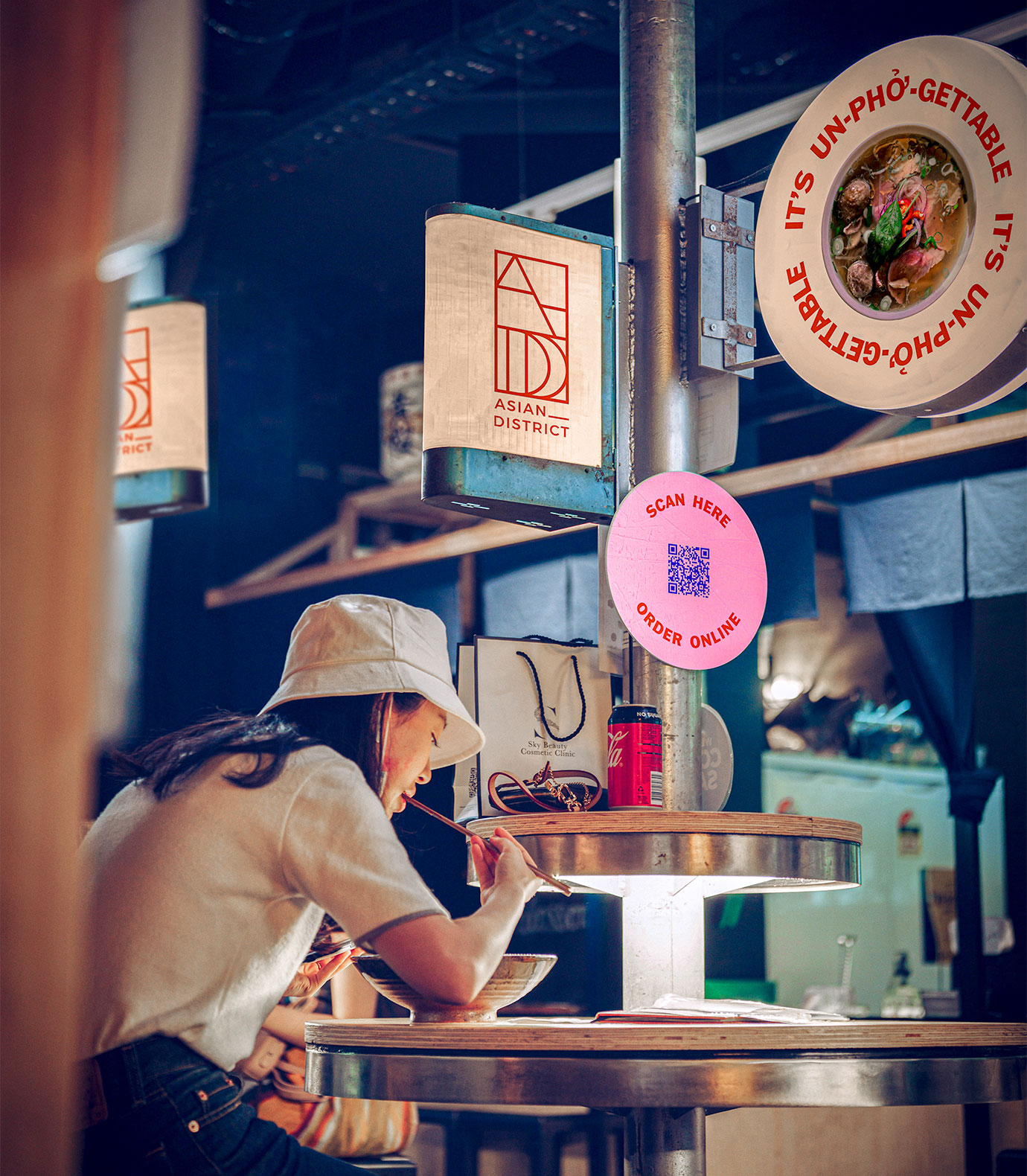
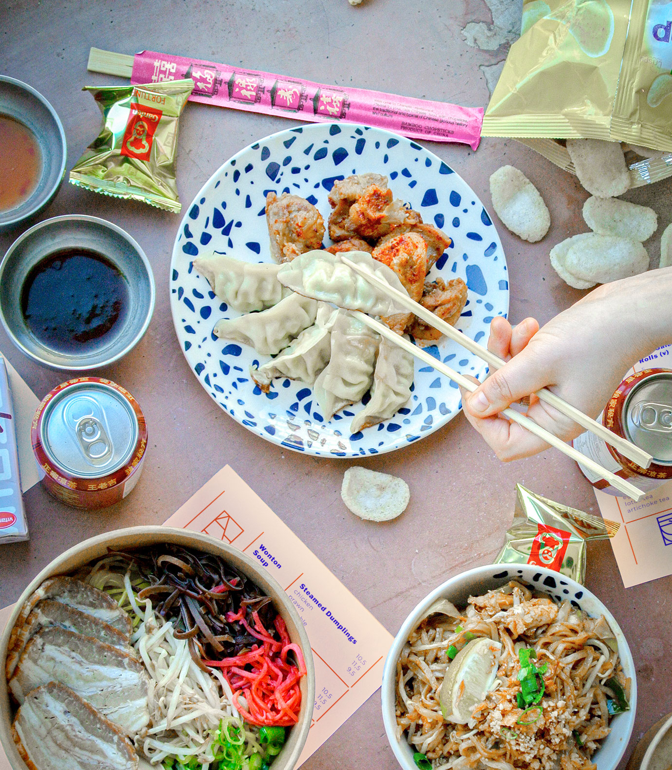
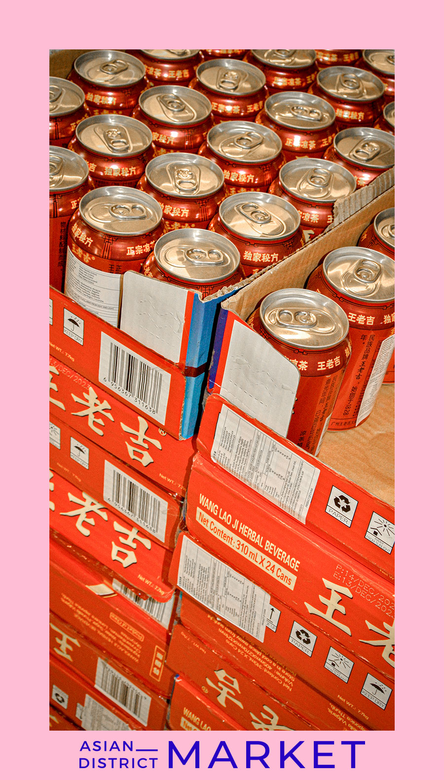
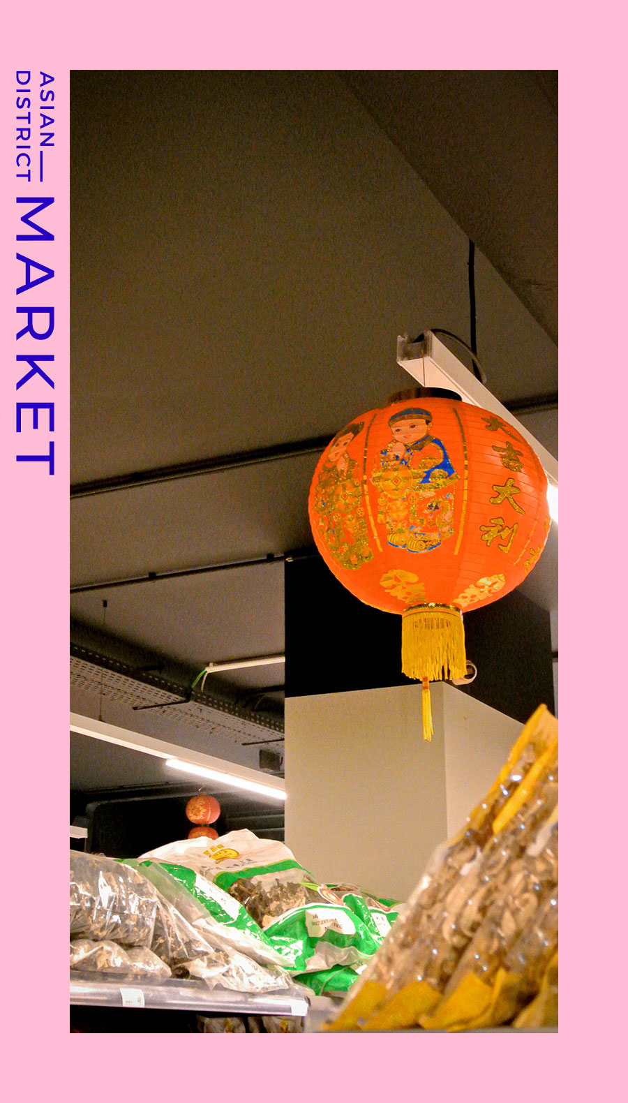
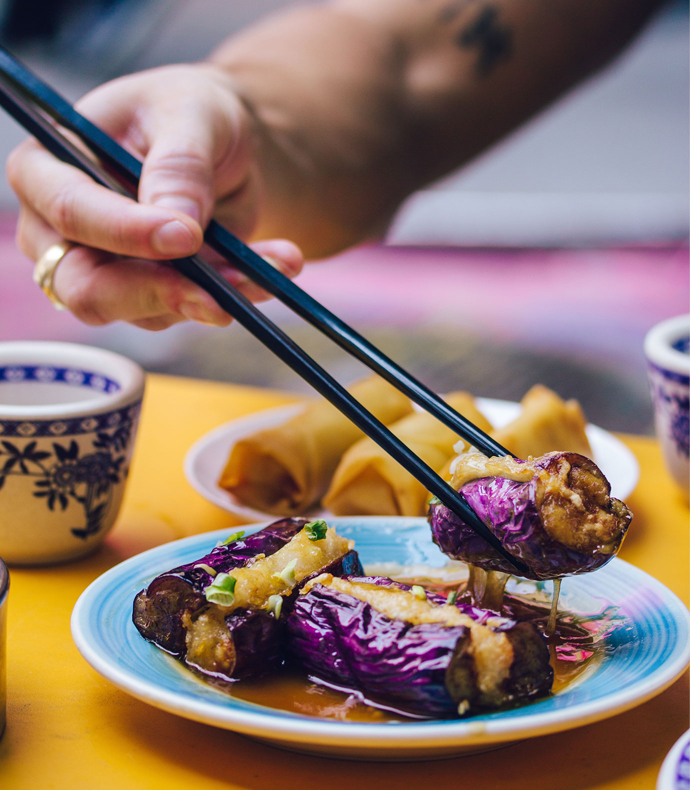
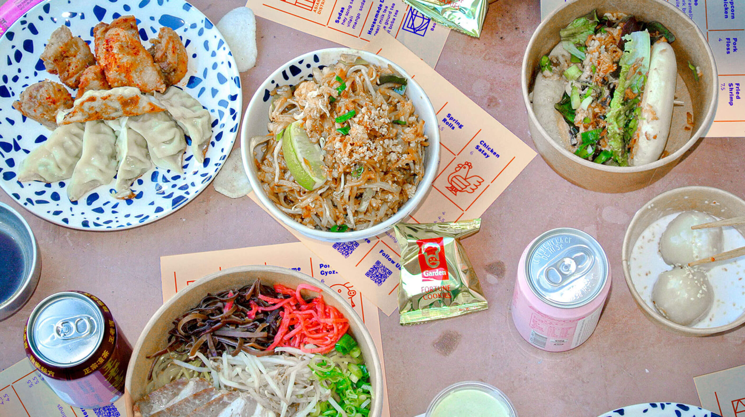
Asian District is more than just a food hall, it is a food lover’s playground. It is the home of not only a delicious selection of restaurants focusing on the cuisine and dish of a few particular Asian countries, but also a market and diverse event space.
the mission
To create a bold and dynamic identity that celebrates the vibrant cuisines and engages the curiosity of people. We needed to create a sense of destination and intention inspired by the vibrant hustle and bustle of street markets.
the results
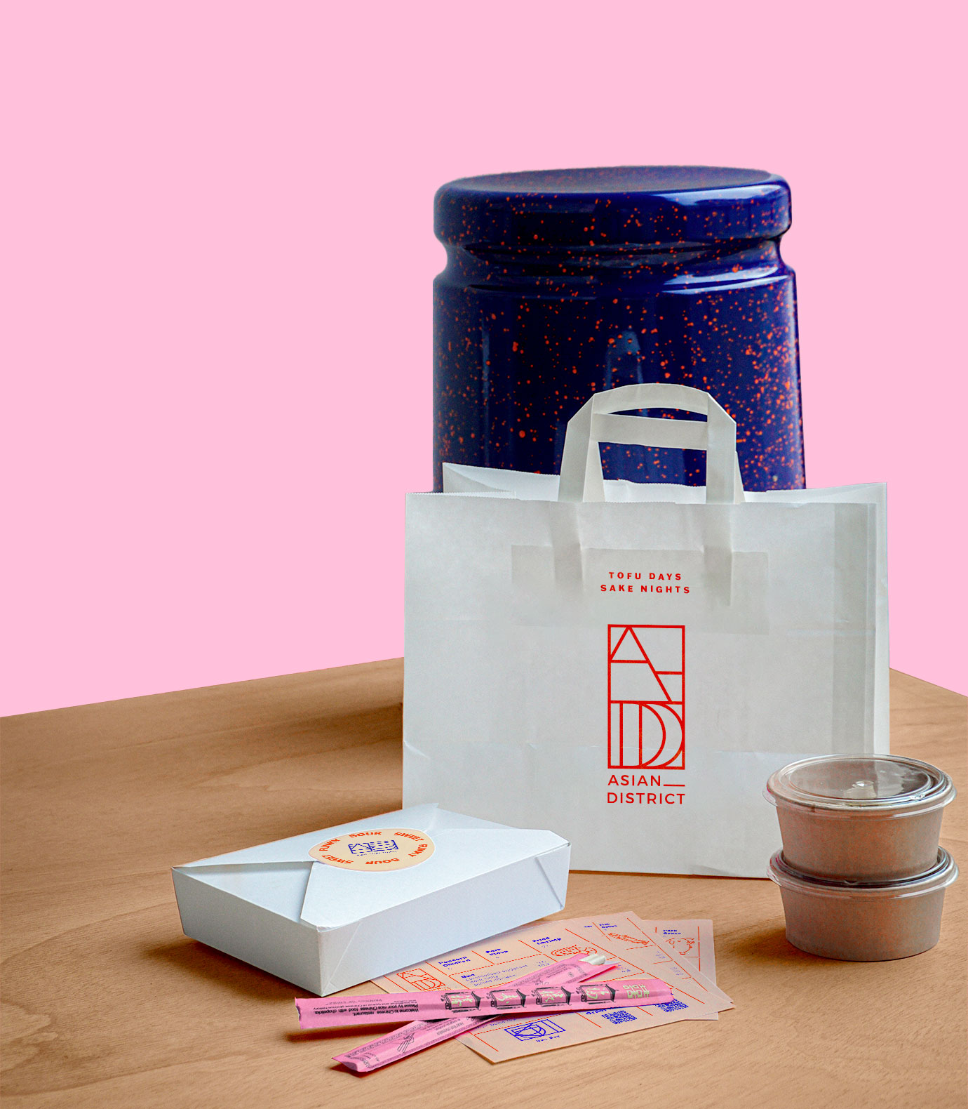
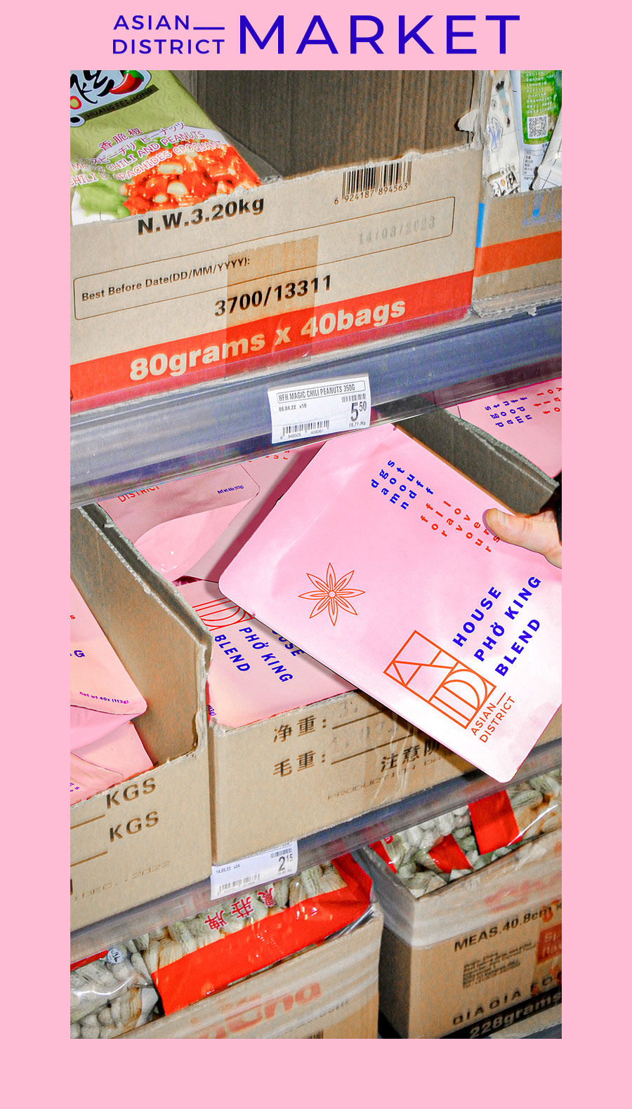
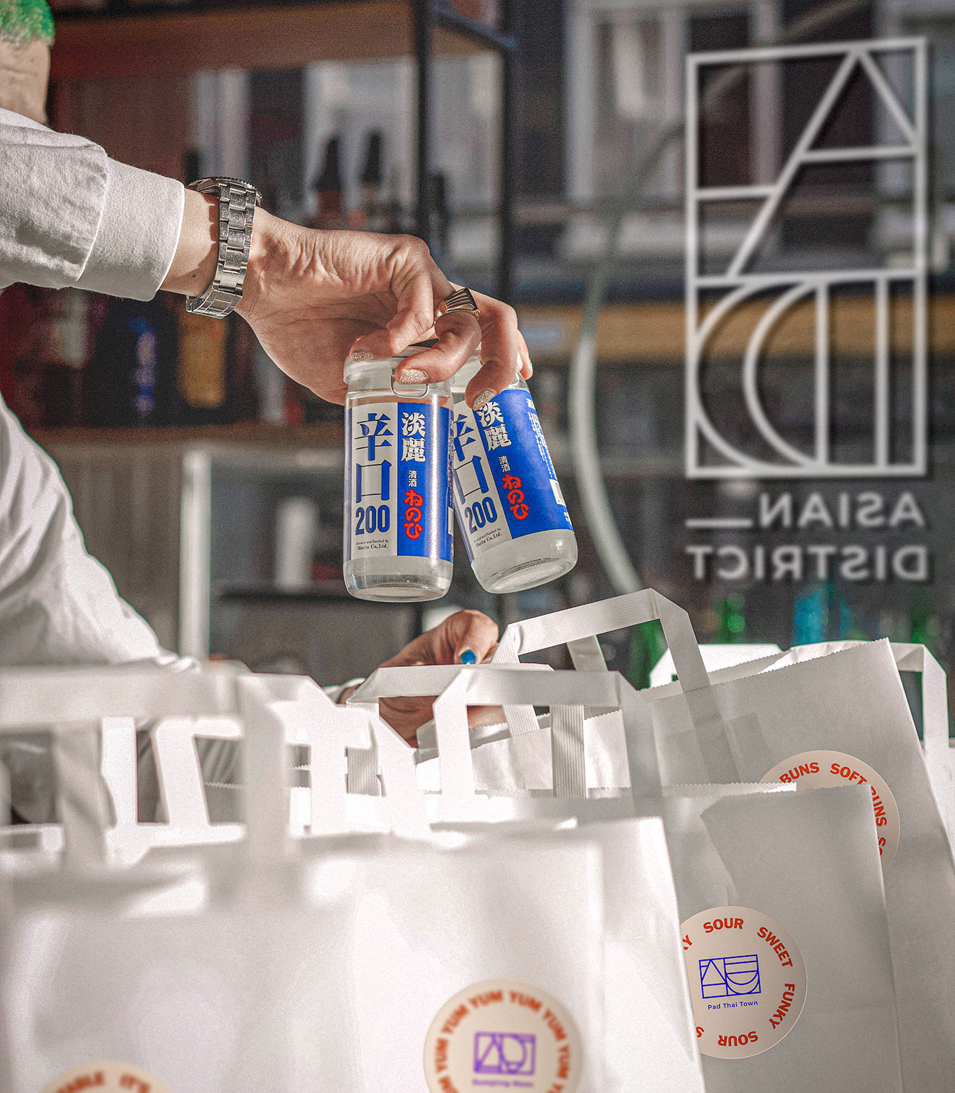
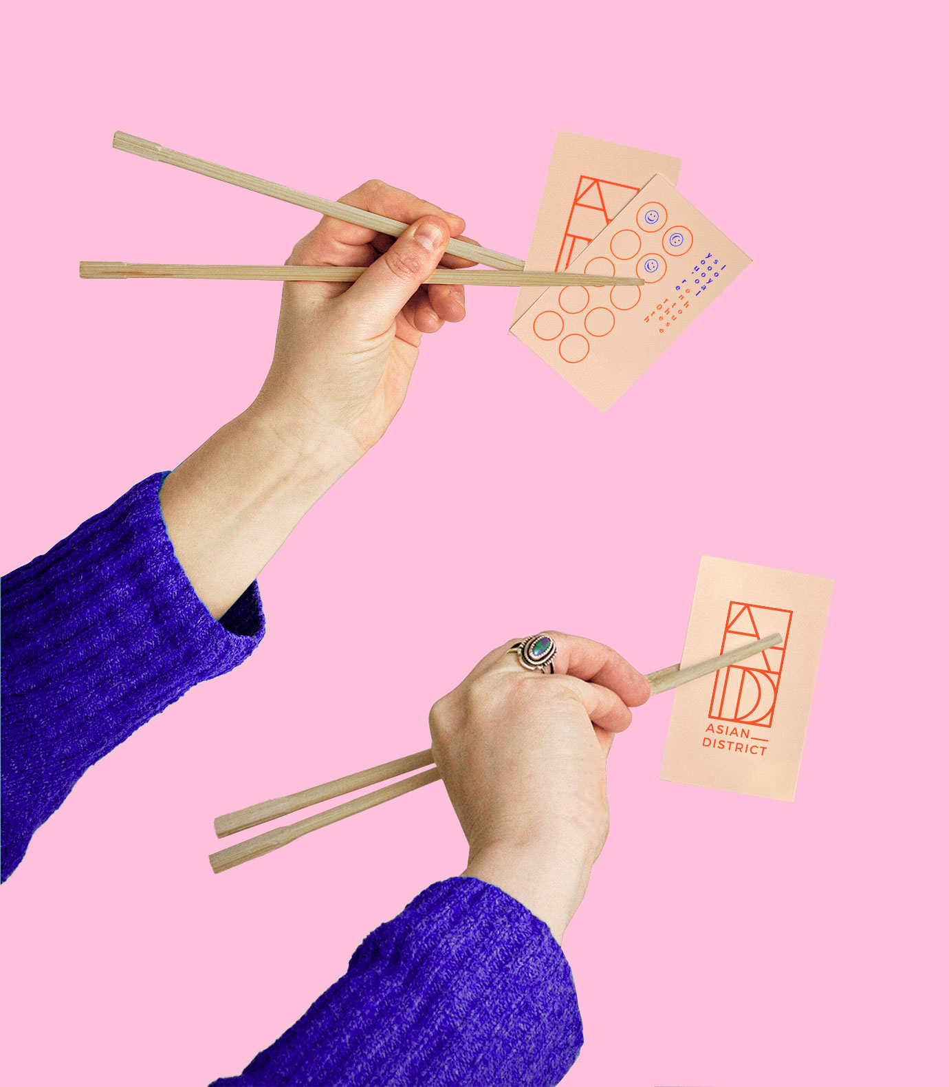
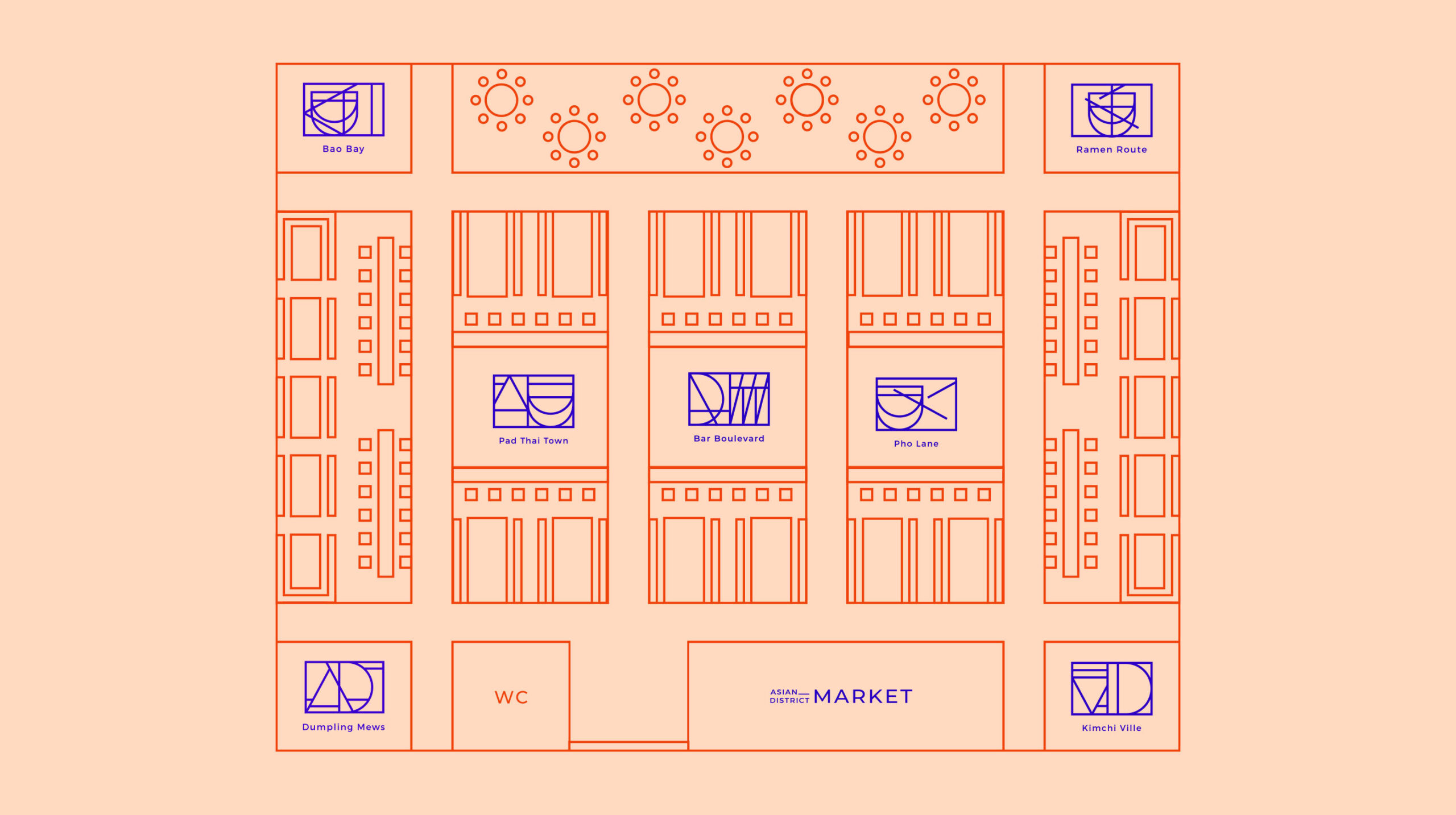
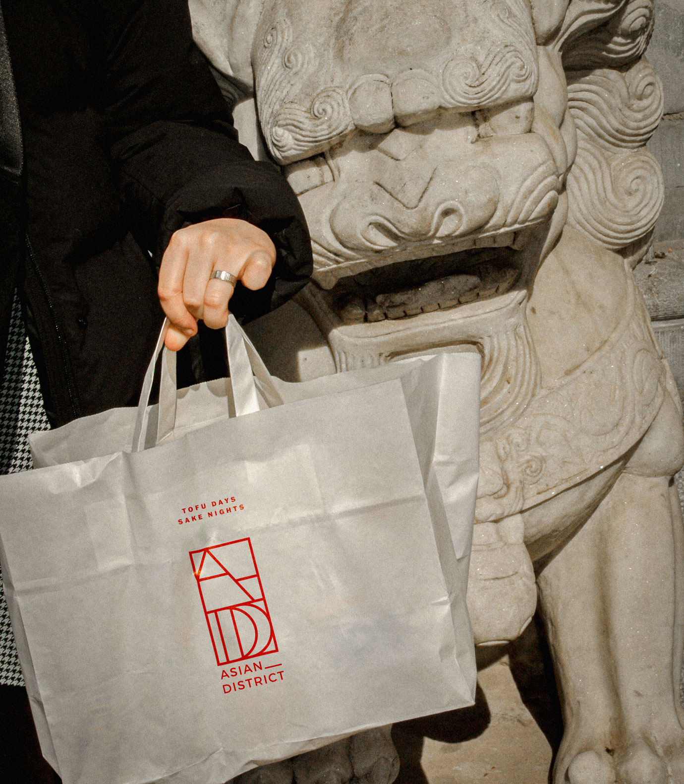
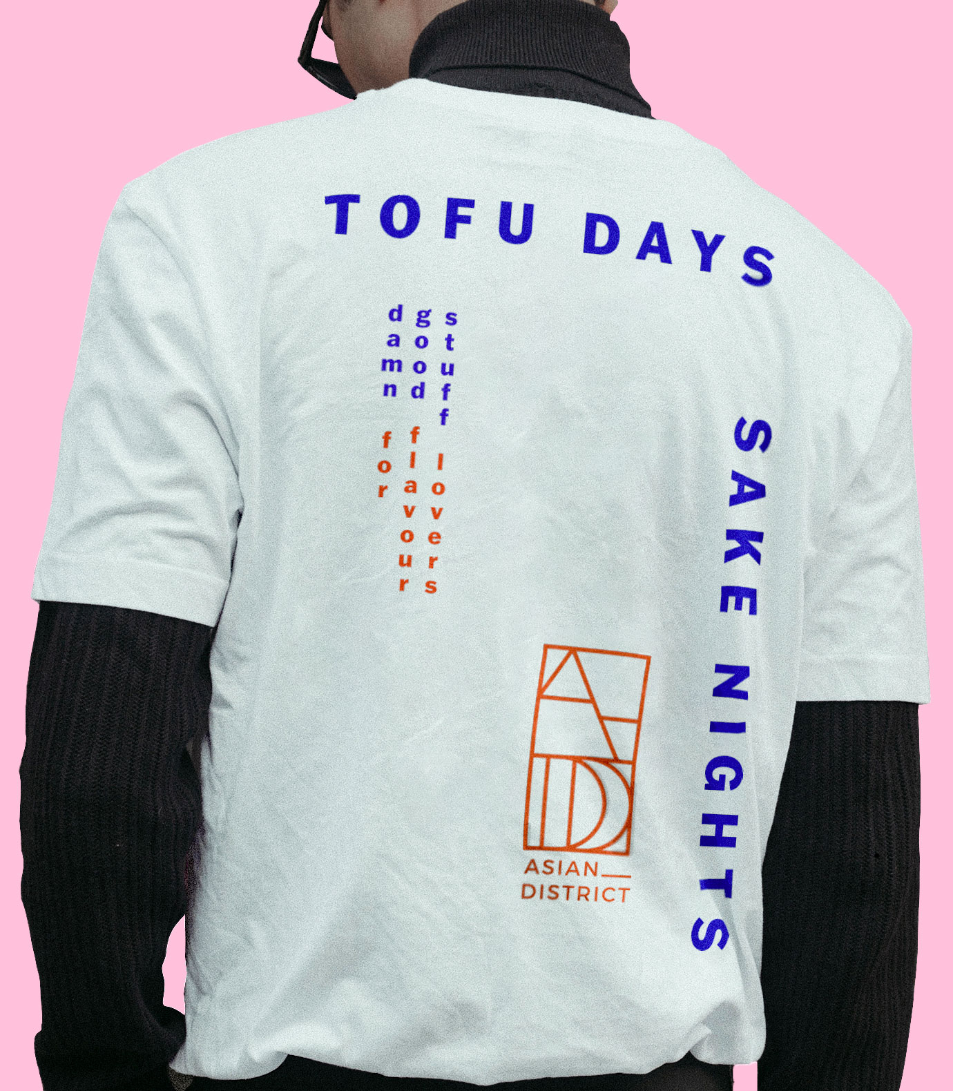
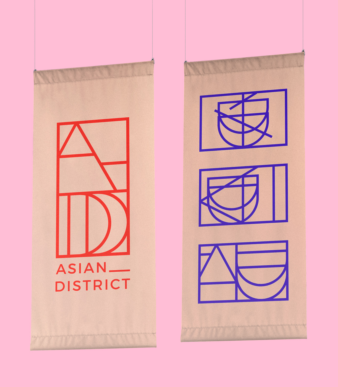
We created a system of naming that enabled each kiosk to stand out while reminding a part of the whole. We blended energetic colours influenced by the various cultures with photography and copy to create a dynamic and layered identity that is scalable and adaptable. The logos are inspired by Noren (Japanese flags) that hang outside shops. Each restaurant logo is a reinterpretations of the main Asian District logo – using elements of the letter A and D to create abstract flag designs reminiscent of bowls and chopsticks for each. Red is traditionally a colour of luck and happiness in many Asian cultures, additionally blue and red represent yin and yang in Korea which felt apt for a diverse community space.
