Athena
services
Brand Identity Illustrations
Pattern design
Editorial design
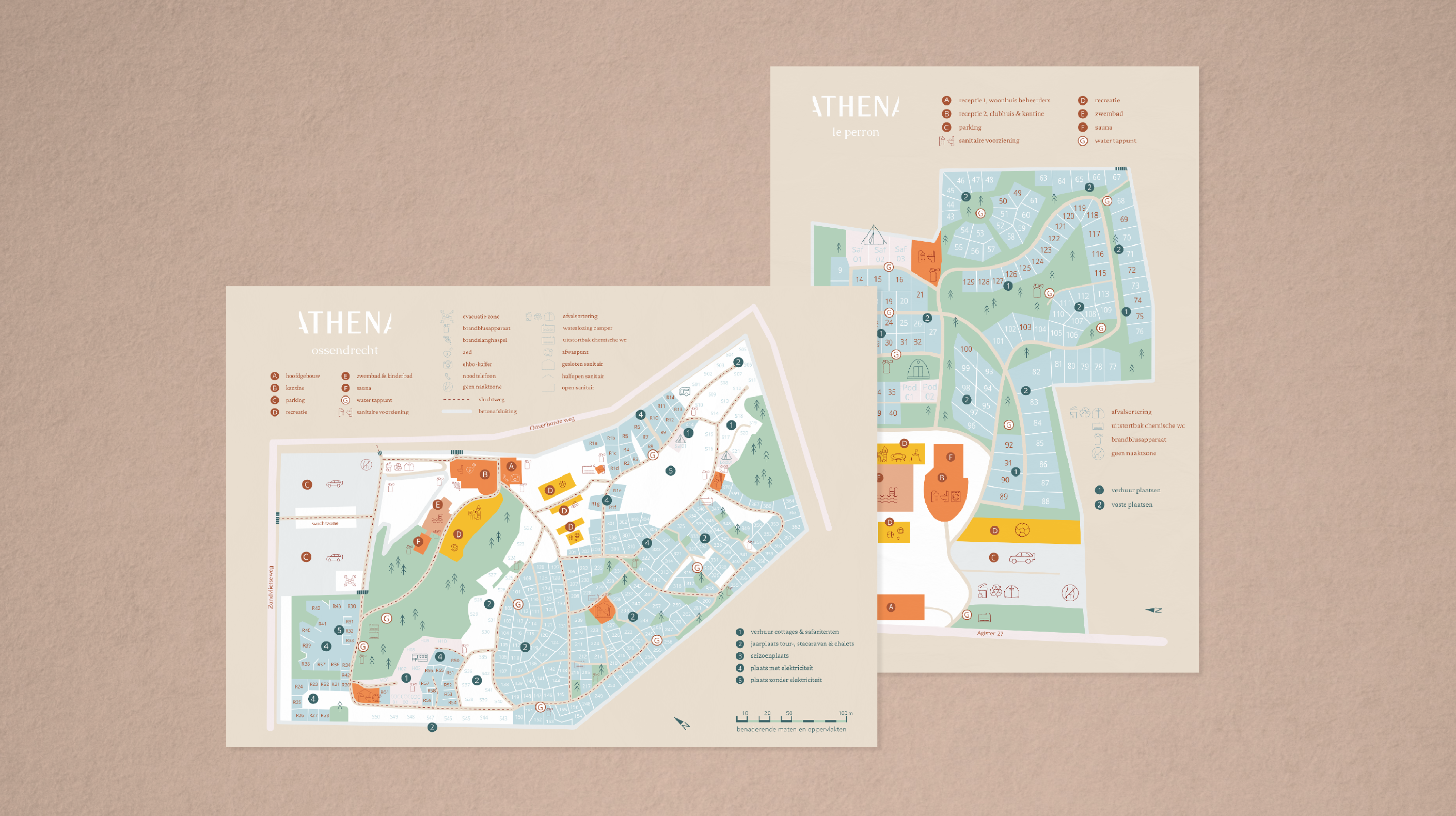
Print collaterals
Website
Socials
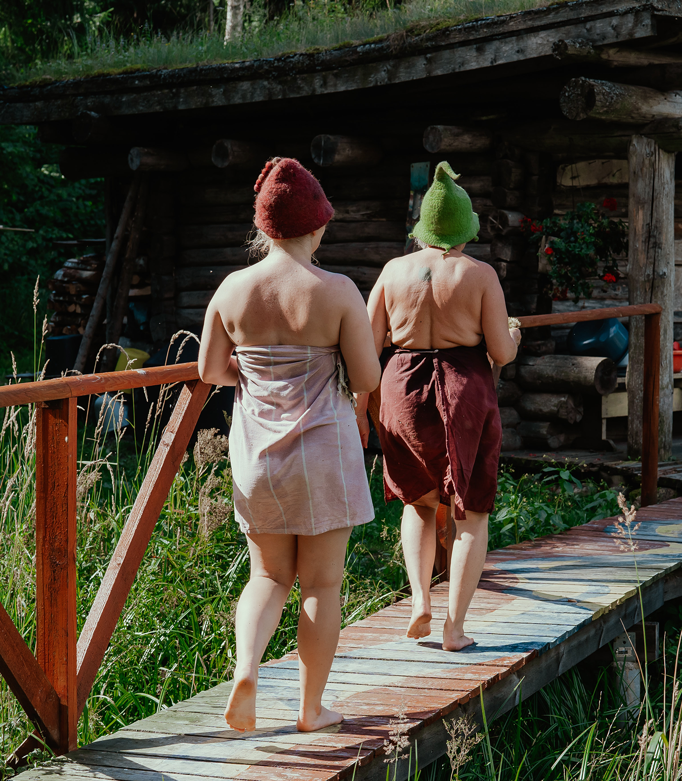
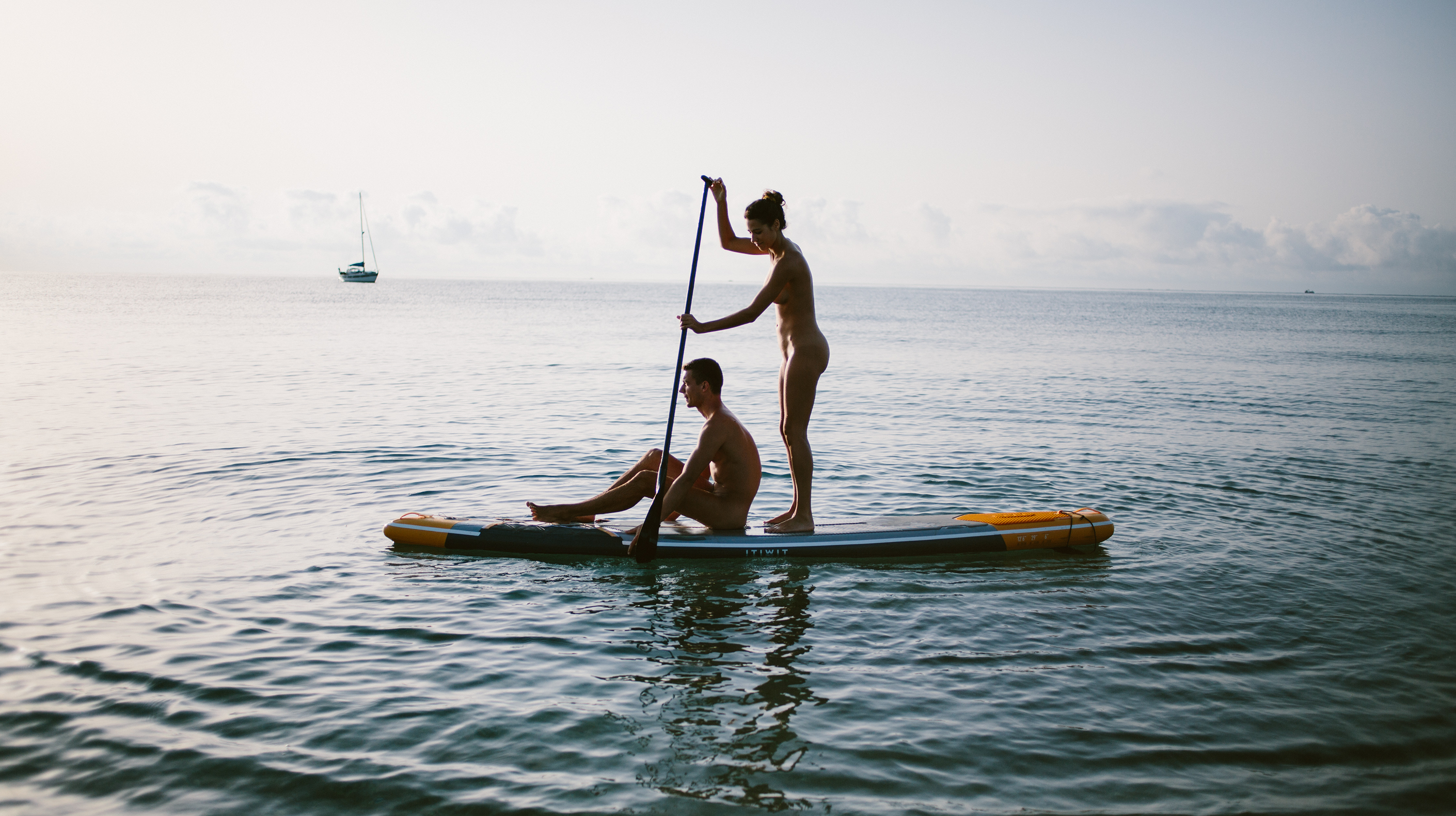
Athena consists of three naturist campsites in Belgium and the Netherlands. Beyond their beautiful grounds, what sets them apart from others is the community that has grown over the years and the lifestyle that they share. Plenty of guests now call it their (second) home and relish spending any free moment surrounded by the warm vibes of Stefan and Thomas, who took over the business from their grandfather and father.
the mission
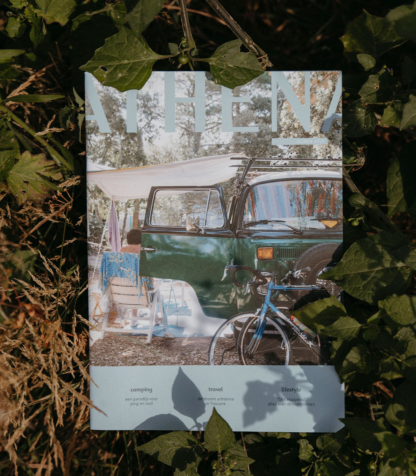
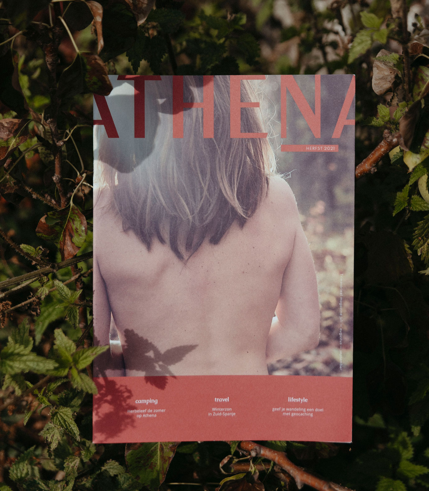
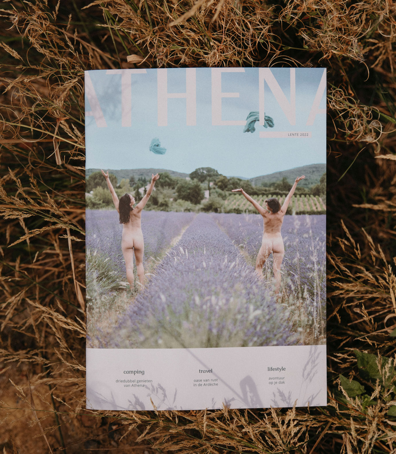
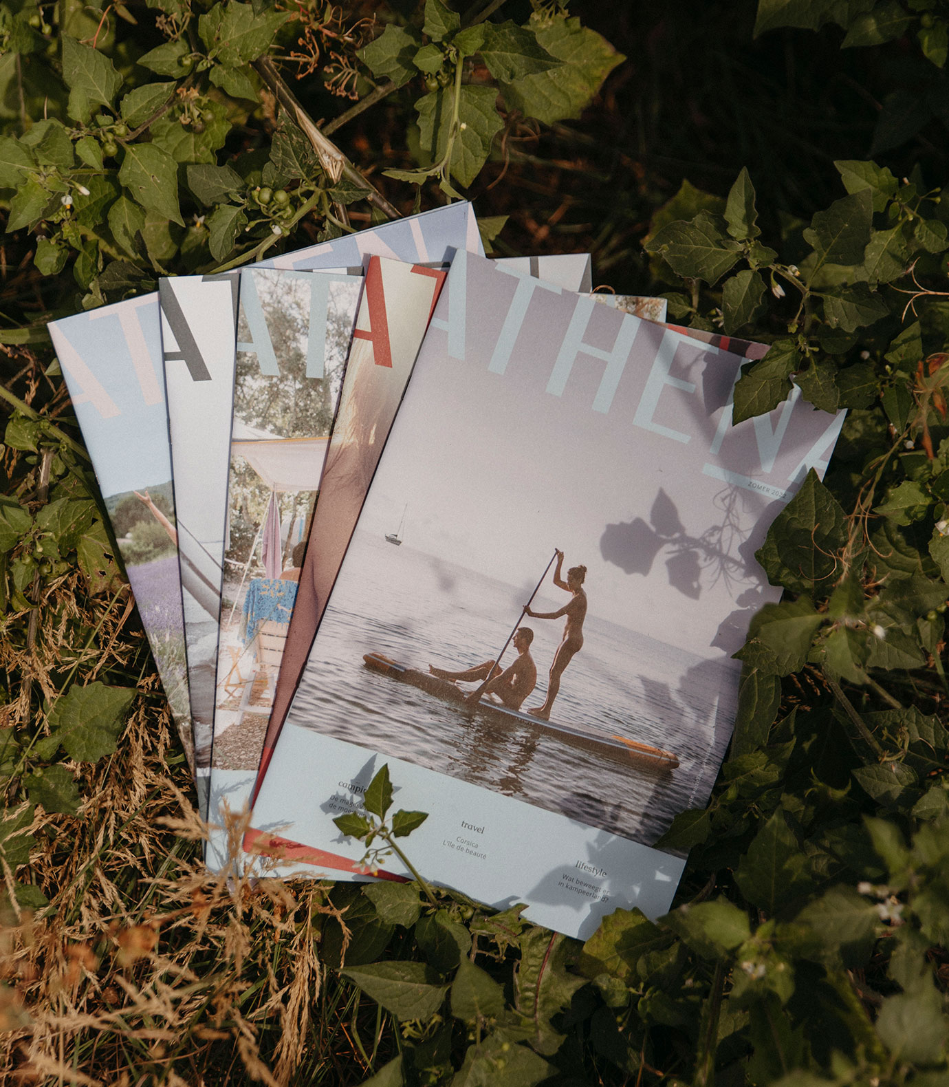
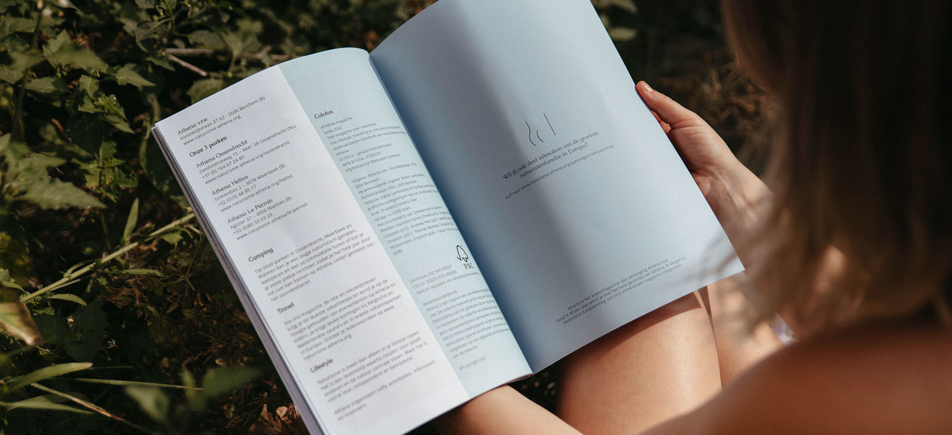
As the previous designer of the magazine was retiring after 30 years, it was time to give the quarterly magazine a new look. And hell, why not give Athena as a business a makeover? As they were renovating the sauna and the club house, this was the perfect timing for a fresh start.
the results
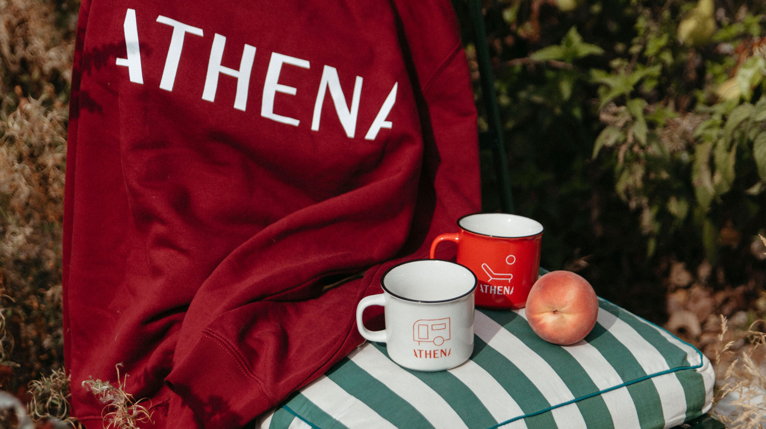
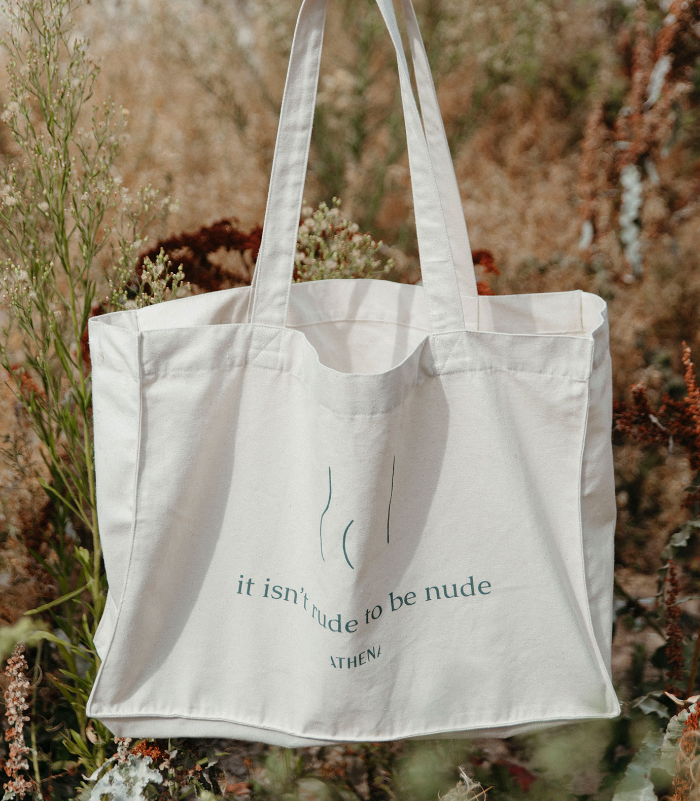
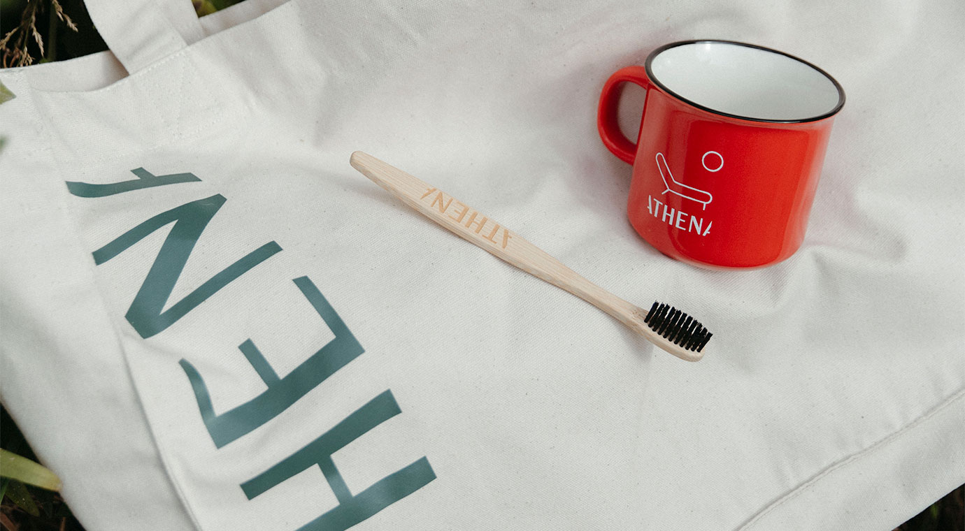
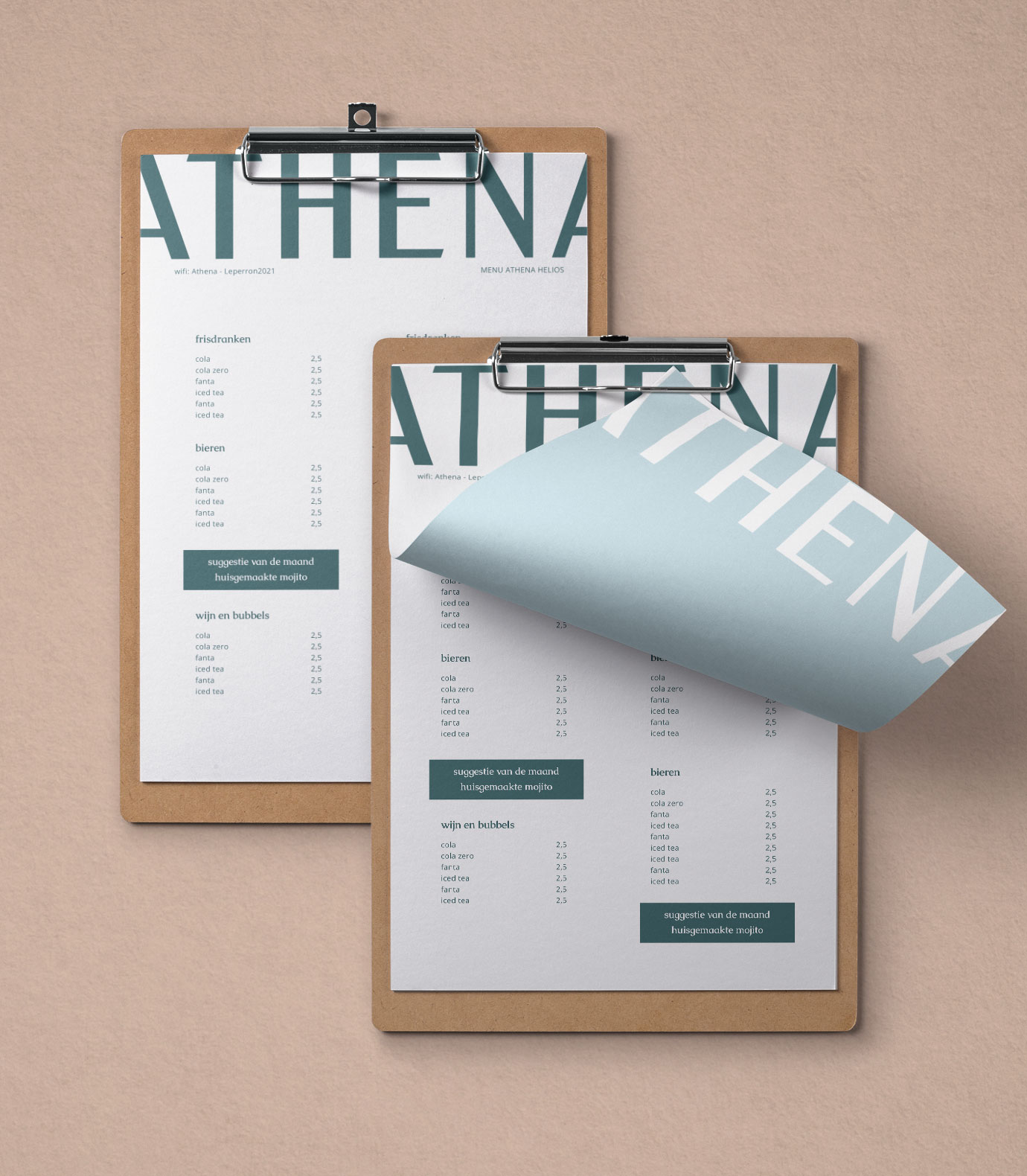
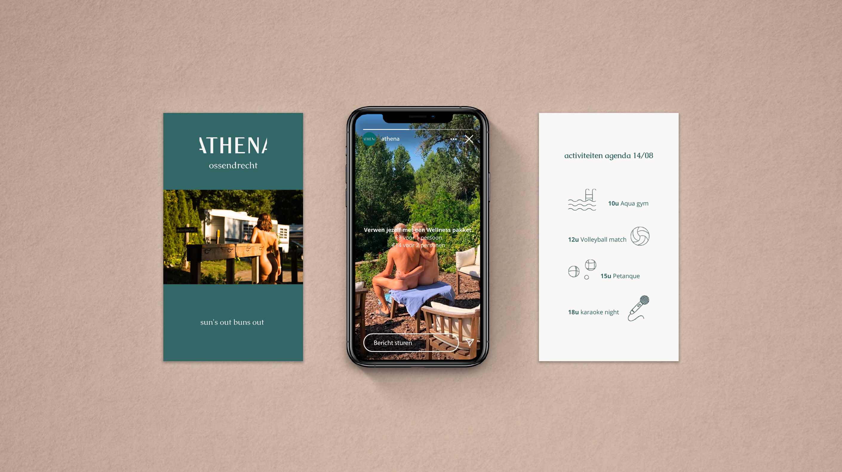
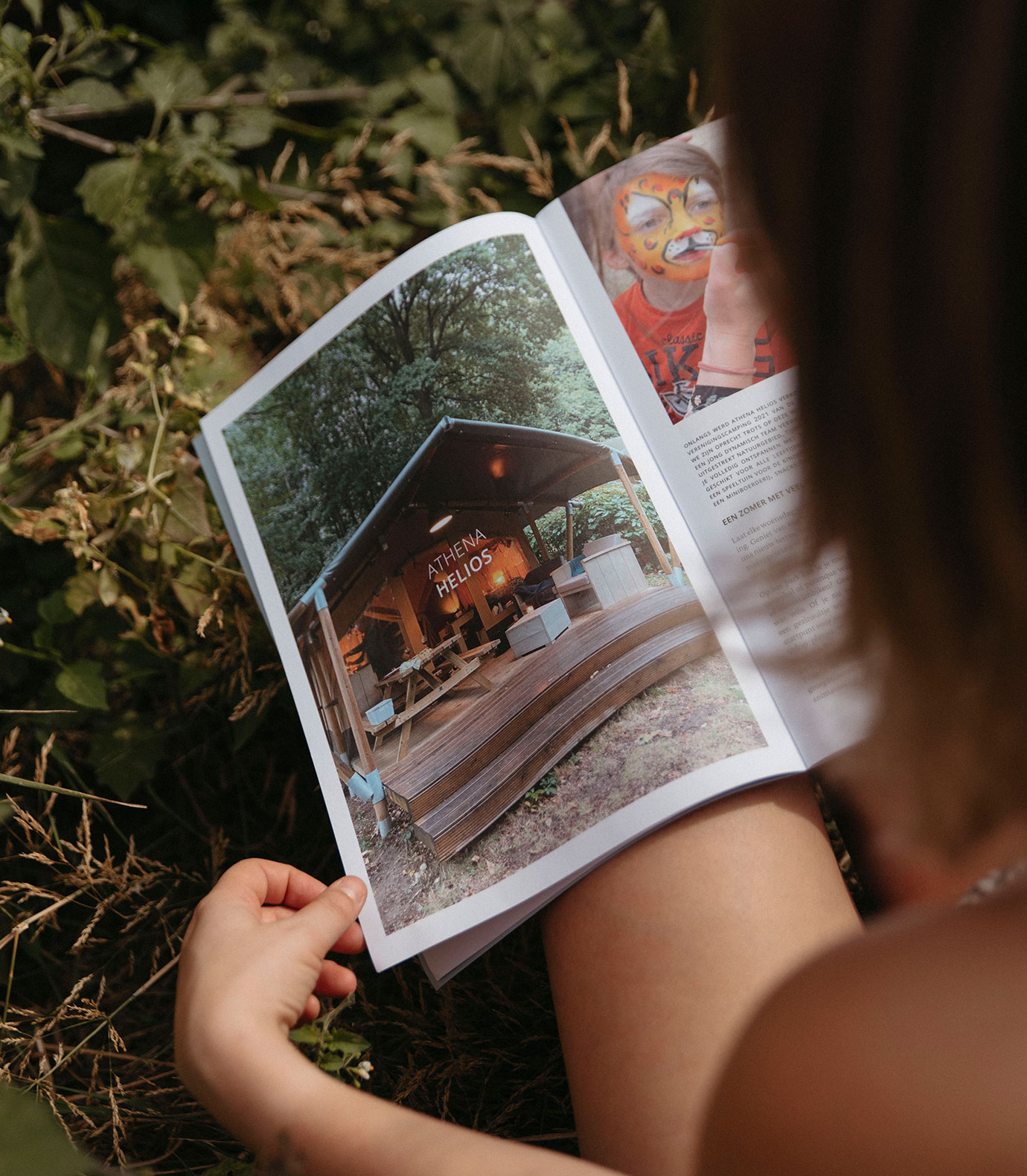
Not having a clue what naturism meant, we quickly learned it’s a lifestyle. Freedom, appreciation for nature and beauty in its simplicity are all keystones on which we base our branding concept for the new identity of Athena. We created several graphic elements that can be used together with the renewed logo. The Athena logo is powerful and recognizable and inspired by an earlier version of the logo that adorns the Ossendrecht campsite. Standing strongly on its own, or falling off the page, it’s contemporary yet was well received by the guests that have continued to return over the years.
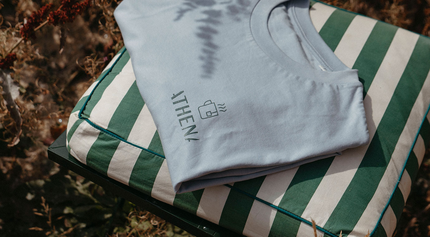
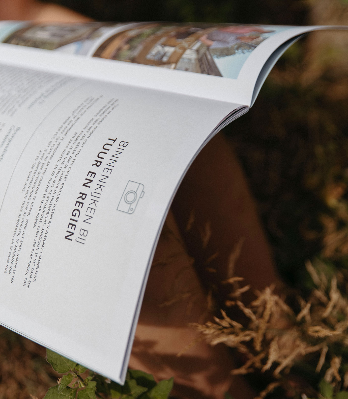
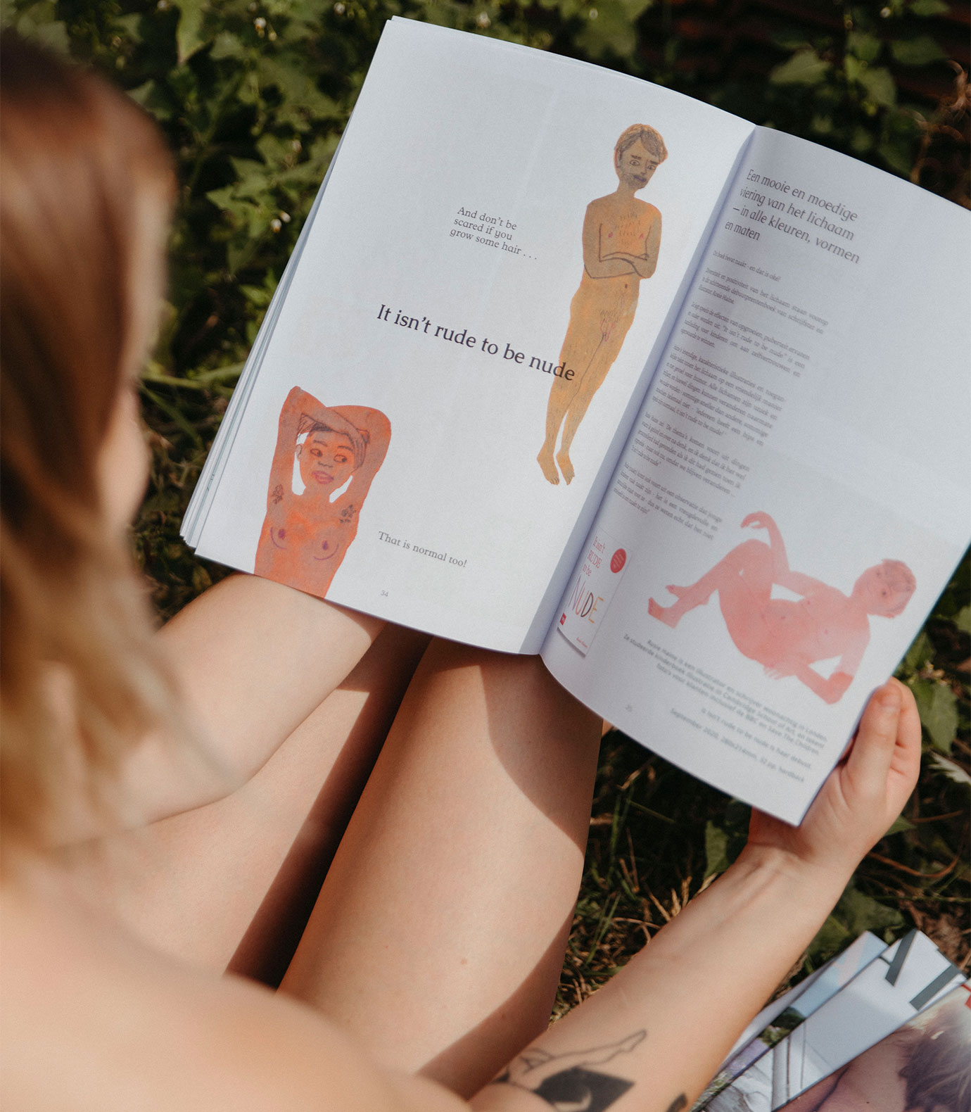
The sleek and at the same time playful icons are used on their own and as patterns. This, together with a quintessential colour palette creates the Athena identity that is both fresh and timeless. We also had fun developing a whole new website design and quarterly magazine. Aren’t you curious? Just get a membership and look for yourself!
