De Linde
services
Brand identity
Melsbroek, a village steeped in history, is today under pressure from urbanisation. Local businesses have largely disappeared, forcing residents to go outside the village for basic amenities. Buurtpunt De Linde is the long-awaited project of Karen and Bart, born out of their deeply rooted social commitment and love for the village and its residents. They have transformed the former café De Linde into a vibrant neighbourhood center.
the mission
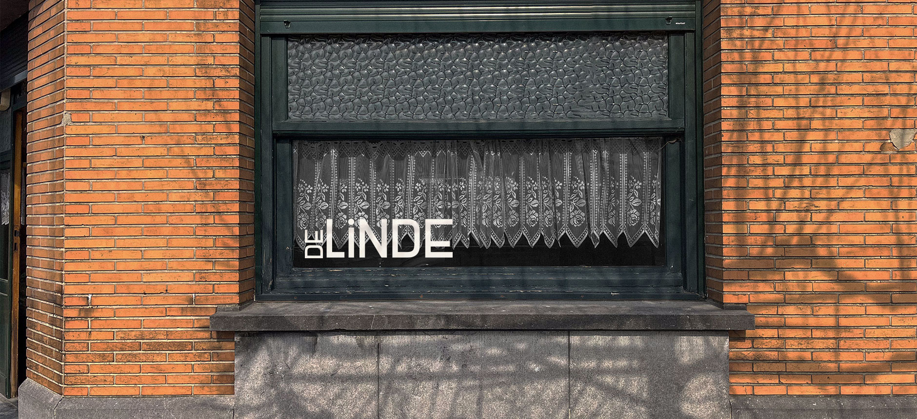
For De Linde we created an identity that honoured the community it serves, with a reflection on its authentic architectural elements. Additionally it needed to be adaptable to the varied functions of the space as bar, event hall and general community space.
the results
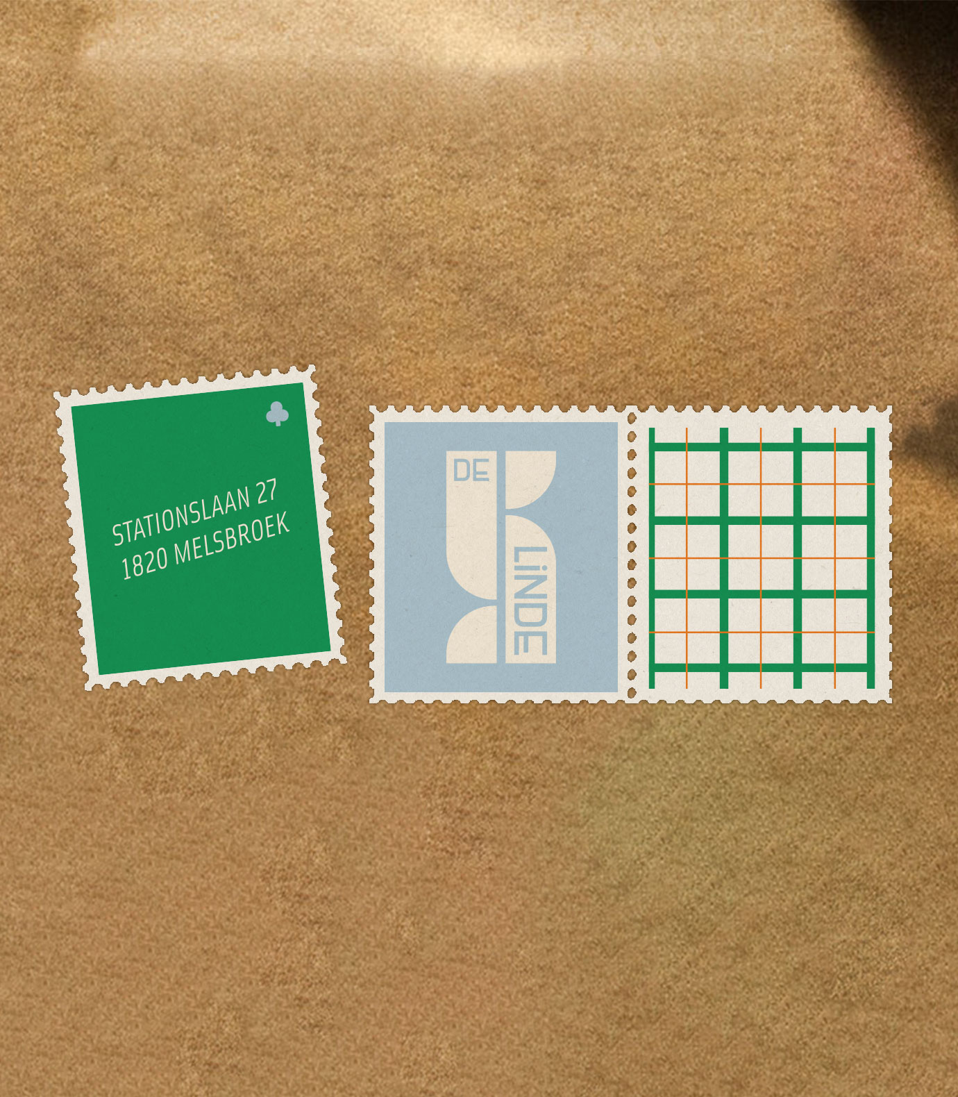
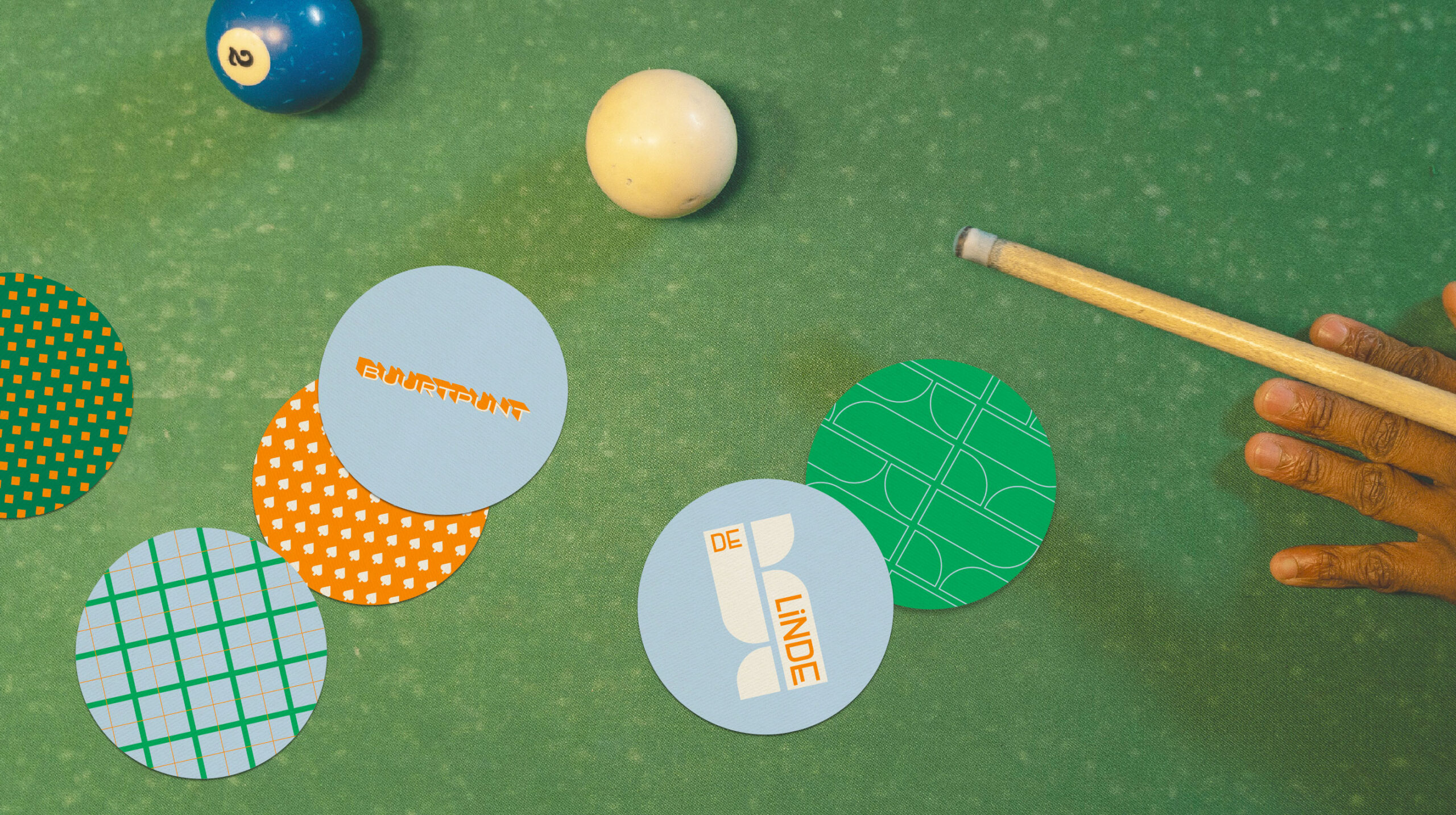
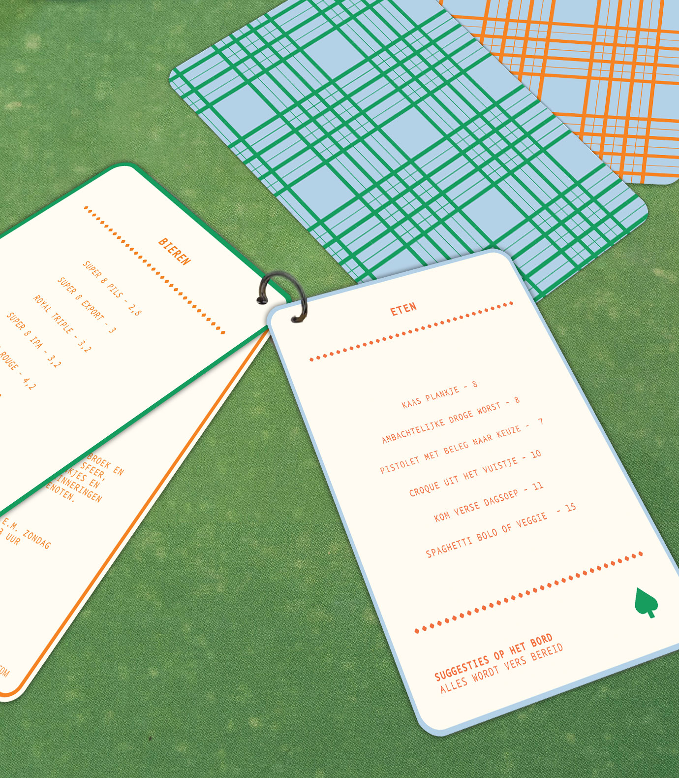
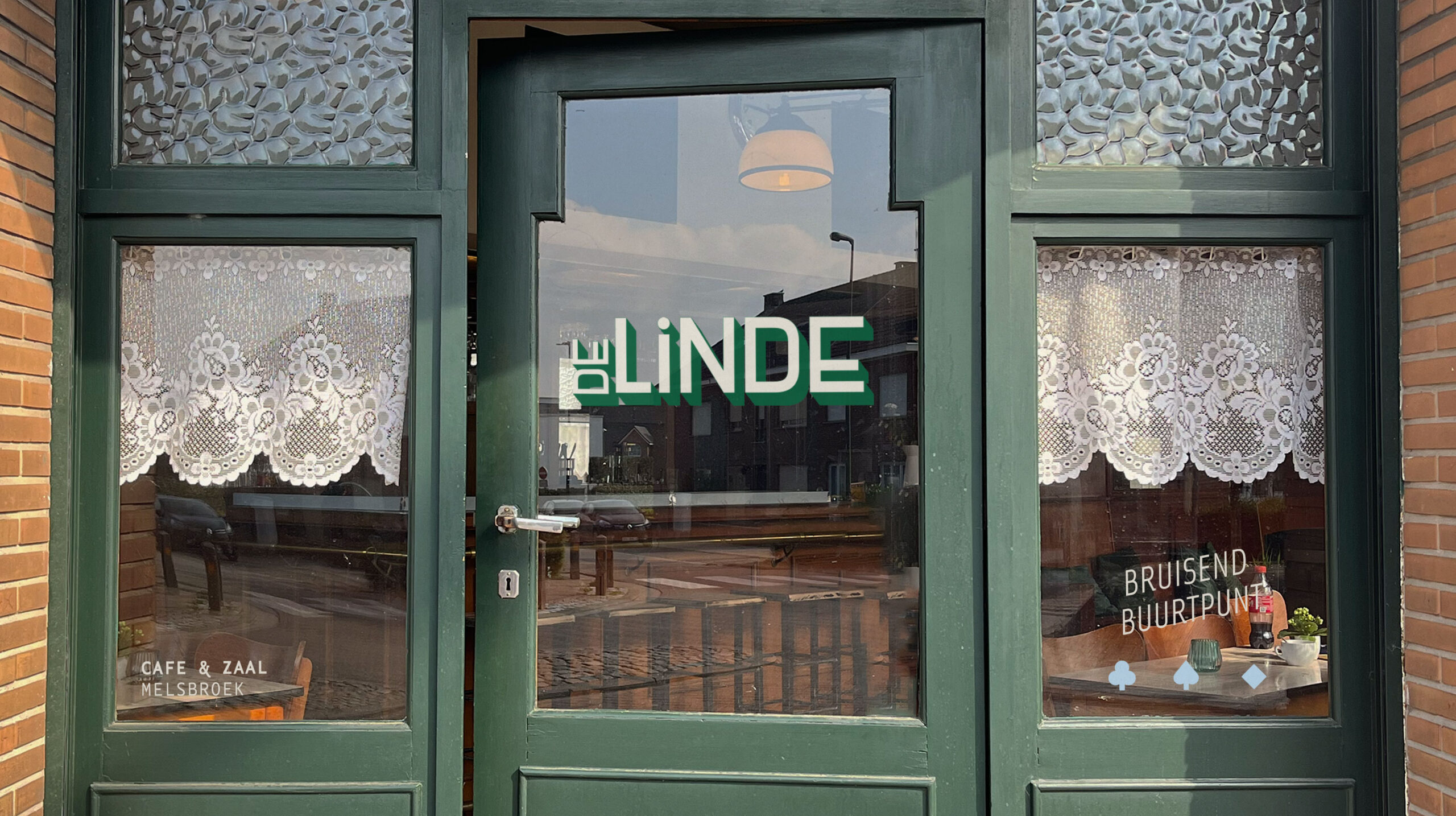
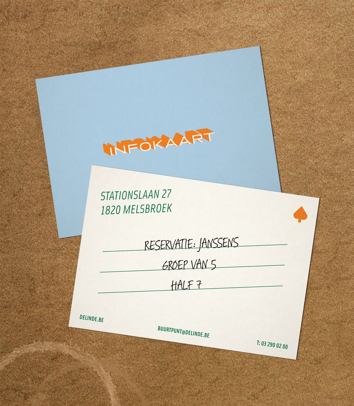
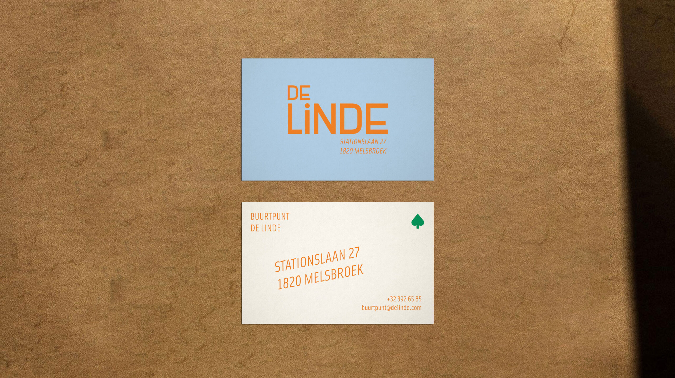
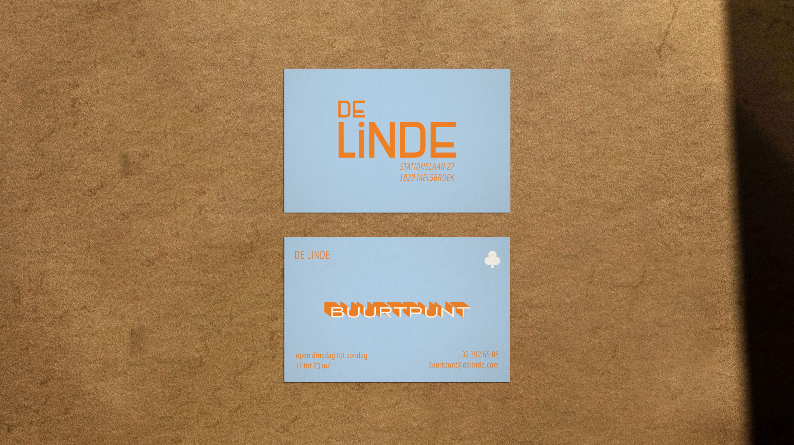
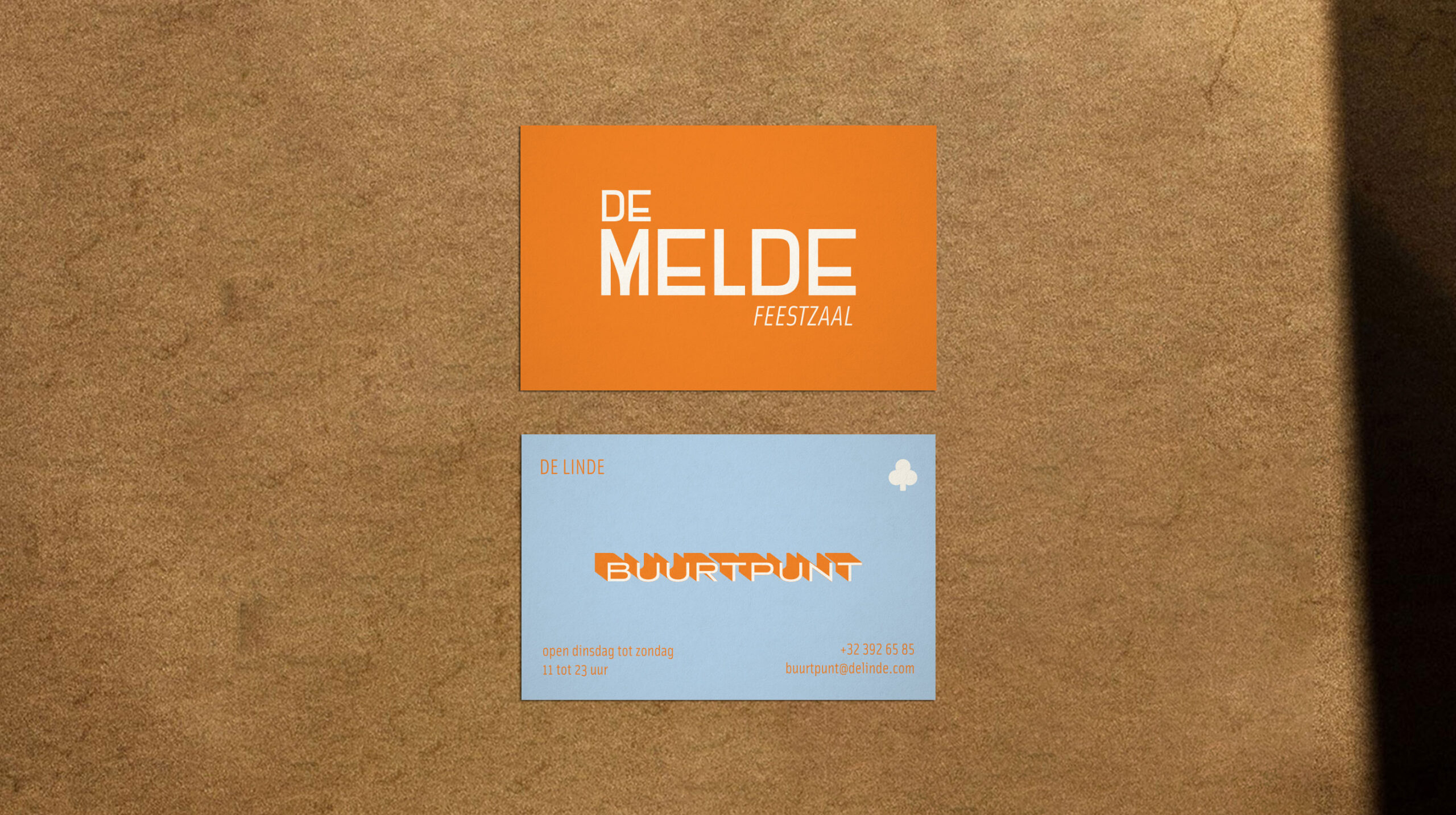
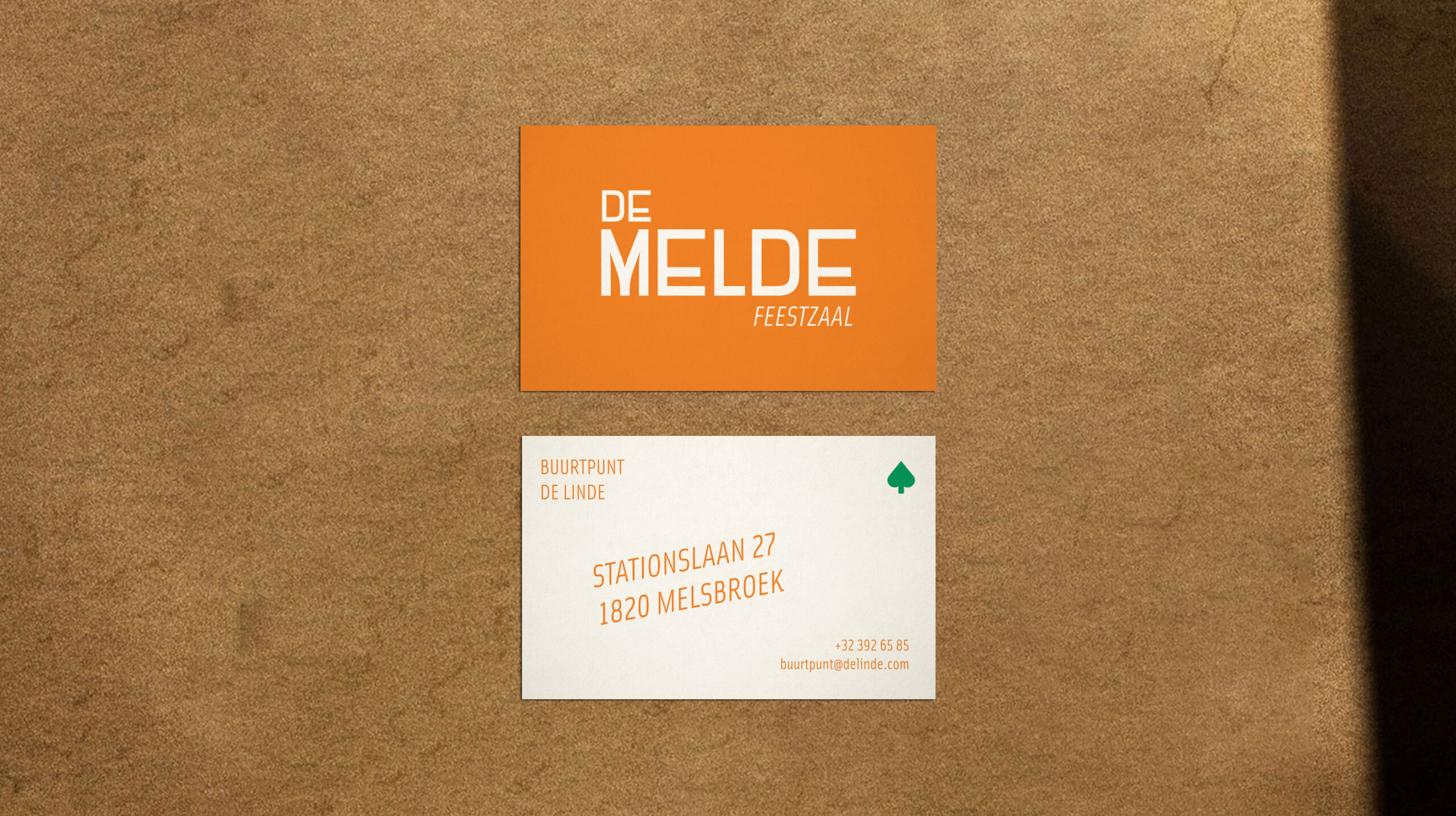
When designing the visual identity, consideration was given to the historical features of the space, but also aimed at attractiveness for future village residents. The typical colours of the former café, orange and green, have been retained, but light blue has been added to create a fresh look. A shadow background in the logo is used as a nod to the mural on the building. The added icons are a representation of the linden tree, the linden leaf, and a symbolic representation of a neighbourhood center. Some patterns, derived from the bricks and the interior, have also been integrated to complete the visual identity.
