Immo
Bosmans Buro
services
Brand identity
Print collaterals
credits
Website Grove Lust
Immo Bosmans Buro is a family business where the personal connection with the client makes them stand out from the rest. It’s the difference between finding a house and a home. Having the two daughters join the company, it was time for a fresh start.
the mission
With expertise in both real estate and insurance, the identity needed to be both approachable and dependable. Recognisable in the streets but not shouty. To add a little extra flavour we wanted to pull from their name ‘Bosmans’ (forest).
the results
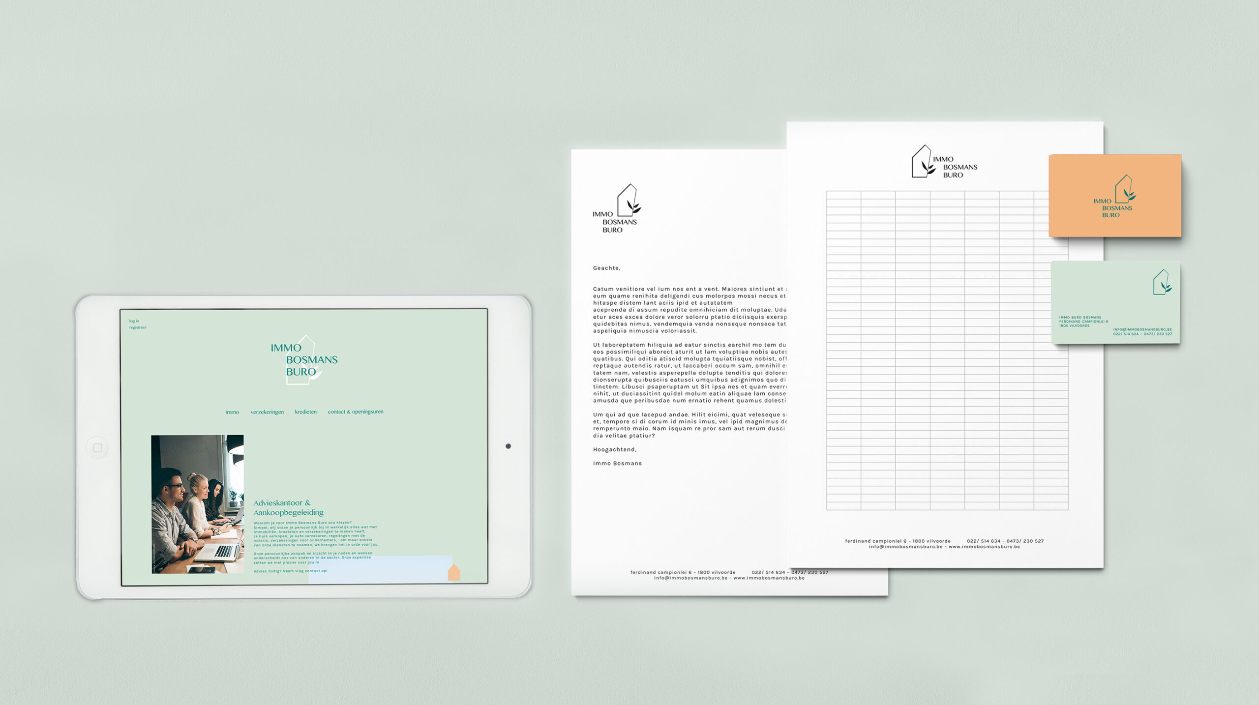
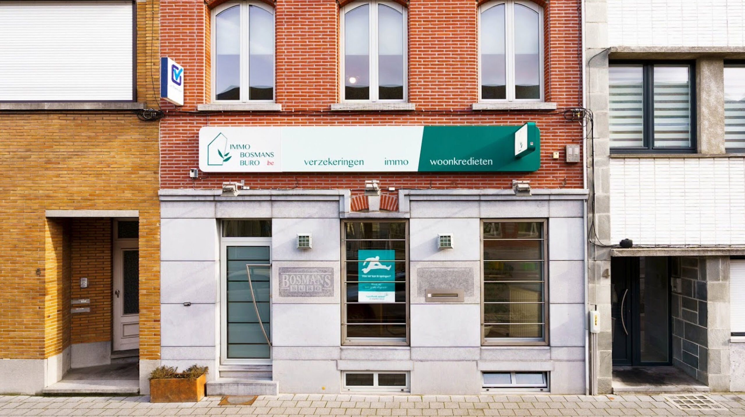
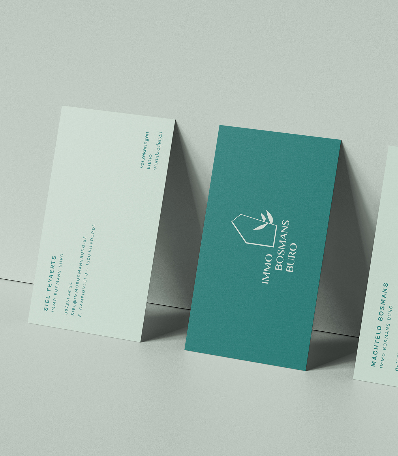
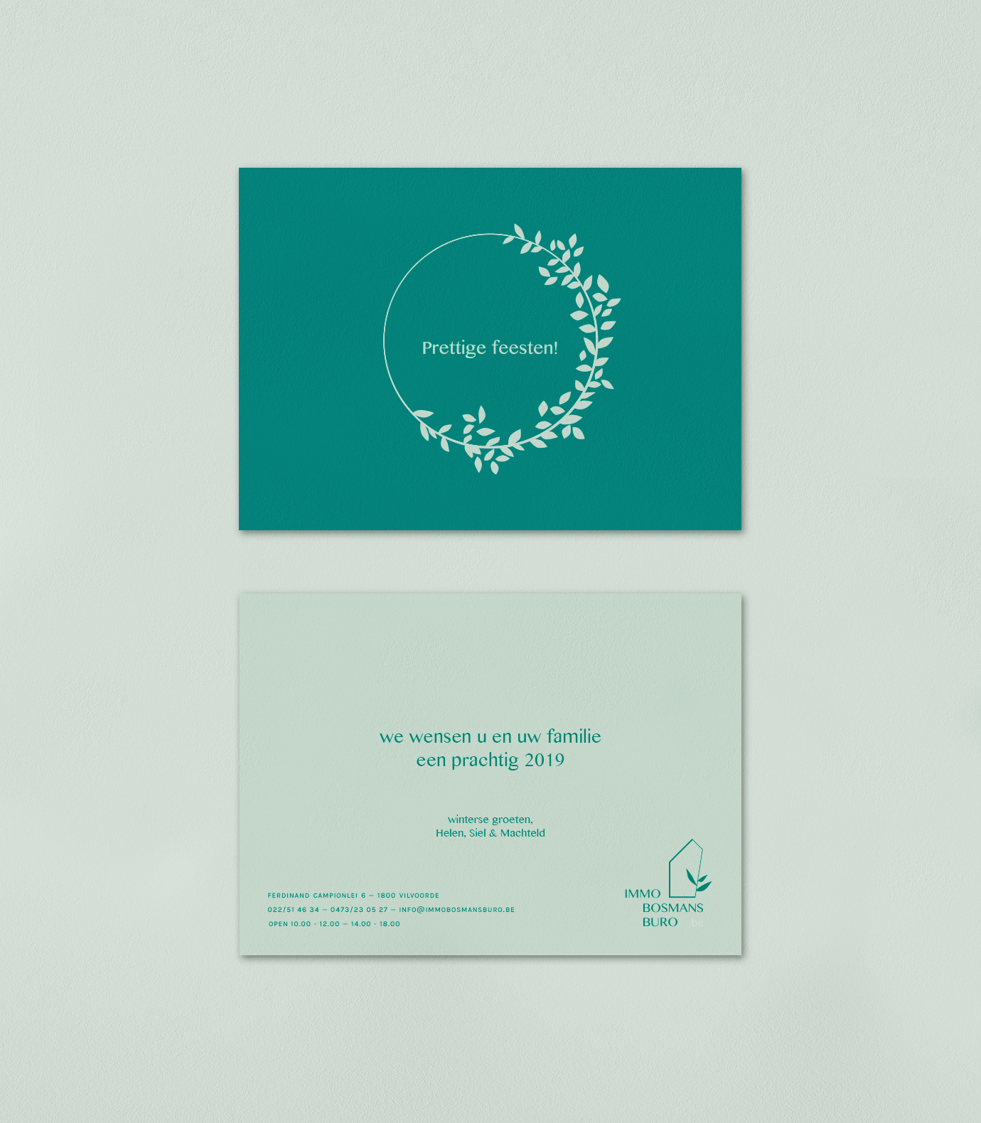
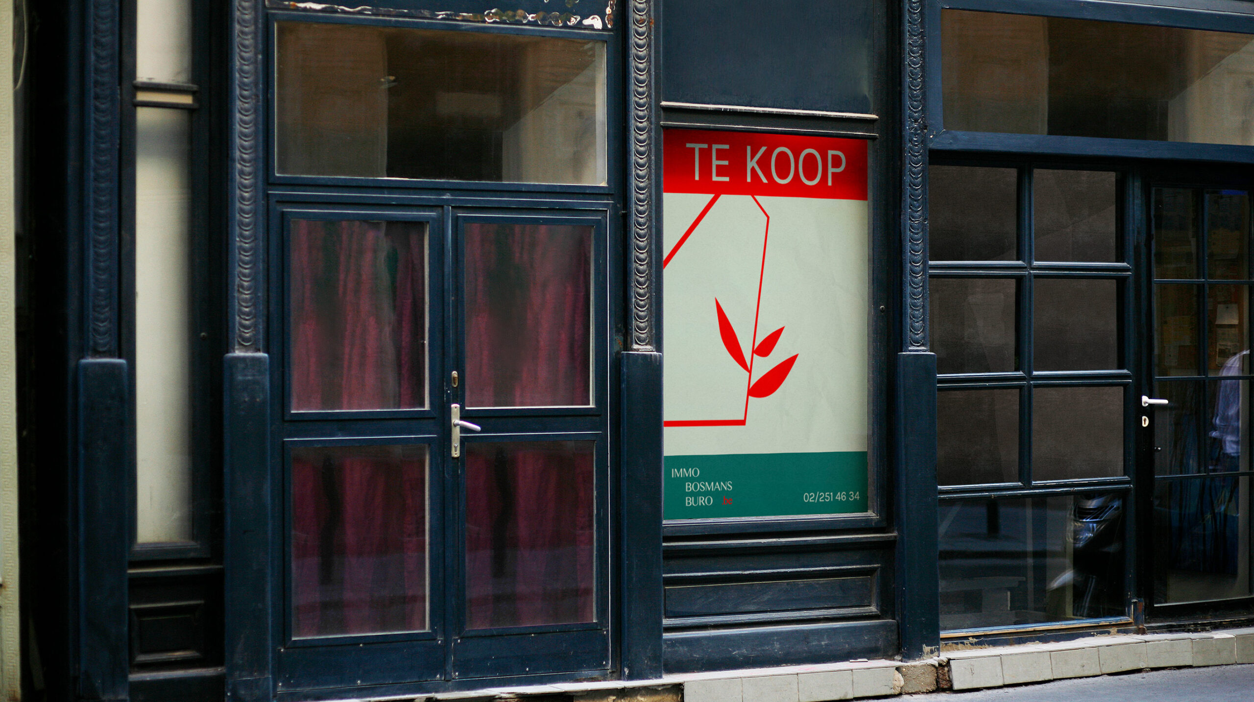
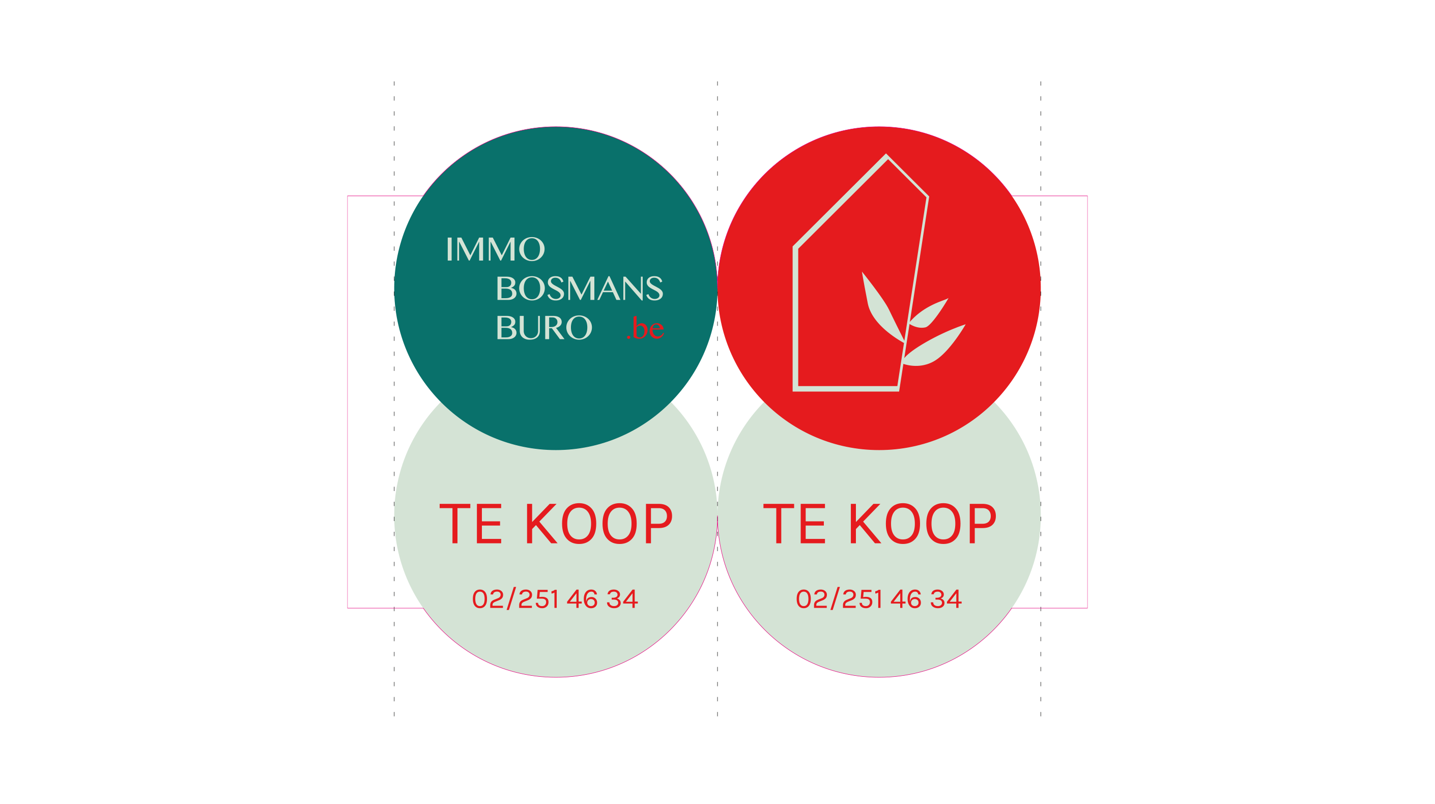
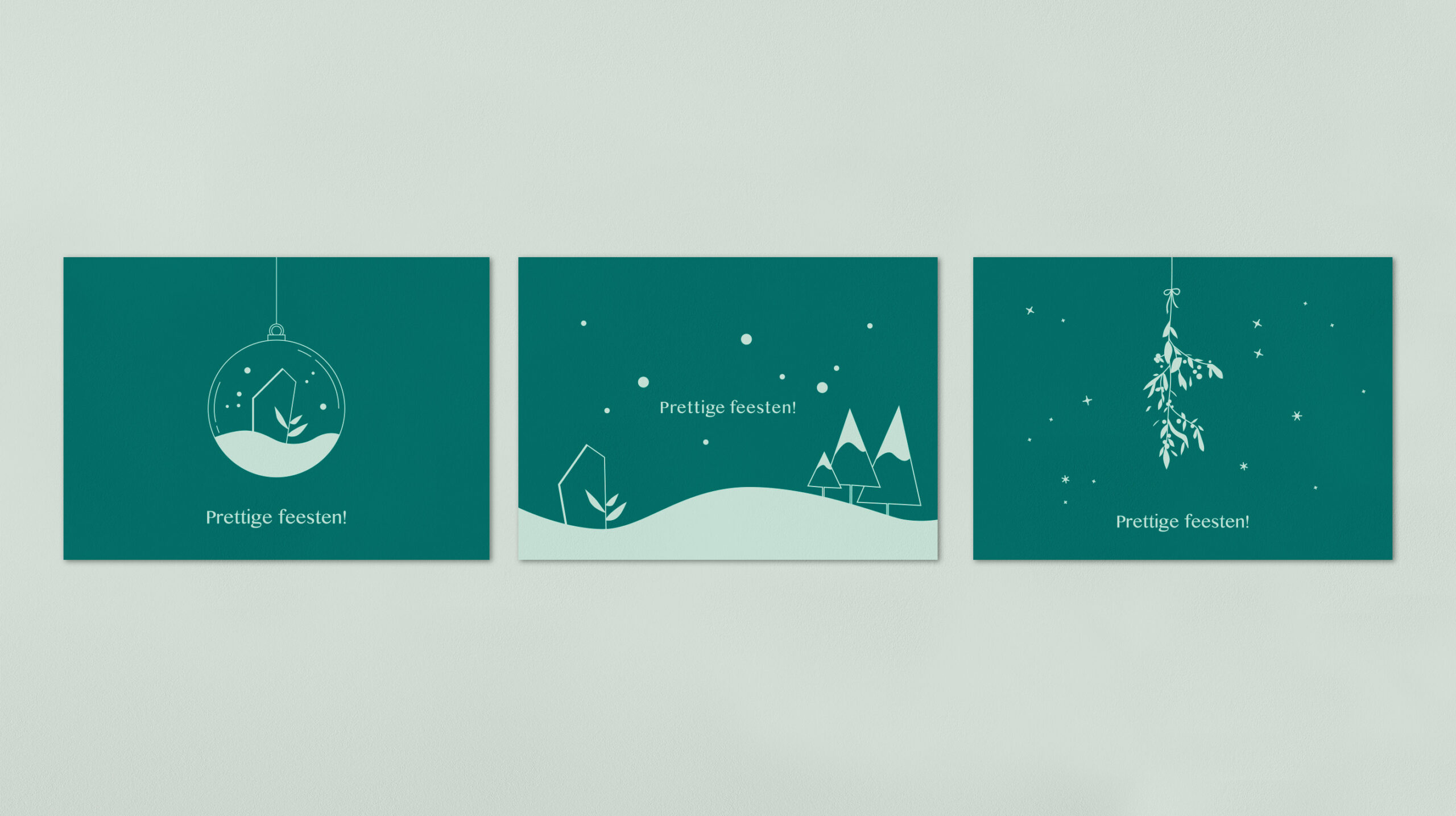
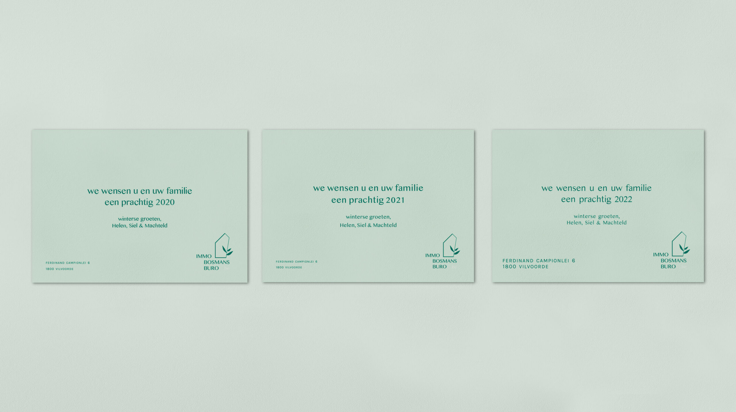
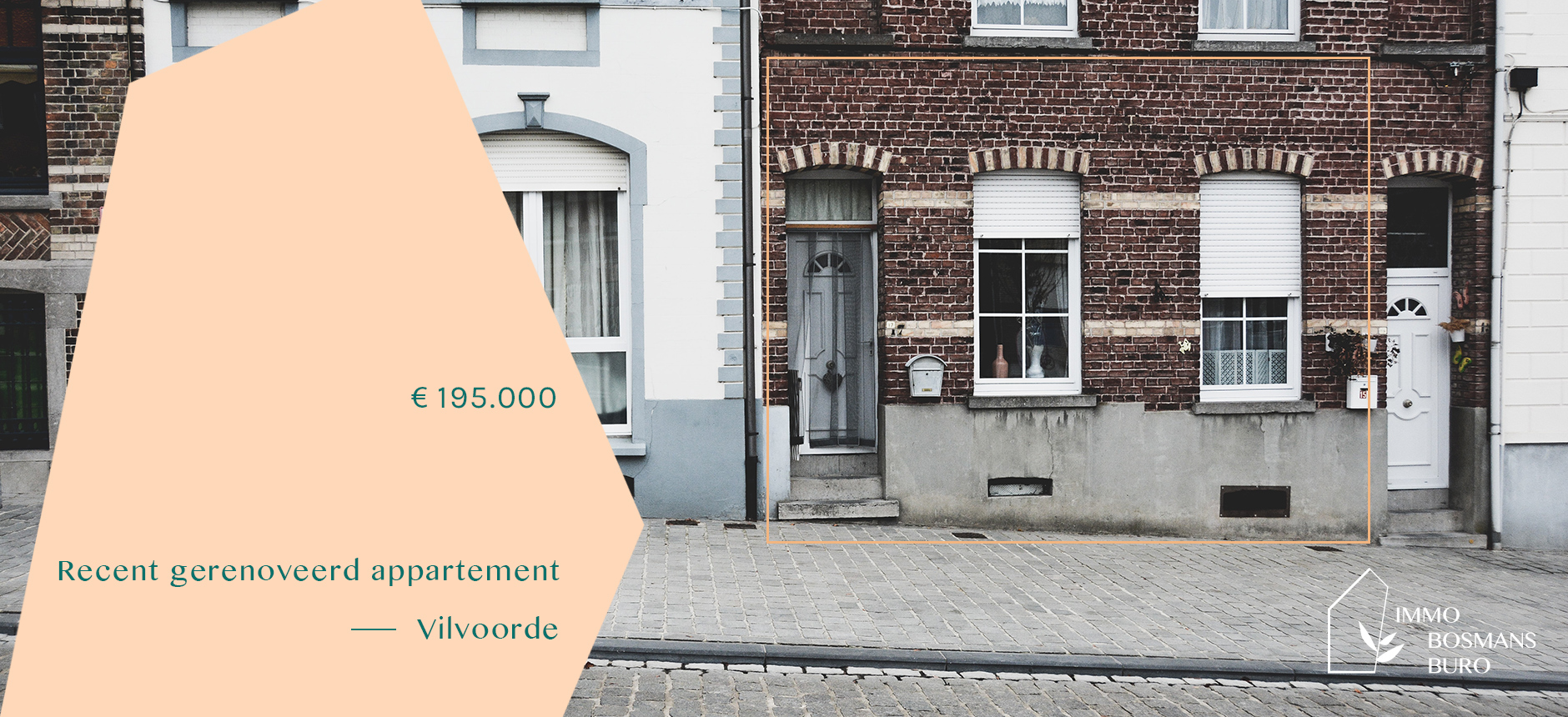
We created a logo that is dynamic because of its variety in lockup options which is important for a company in real estate where applications vary. The icon by itself, including the website, horizontal or vertical: you name it we had a solution. The graphic element is very dynamic allowing for variety in its implementation. The tone on tone greens make for clean continuity while the abricot and red are nice to break it all up and make everything a bit more exciting. The icon was a starting point for the illustration language that was developed and continues to provide inspiration for the yearly Christmas card.
