Optiek de Putter
services
Brand identity
Print collaterals
Website
Socials
credits
Interior design Studio Haver
Photography Hannelore Veelaert
& Alexandra Bertels
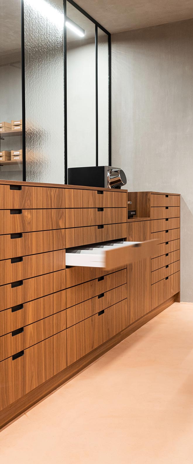
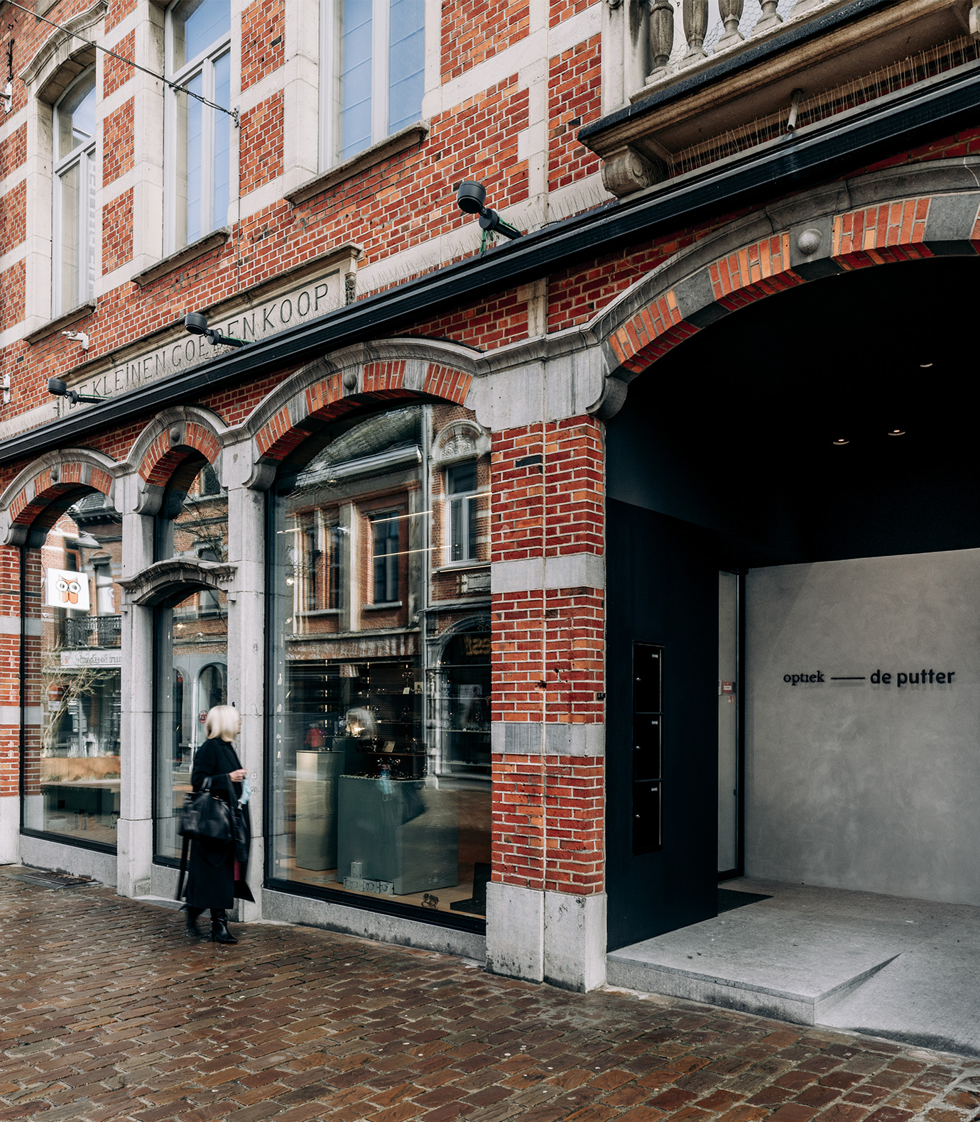
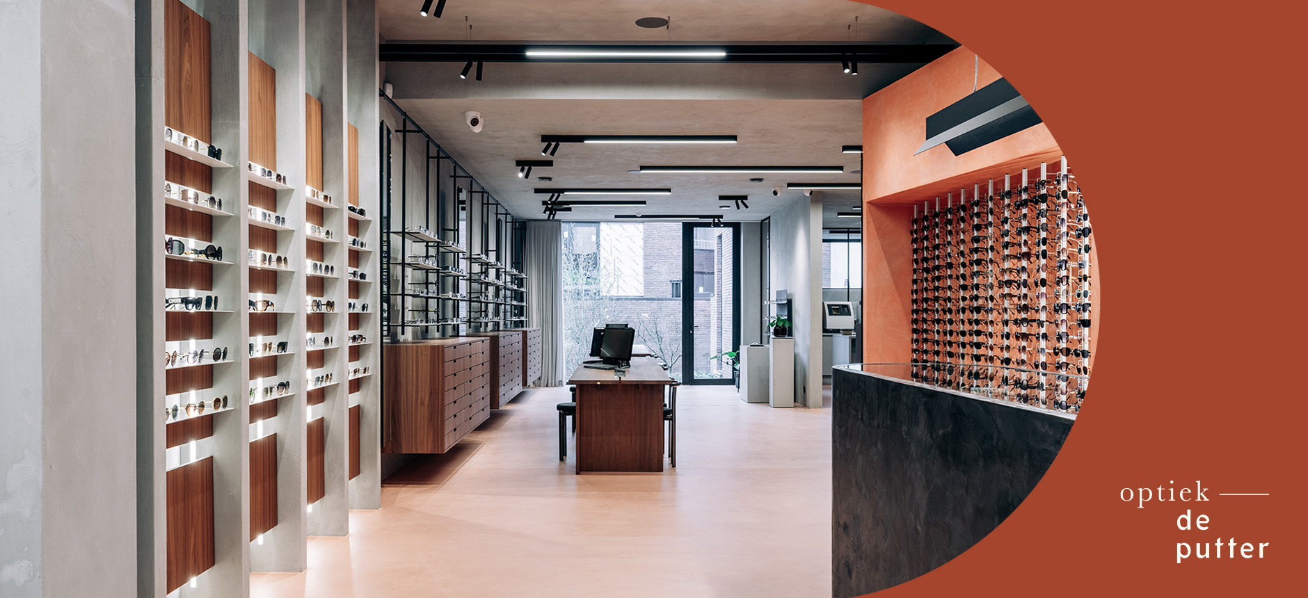
Optiek De Putter is a third generation optician whose breadth of knowledge and dedication has made it a staple within the community of Aarschot. The rebranding of the family business came along with the renovation of the interior. Together with Judith from Studio Haver, we teamed up to build a strong concept.
the mission
Looking at the future, yet respecting what their grandfather had established, we wanted to create an identity that reflects the characteristics of the family: jovial, warm and with passion and expertise. While focusing on the individual’s experience and ability to define themselves within the space.
the results
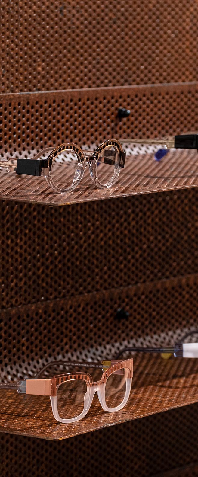
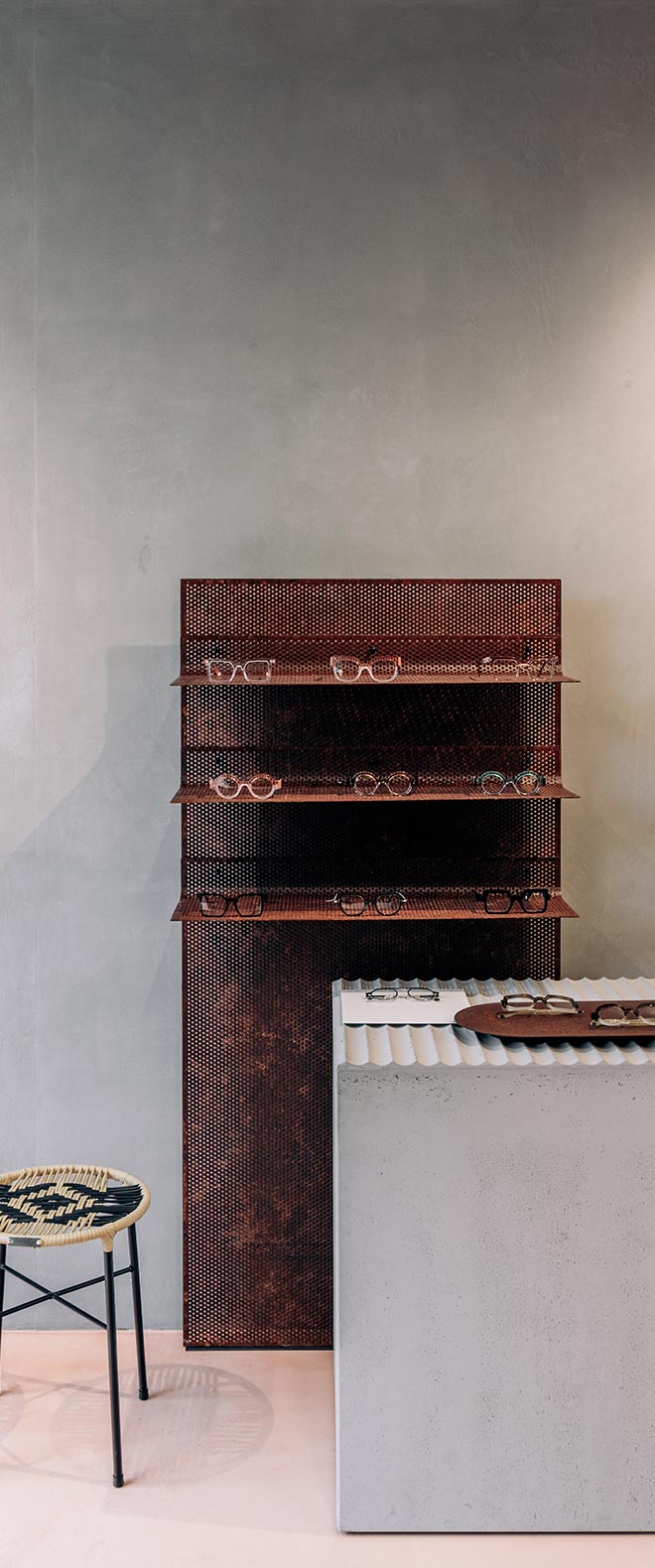
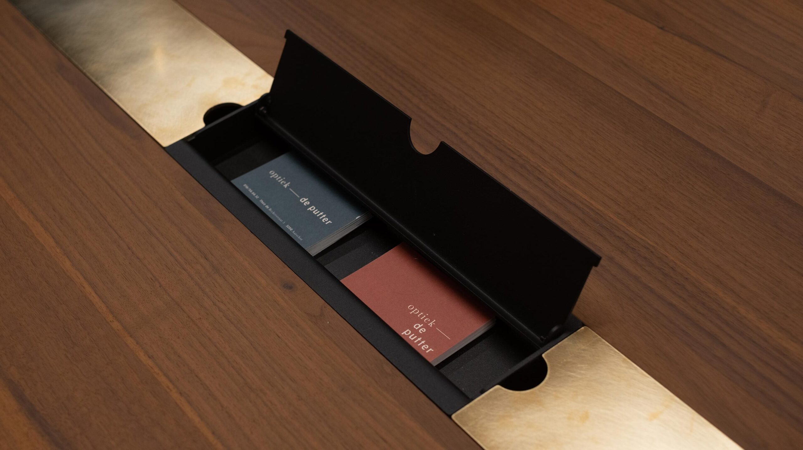
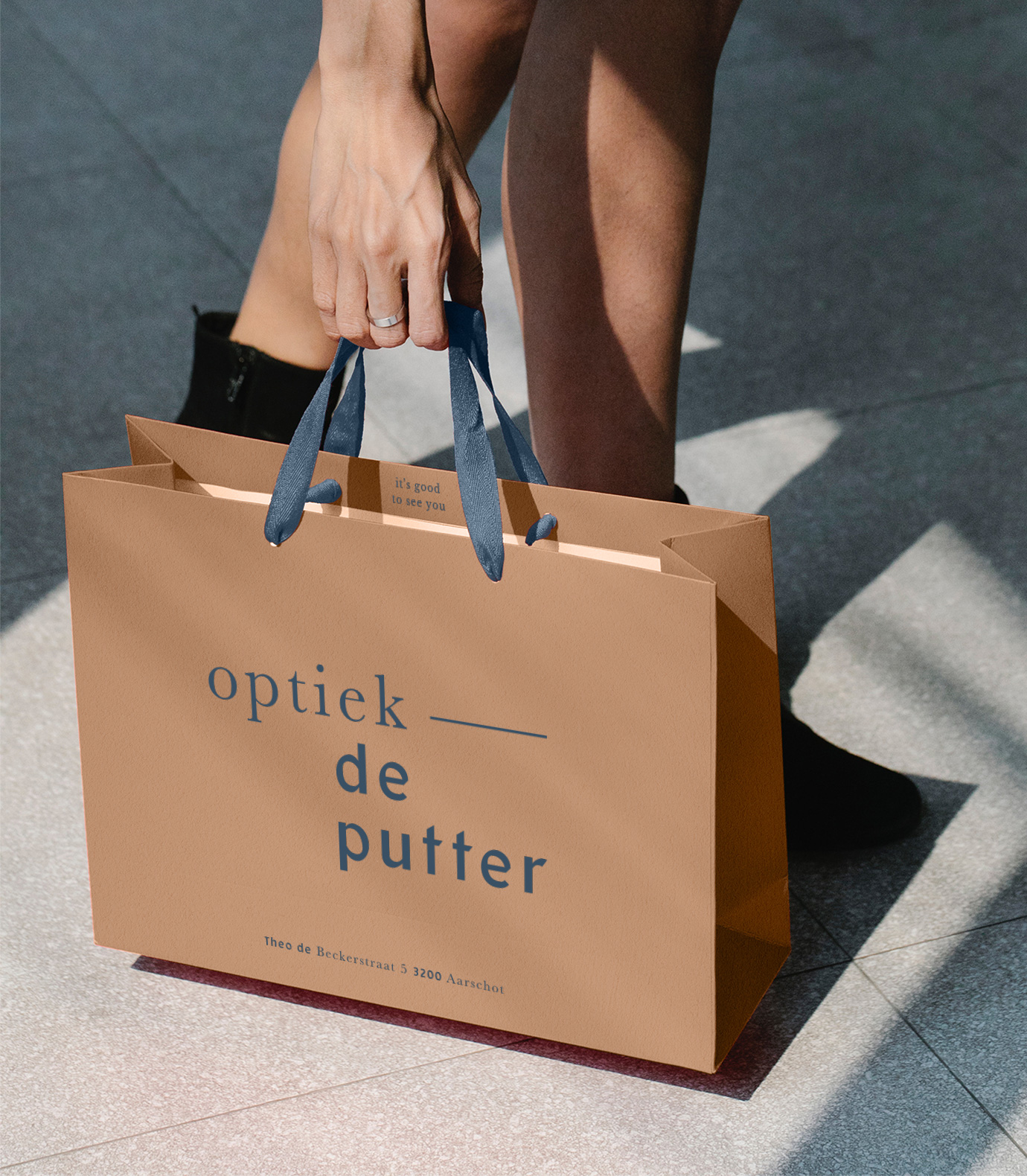
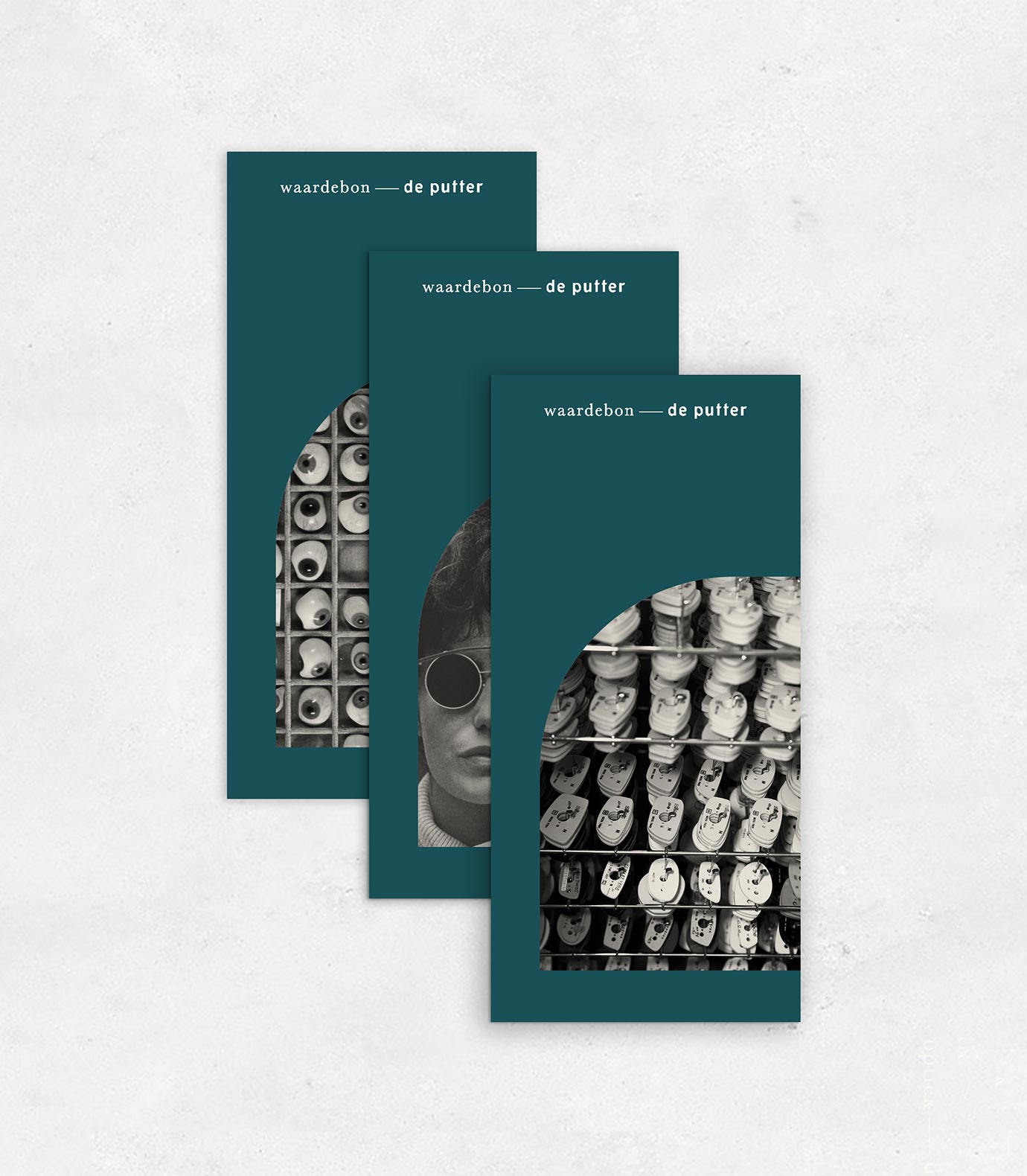
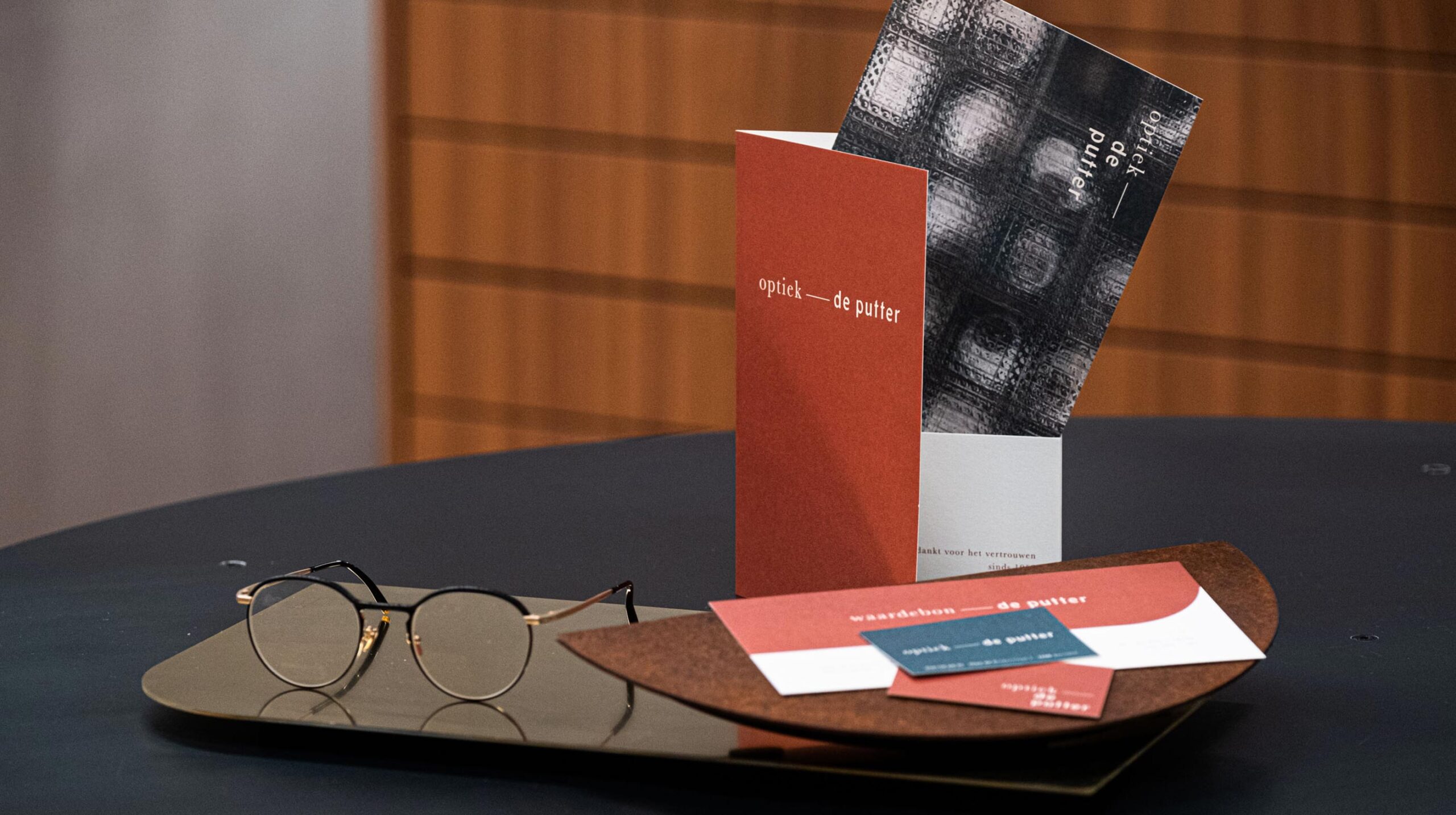
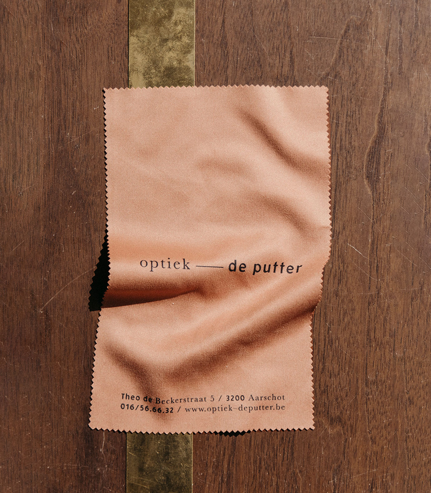
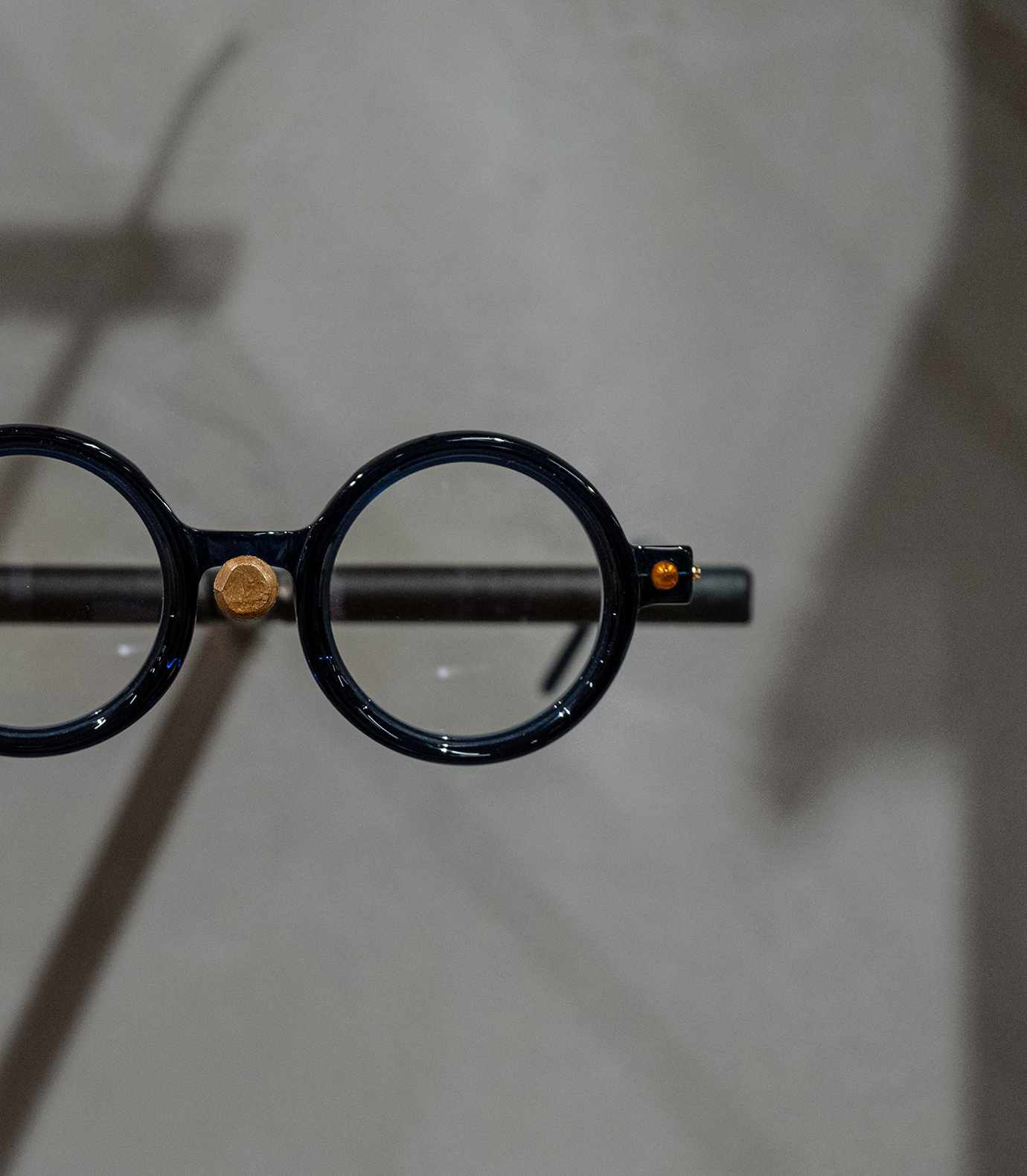
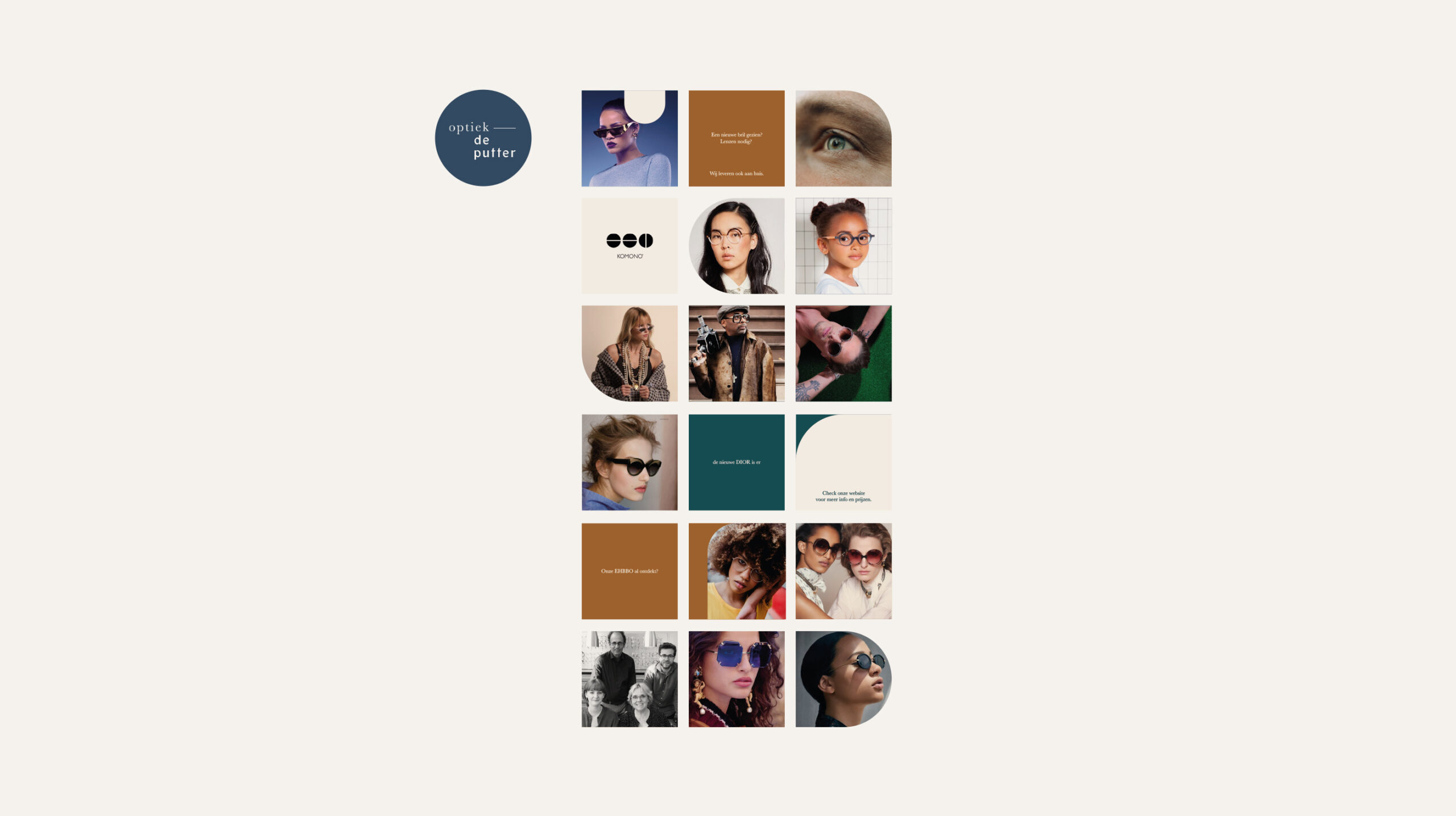
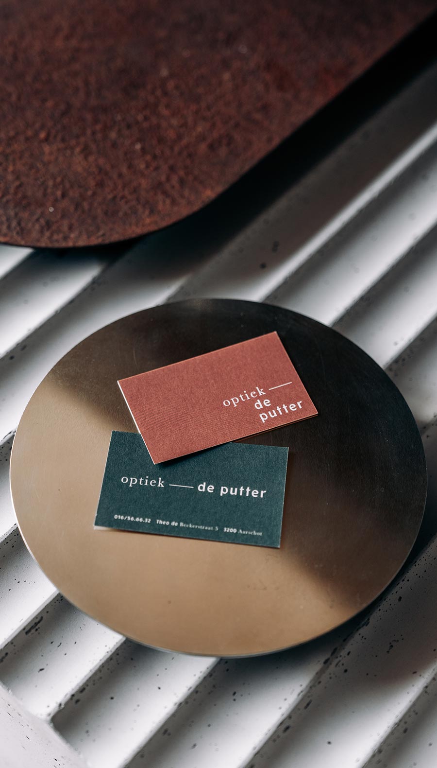
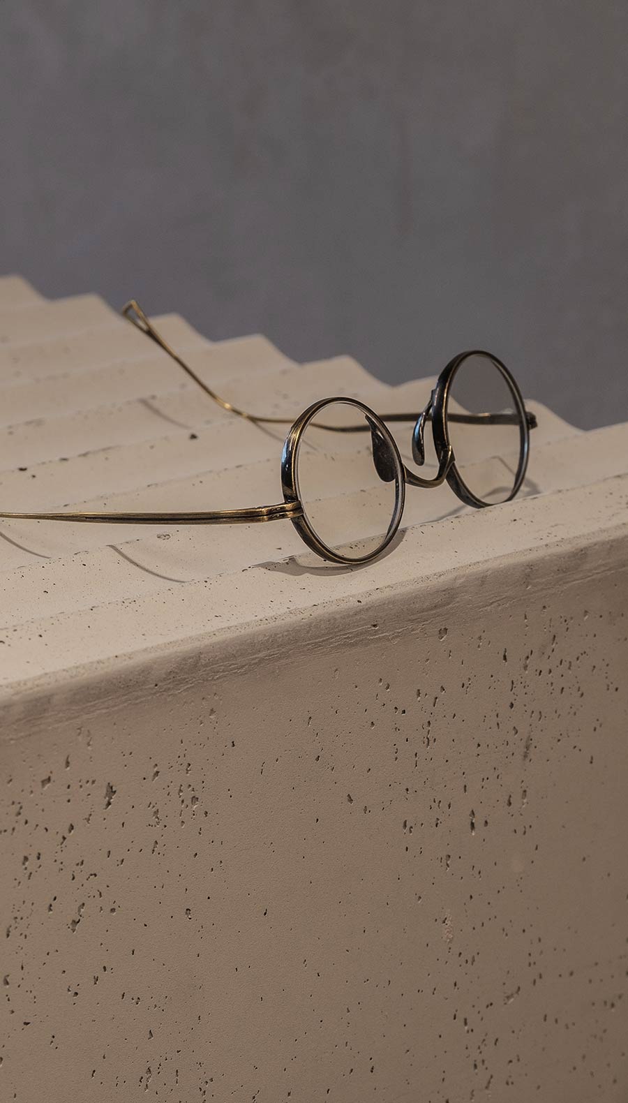
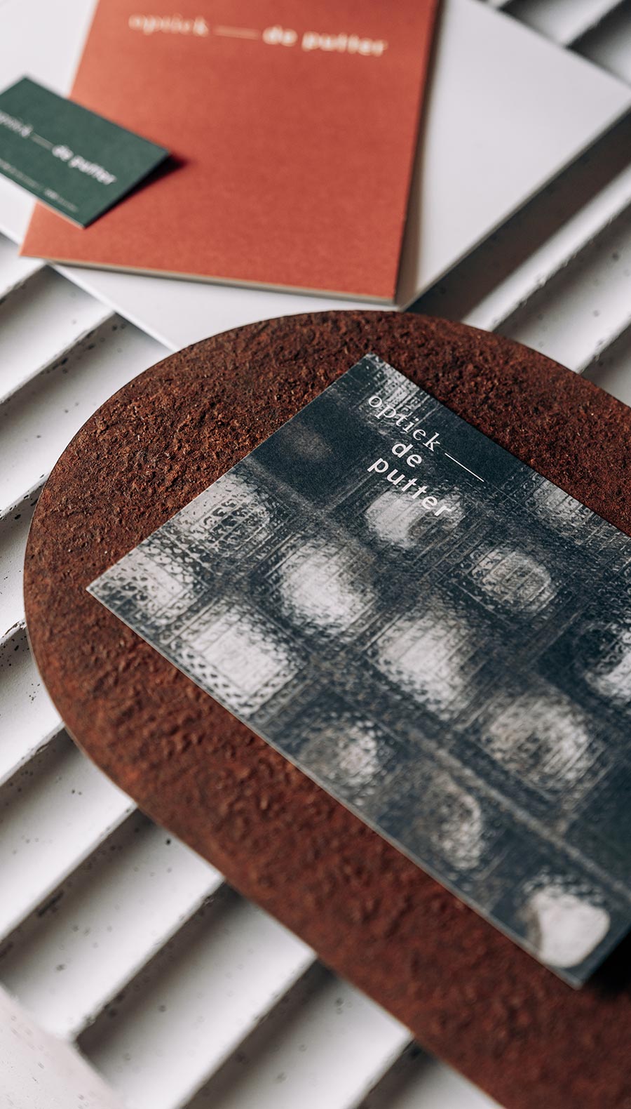
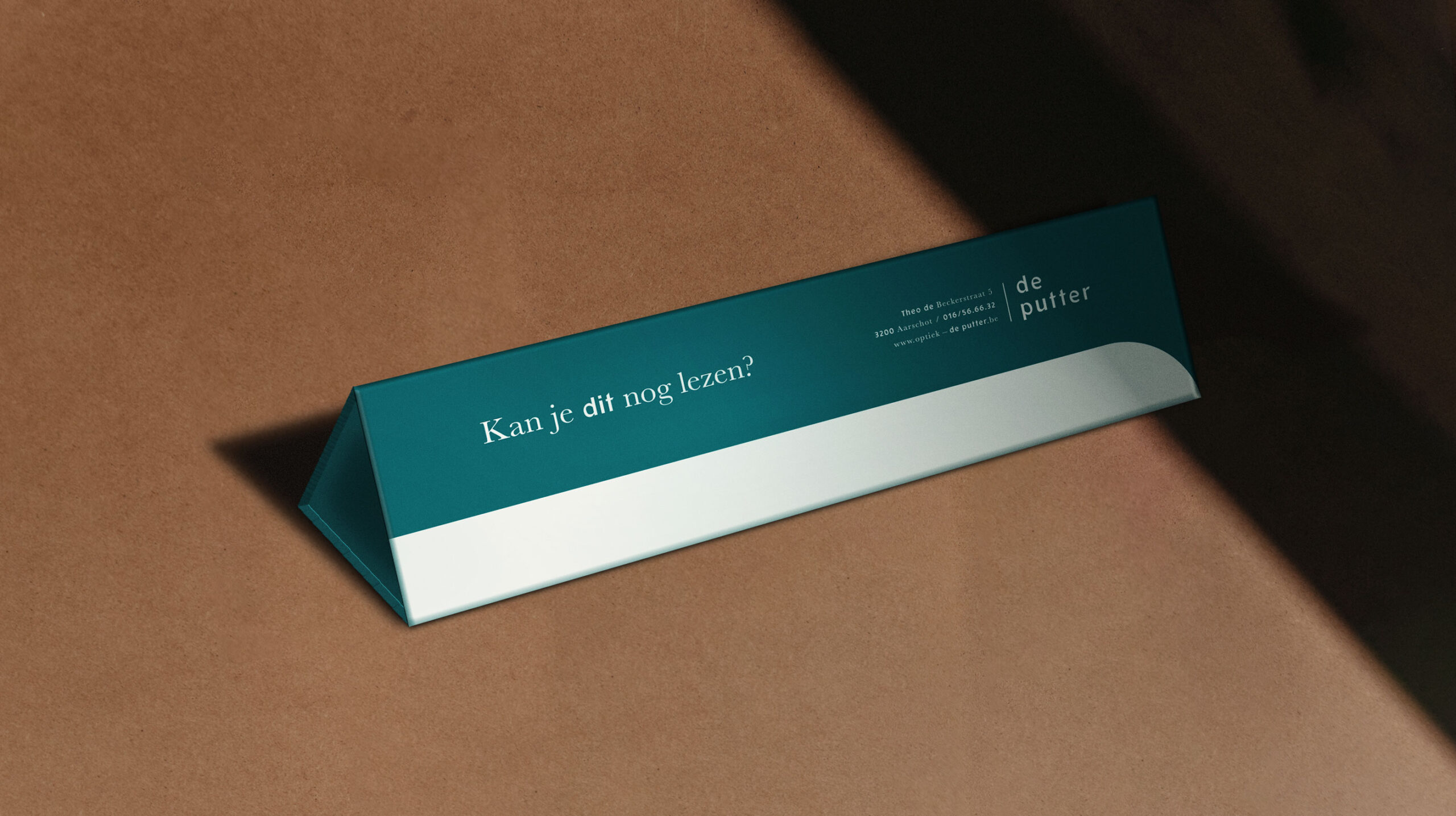
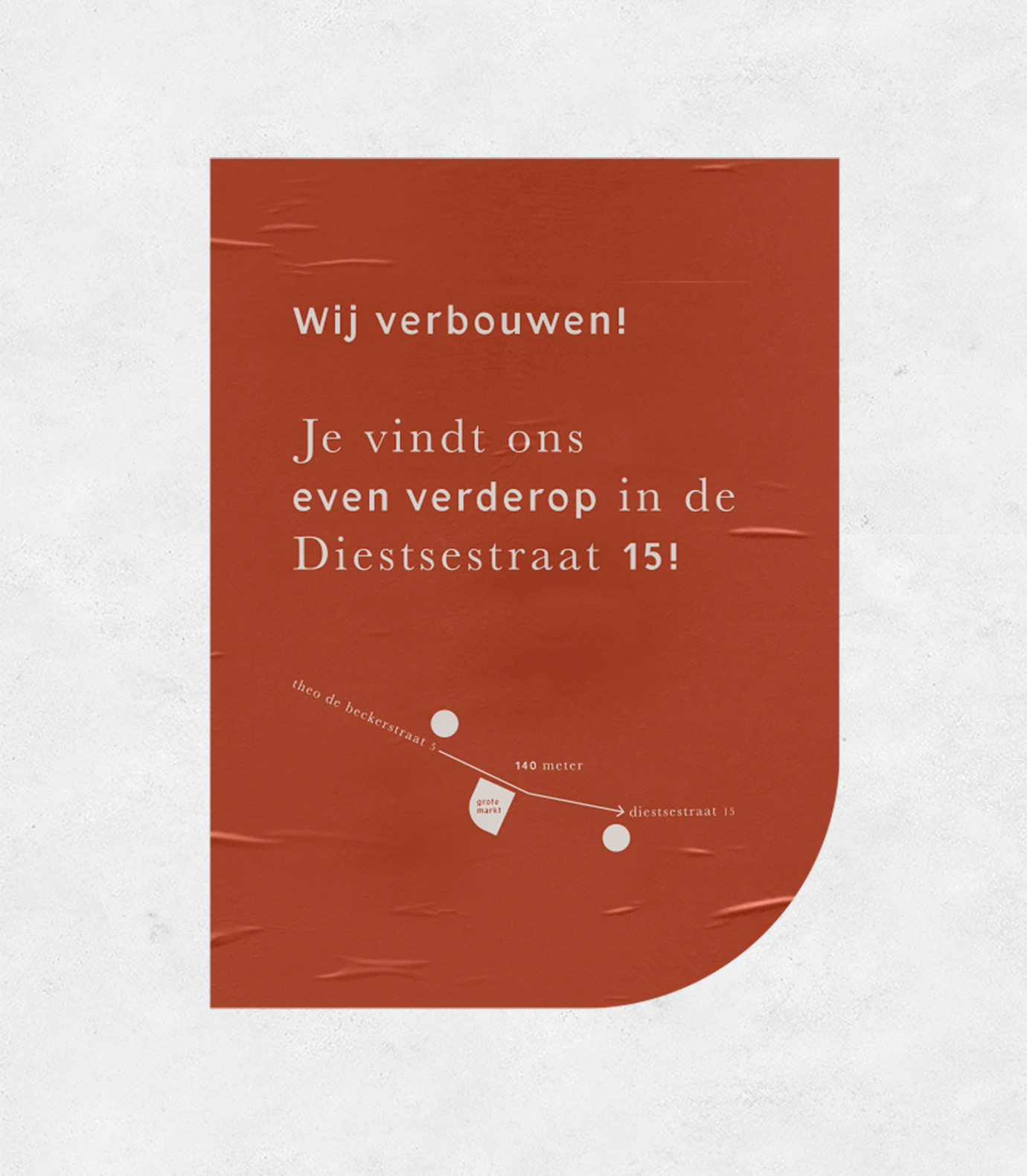
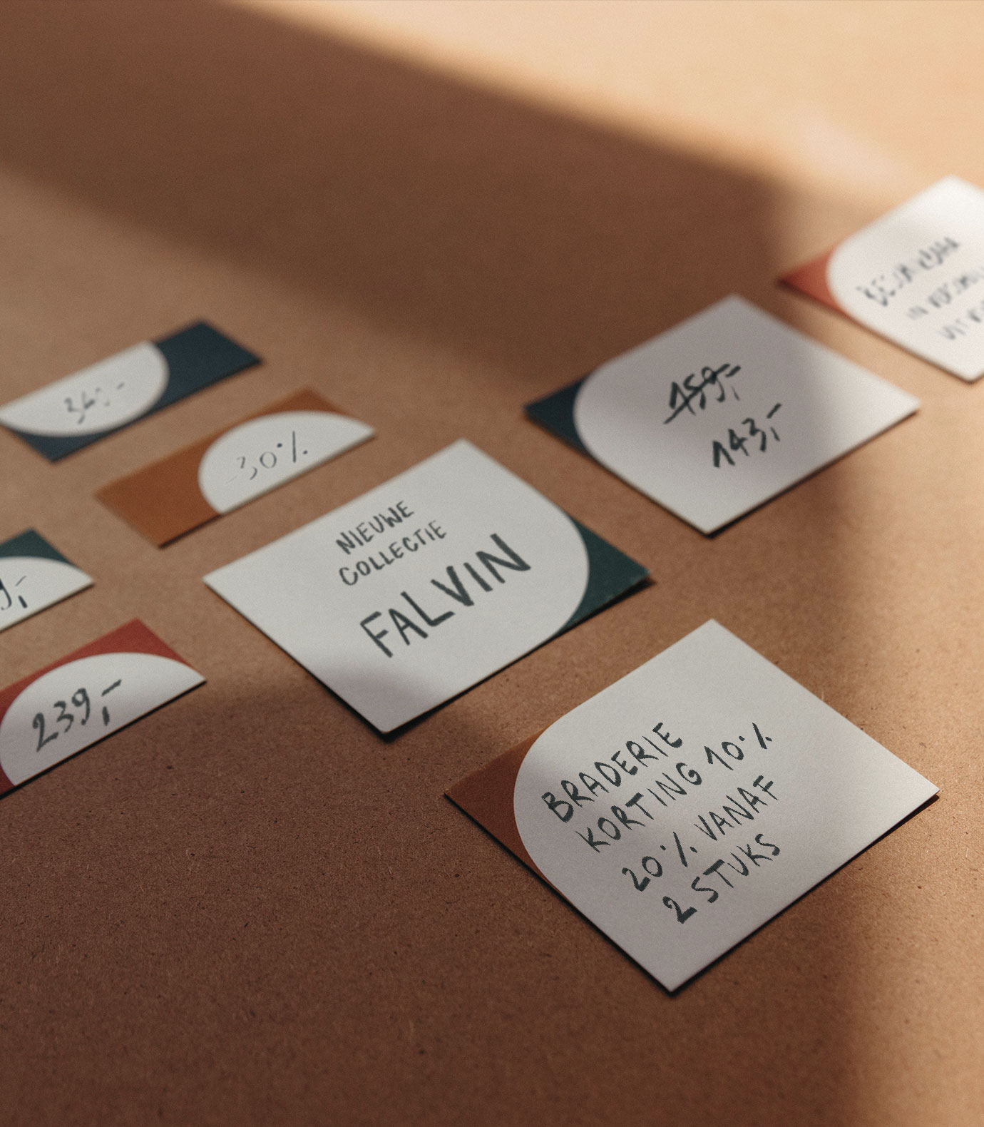
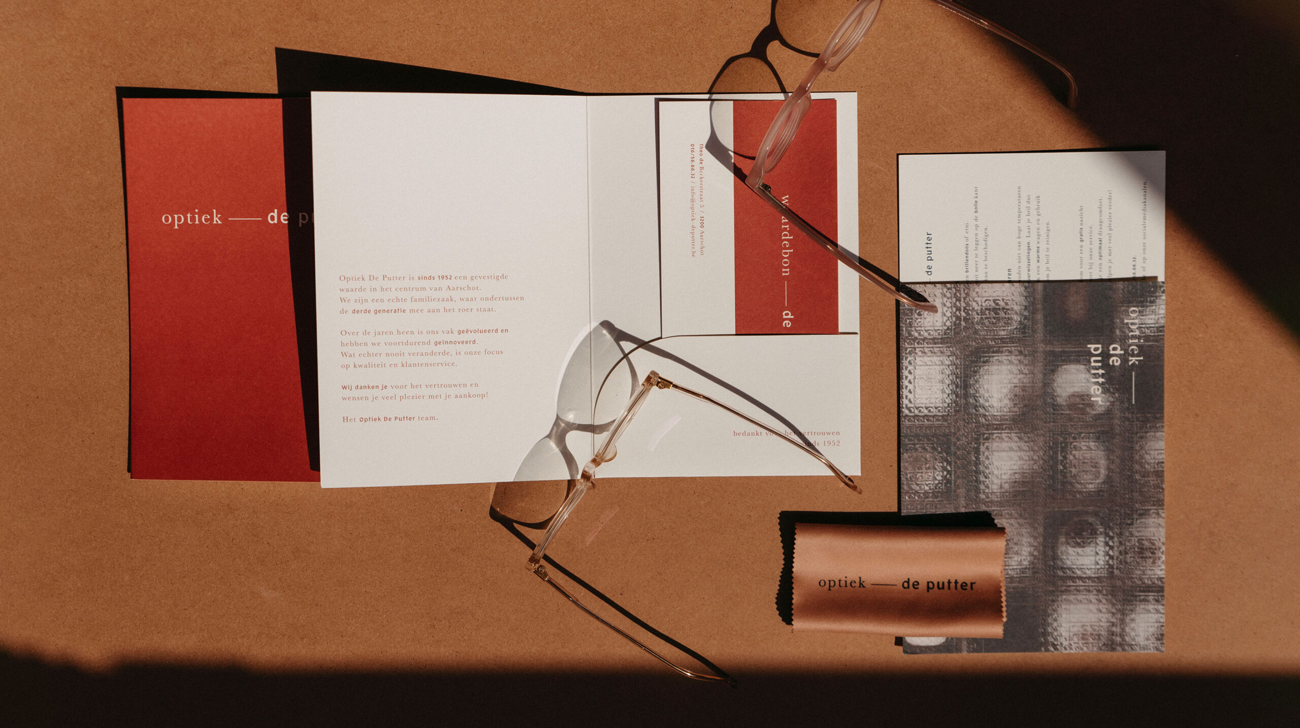
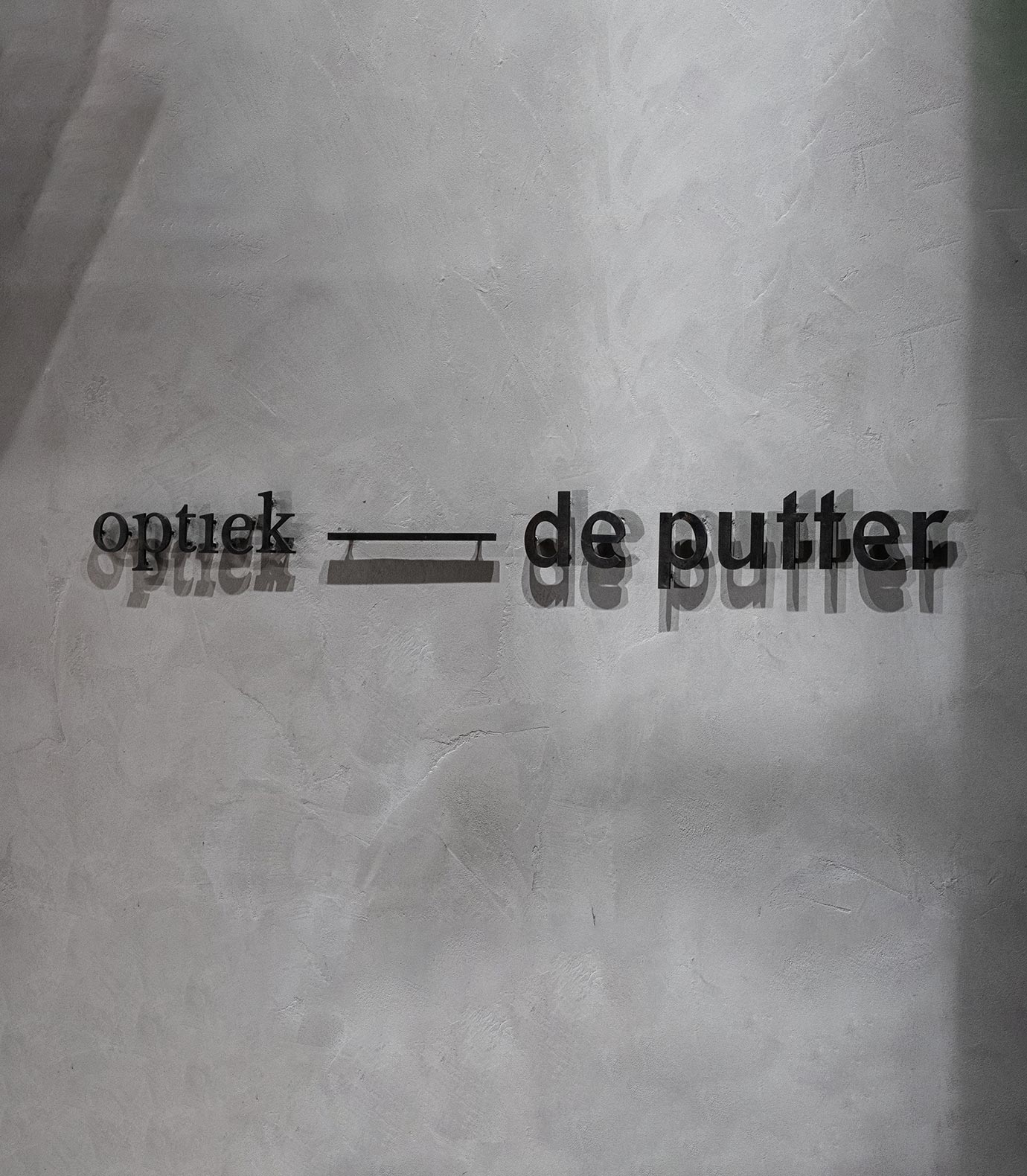
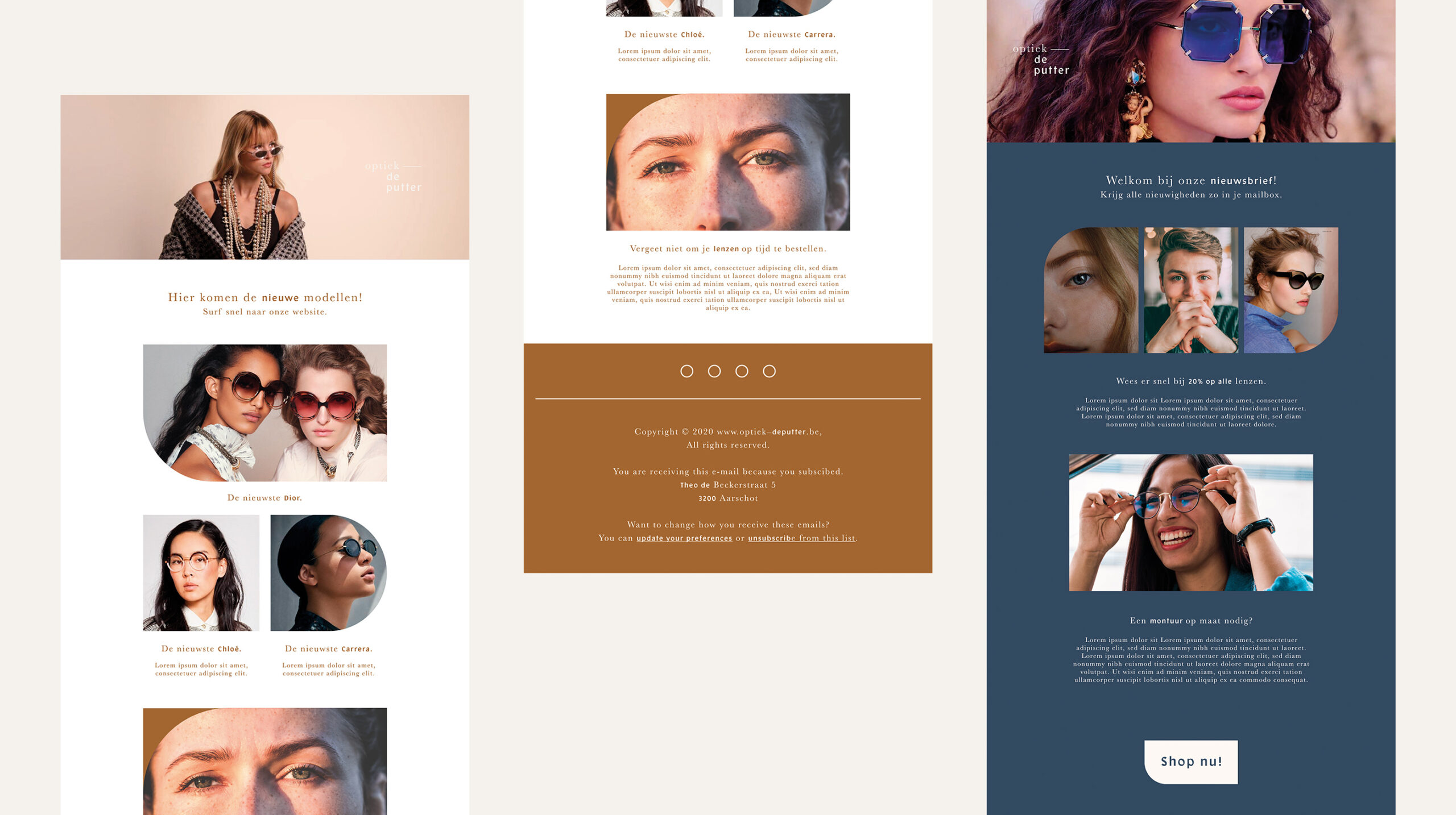
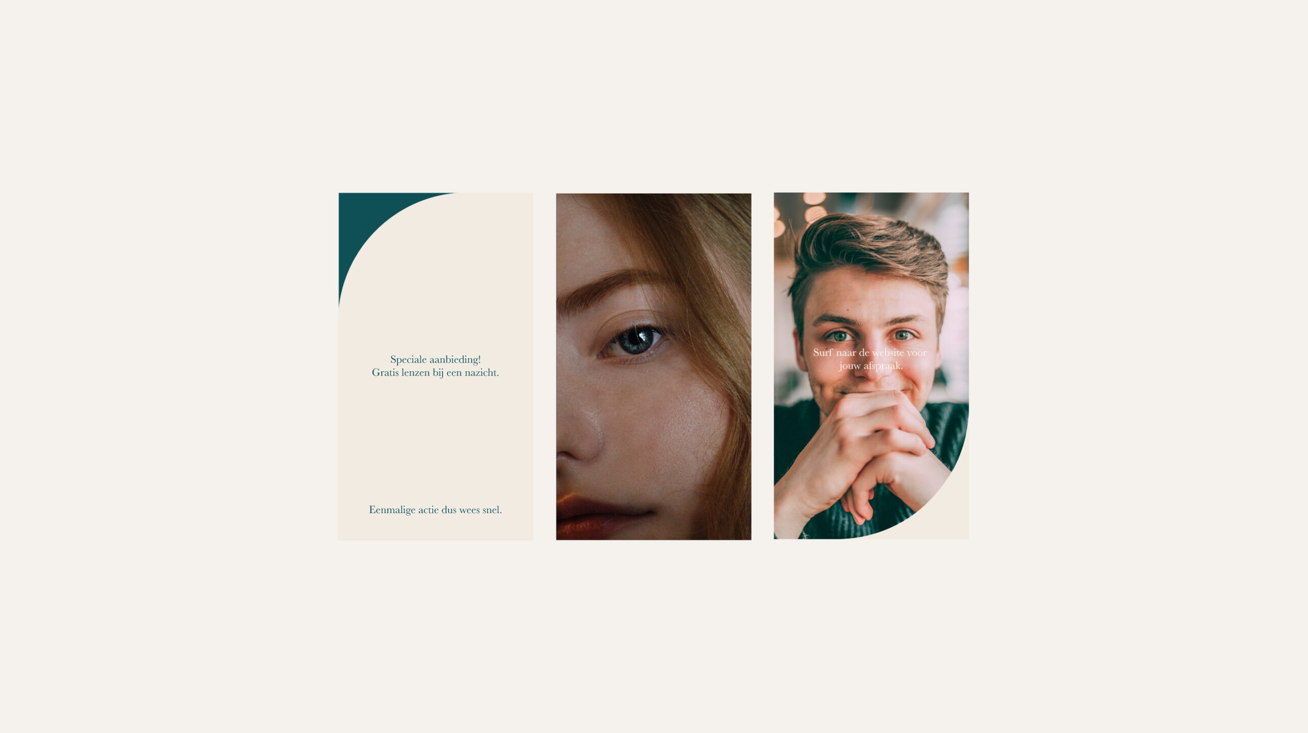
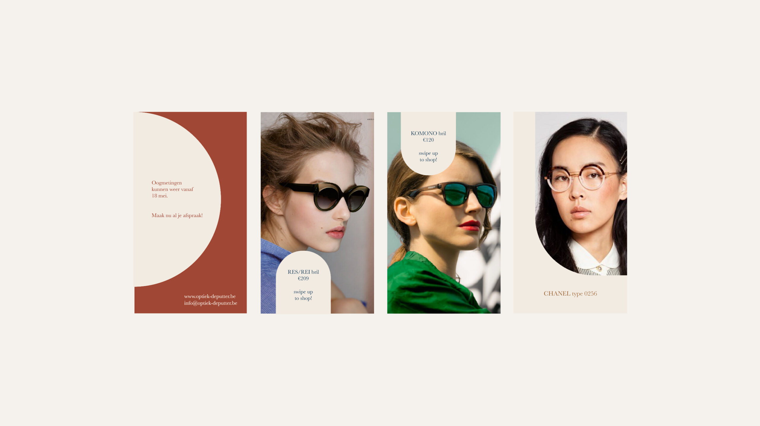
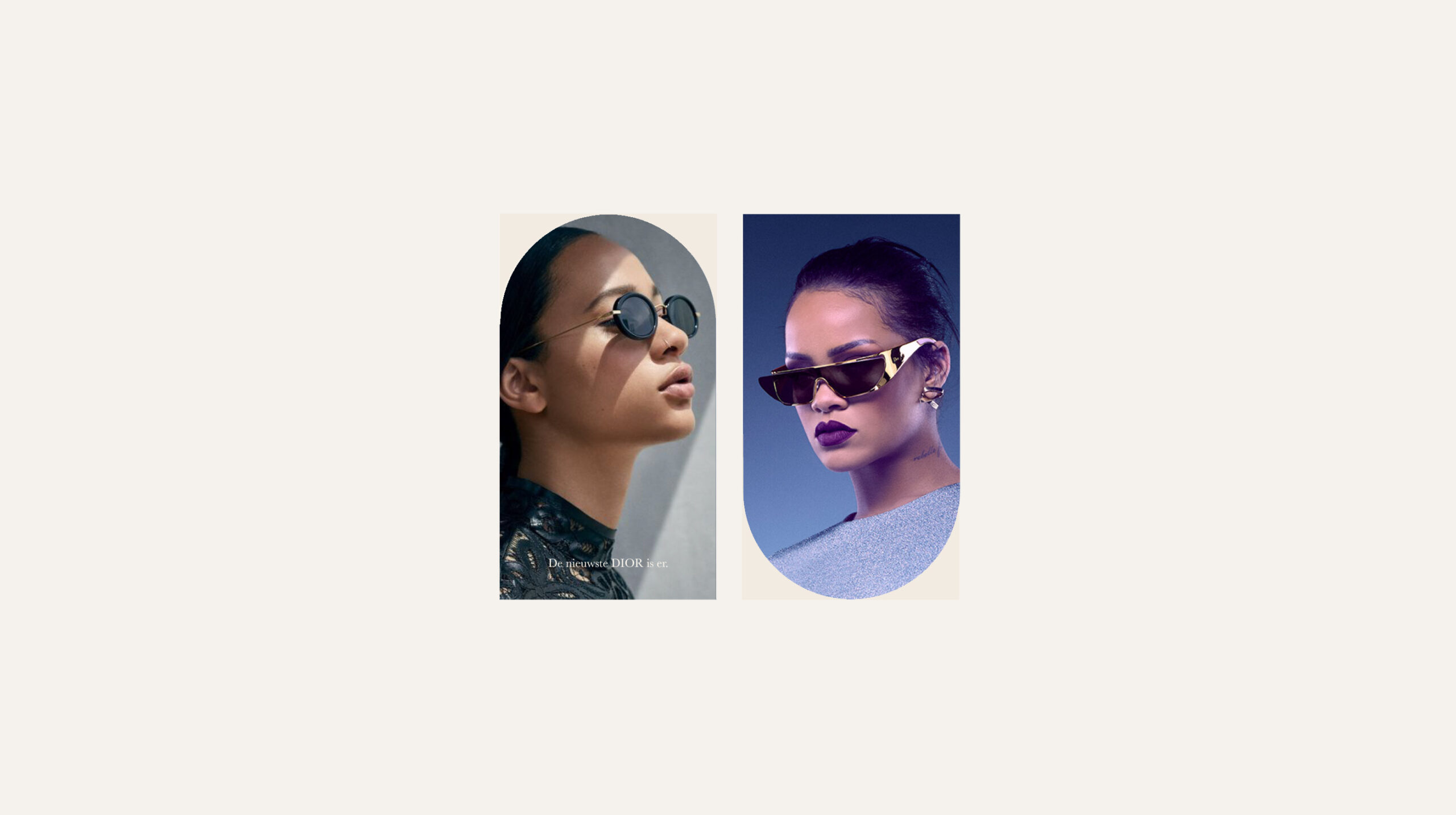
A brand which feels warm, modern and luxurious, with an appreciation of craftsmanship and attention to detail. An elegant colour palette with rich, natural colours inspired by the iris compliments the raw and finished materials of the interior. The graphic shapes used throughout the identity arise from the forms of spectacle frames and lenses and are used subtly but extensively and are also reflected in the interiors. The black and white photography in deliverables comes from Optiek De Putter’s archives and provides a connection to the heritage and development of their profession. While the use of alternating serif and san serif font, often in tandem with one another provide a contrast in taste and reflect the significance a pair of glasses can have in expressing individual style.
